From user research to a product spec.
Discovery → definitionAt EasyDMARC — a cybersecurity platform for email authentication — I ran discovery interviews with MSP customers, synthesized the findings into themes and an impact-effort prioritization, and then authored a PRD for the highest-value opportunity it surfaced: advanced, customizable email reporting. This is the whole arc, end to end: the research, the decision, and the spec it produced.
Two artifacts, one continuous story.
Most portfolio pieces show a finished screen and ask you to trust that someone found the right problem first. This one shows the other half — the part that usually stays hidden. It pairs a UX research study with the PRD it directly produced, so you can follow the line from a real customer complaint all the way to a written, scoped feature.
EasyDMARC's users are the people who keep email trustworthy — MSPs, IT admins and security teams managing DMARC compliance across dozens of domains. The goal of the research was simply to understand where the product was getting in their way. The goal of the PRD was to turn the single clearest finding into something a team could actually build.
The through-line is the point: a recurring complaint in the interviews → the top-scoring opportunity in the prioritization → a PRD that specifies the fix. Research that doesn't change a decision isn't worth showing; this one did.
Listening to the people who run email security.
Six interviews with MSP admins, synthesized into six themes and ranked by impact and effort — a compact discovery study built to point at the work that mattered most.
Objective, participants, method.
The study was deliberately lean: understand user challenges, then improve the EasyDMARC experience. I interviewed MSP administrators — the power users who feel the product's rough edges daily — and ran a four-step method: user interviews → affinity mapping → prioritization → key findings. (Participant names are anonymized here for the portfolio.)
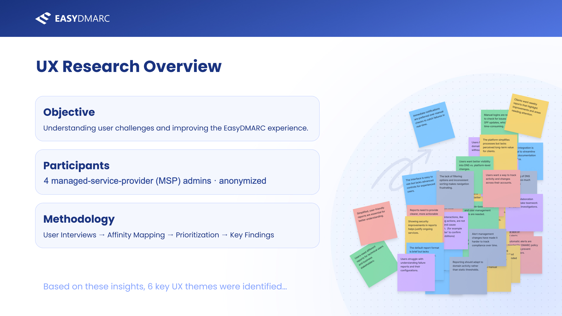
The setup slide. A small-n qualitative study with power users — the right shape for discovering problems (not measuring them), which is exactly what this phase needed to do.
From raw notes to ranked priorities.
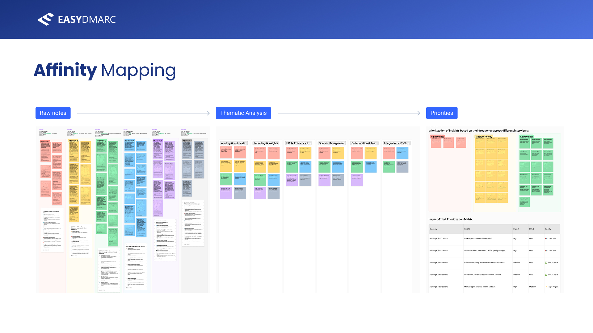
Synthesis is where research earns its keep. I took the six interview transcripts, broke them into individual observations, and clustered them into themes — then ranked those clusters by how often they recurred across interviews. The affinity map makes the whole pipeline visible: messy notes on the left, coherent themes in the middle, a prioritized board on the right.
The synthesis pipeline in one frame. Clustering by frequency across interviews is what turns anecdotes into evidence — and what lets you defend a priority call later.
Six themes the product kept tripping over.
The clustering resolved into six recurring themes — alerting & notifications, reporting & insights, UI & navigation, domain management, collaboration, and integrations. Each is a one-line statement of a real friction, in the users' own framing.
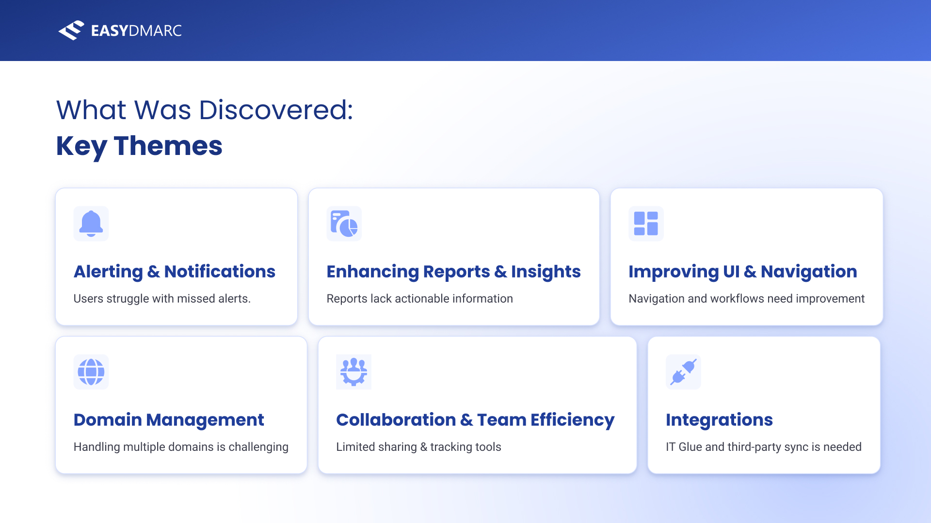
Six themes, each phrased as a user problem. “Enhancing Reports & Insights — reports lack actionable information” is the one this case study follows to its conclusion.
Scoring every insight by impact and effort.
Themes alone don't tell you what to build first. I scored each individual insight on impact and effort and sorted them into Quick Wins, Major Projects, Nice-to-Haves and Low-Priority — a defensible, at-a-glance map of where to spend the next sprint. “Reports need clearer, actionable insights” landed as a high-impact, low-effort Quick Win.
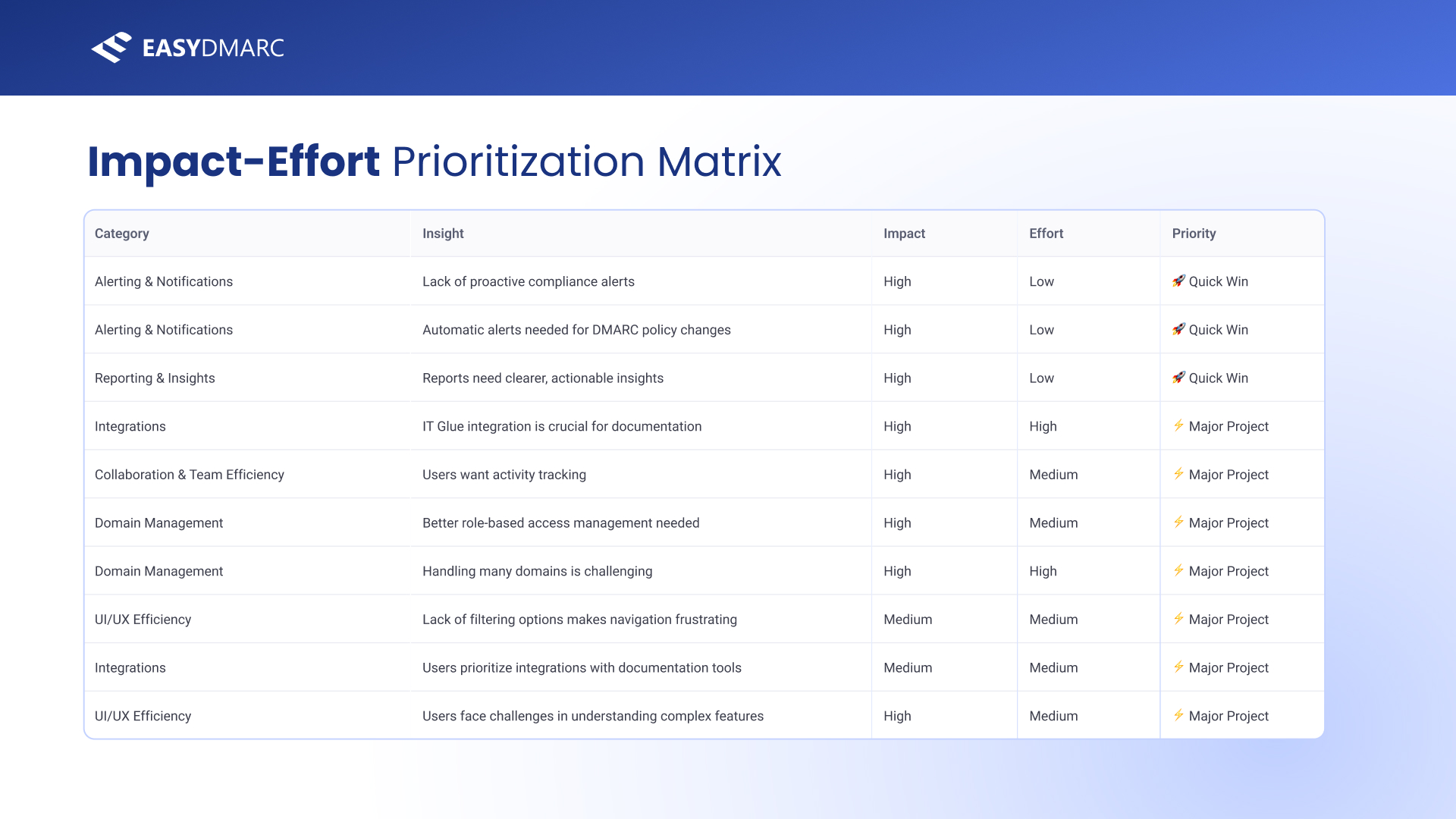
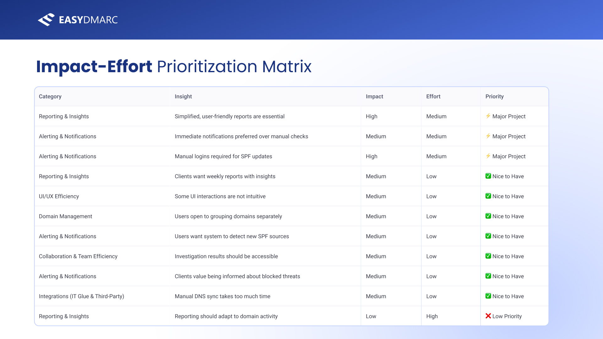
The full impact-effort matrix. Reporting shows up at the top as a Quick Win and recurs as a Major Project — a strong signal that it deserved a real spec, not a patch.
What the research concluded.
The study closed on five plain-language conclusions and a sequence: ship the quick wins first, then take on the major projects, then re-test. Reporting sat across both buckets — which is what pointed me at it for the deeper definition work that follows.
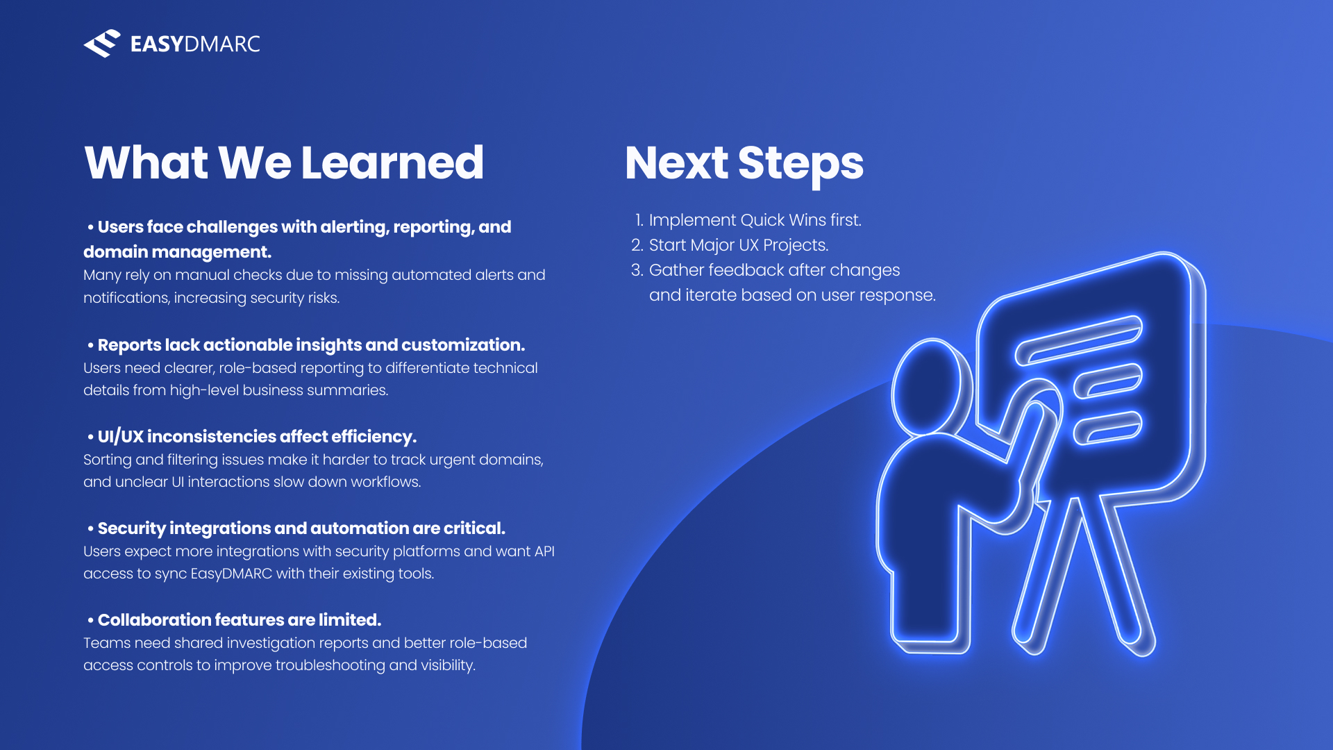
The takeaways slide. “Reports lack actionable insights and customization” is called out explicitly — the bridge from research into the PRD.
One theme, loud enough to spec.
Across the interviews, reporting came up more than anything else — and unlike most complaints, users were specific about what they wanted. That specificity is what made it writable as a PRD.
The complaint, in users' own words.
When I pulled every reporting-related quote together, a clear picture emerged: users were paying for other tools to get the reports EasyDMARC didn't give them. They didn't want more data — they wanted actionable, customizable, role-aware reports they could schedule and share. This wasn't a vague wish; it was a feature brief hiding in the transcripts.
“I have other DMARC systems that send me a report every day… I don't understand why EasyDMARC doesn't have a report like this.”
“The reporting I get now is ‘good enough,’ but it's not actionable. It tells me things at a high level, but I can't drill down easily.”
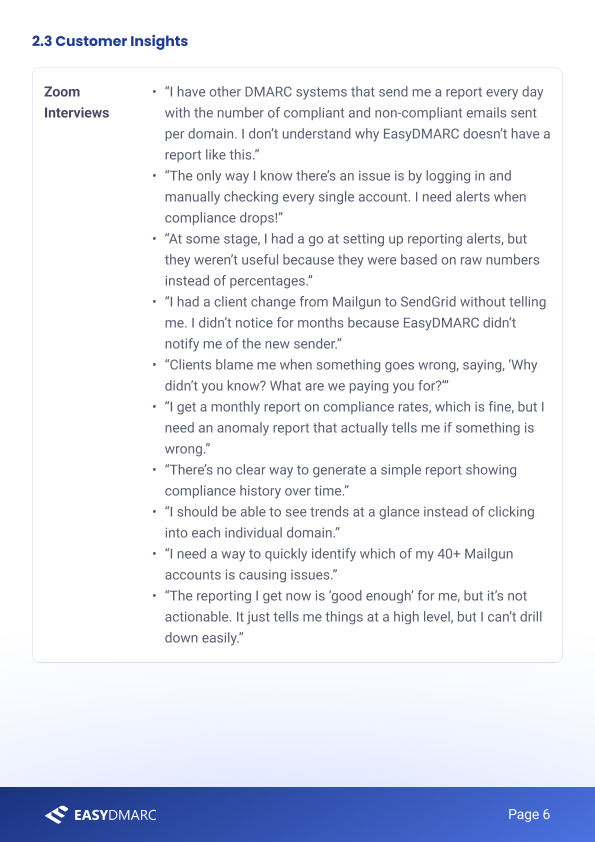
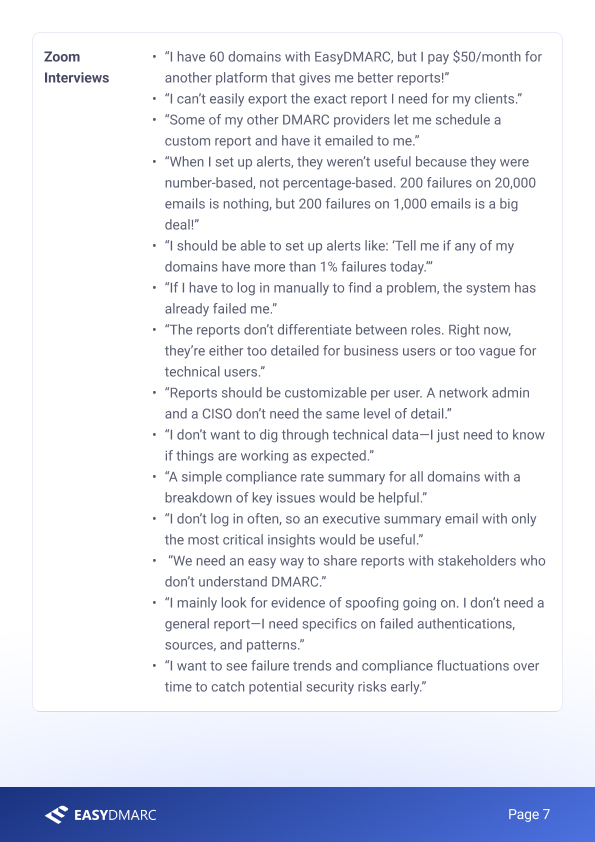
The verbatim evidence, carried straight into the PRD's customer-insights section. Writing the spec on top of real quotes keeps it honest — every requirement traces back to a sentence a user actually said.
Advanced Email Report Customization & Settings.
A full product-requirement document for the reporting feature — problem, objectives, scope, wireframed flow, and the KPIs to judge it by. Authored end to end.
Defining the problem before the feature.
The PRD opens the way a good one should — not with a feature, but with a problem statement: who faces it, why it matters, and why this is the right way to solve it. It frames the work as eliminating manual report-checking with scheduled, customizable, role-aware reporting, and sets a vision and concrete goals before a single screen.
 Cover
Cover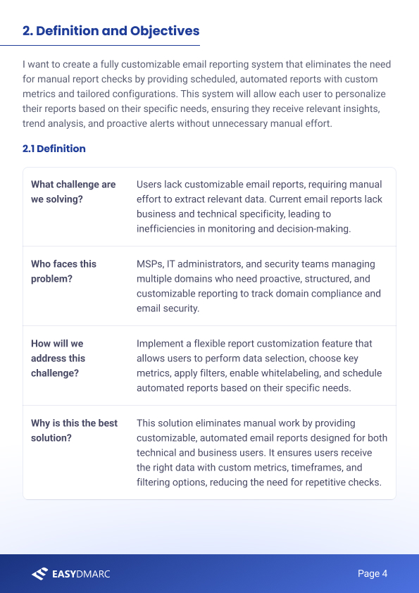 Definition & objectives
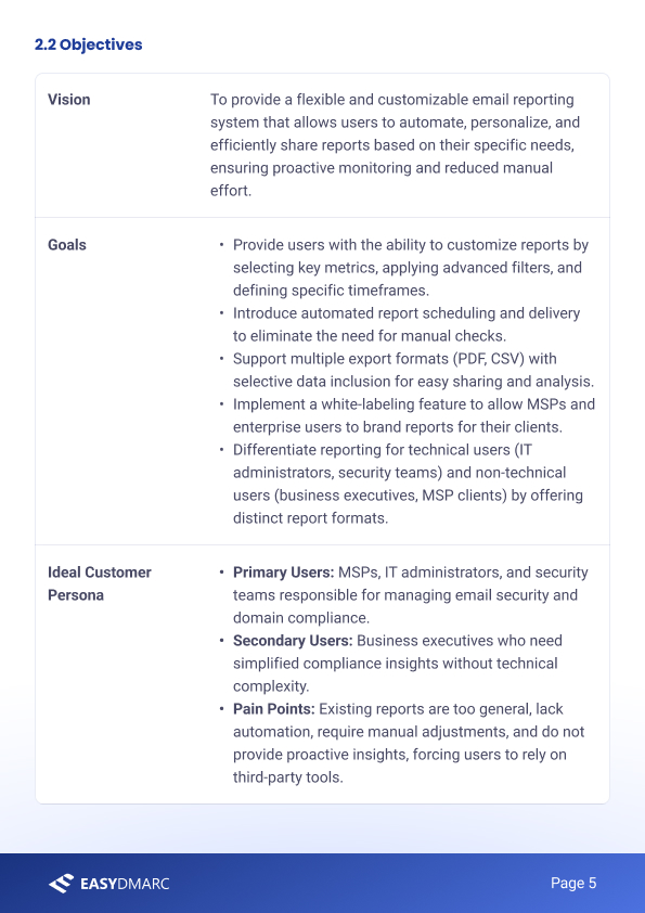 Vision & persona
Problem first. The opening pages translate the research into a vision, measurable goals, and a primary persona — so the feature that follows is accountable to something.
What the feature is — and isn't.
The heart of the PRD is the feature definition: a “must-have” reporting builder where users choose report type, recipients, key metrics, filters, timeframes, scheduling, permissions, and whitelabel branding. Crucially it also draws the boundary — an explicit “not doing” list (no real-time dashboards, no AI prediction, no live collaborative editing) that keeps v1 shippable.
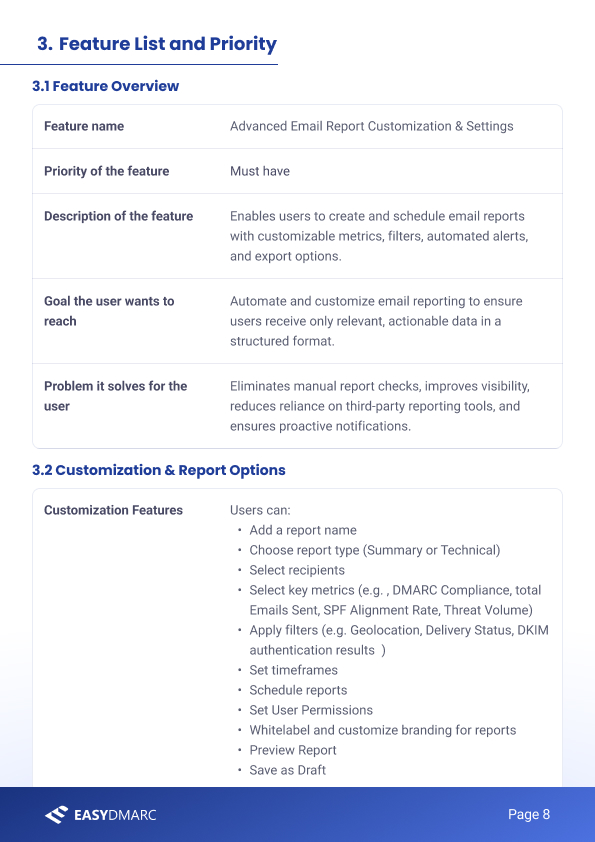 Feature list & priority
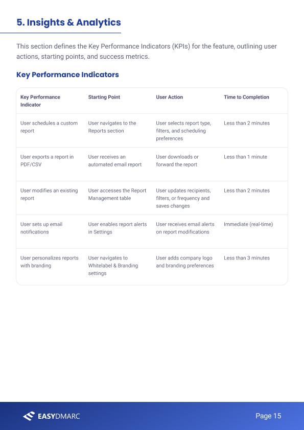 KPIs & success metrics
Scope and success, side by side. A tight feature list with a clear “excluded” boundary on the left; measurable KPIs (time-to-complete each task) on the right, so the feature can be judged, not just shipped.
The reporting builder, wireframed.
The PRD doesn't stop at requirements — it specifies the flow. A user opens the Reports table, hits Create New Report, and works down a single accordion: Details → Recipients & Frequency → Customize → Report Format & Sharing → Notifications & Access. Each step in the spec is drawn as a wireframe, so engineering and design read the same intent.
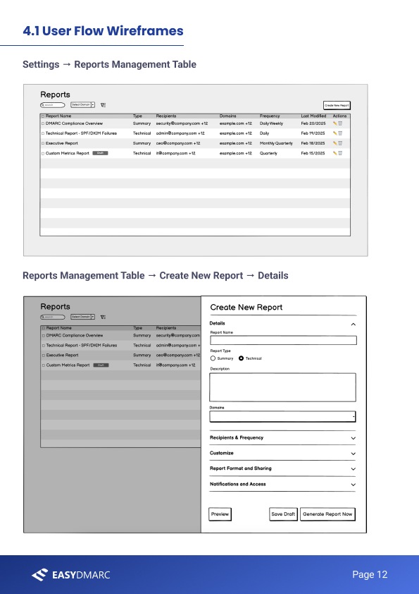 Table → Details
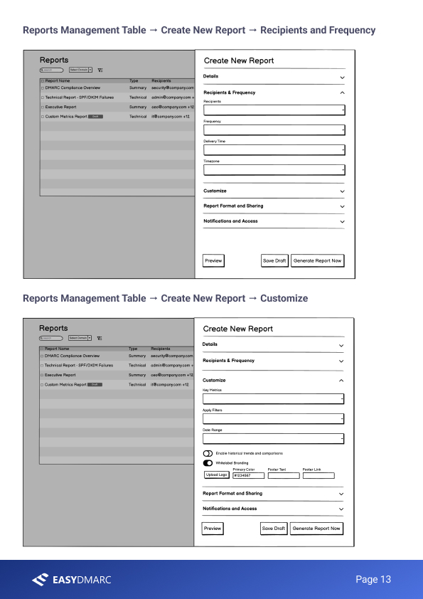 Recipients → Customize
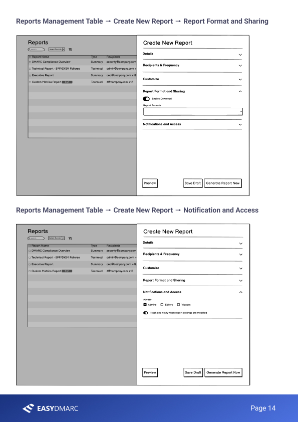 Format → Access
The full create-report flow, wireframed step by step. Specifying the interaction — not just the requirements — is what makes a PRD buildable instead of merely directional.
Why I show these together.
Separately, the deck is “some research” and the PRD is “some pages.” Together they're proof of the thing that actually matters: the ability to move from a user's sentence to a defensible decision to a buildable spec.
From a sentence to a spec.
The reporting feature was scoped to ship as part of EasyDMARC's higher tiers, with whitelabel branding as a paid add-on — but the part I care about for this portfolio is the method: every requirement in that PRD can be traced back to a specific quote in the research. That traceability is the whole job. It's what lets you walk into a prioritization meeting and defend a roadmap with evidence instead of opinion.
If I were taking this further, the next step is written into the research itself: ship the quick win, then run a second round of interviews against the same users to see whether the new reporting actually removed the pain — closing the discovery loop rather than assuming it's closed.
Happy to walk through the interview guide, the synthesis, or any part of the PRD — including the trade-offs I cut from v1 — in a conversation.
Get in touch →Like what you see?
I'm open to senior product design roles and select freelance engagements. Always happy to chat.
Get in touch →