Adapting Material 3 into EasySender's design system.
EasySender is an email deliverability platform — verification, inbox-placement testing, and integrations with Amazon SES, Mailgun, SendGrid, and Google Postmaster. Rather than invent a language from scratch, I built the design system on top of Material Design 3, then tailored its foundations and components to fit a dense, data-heavy product across web and mobile.
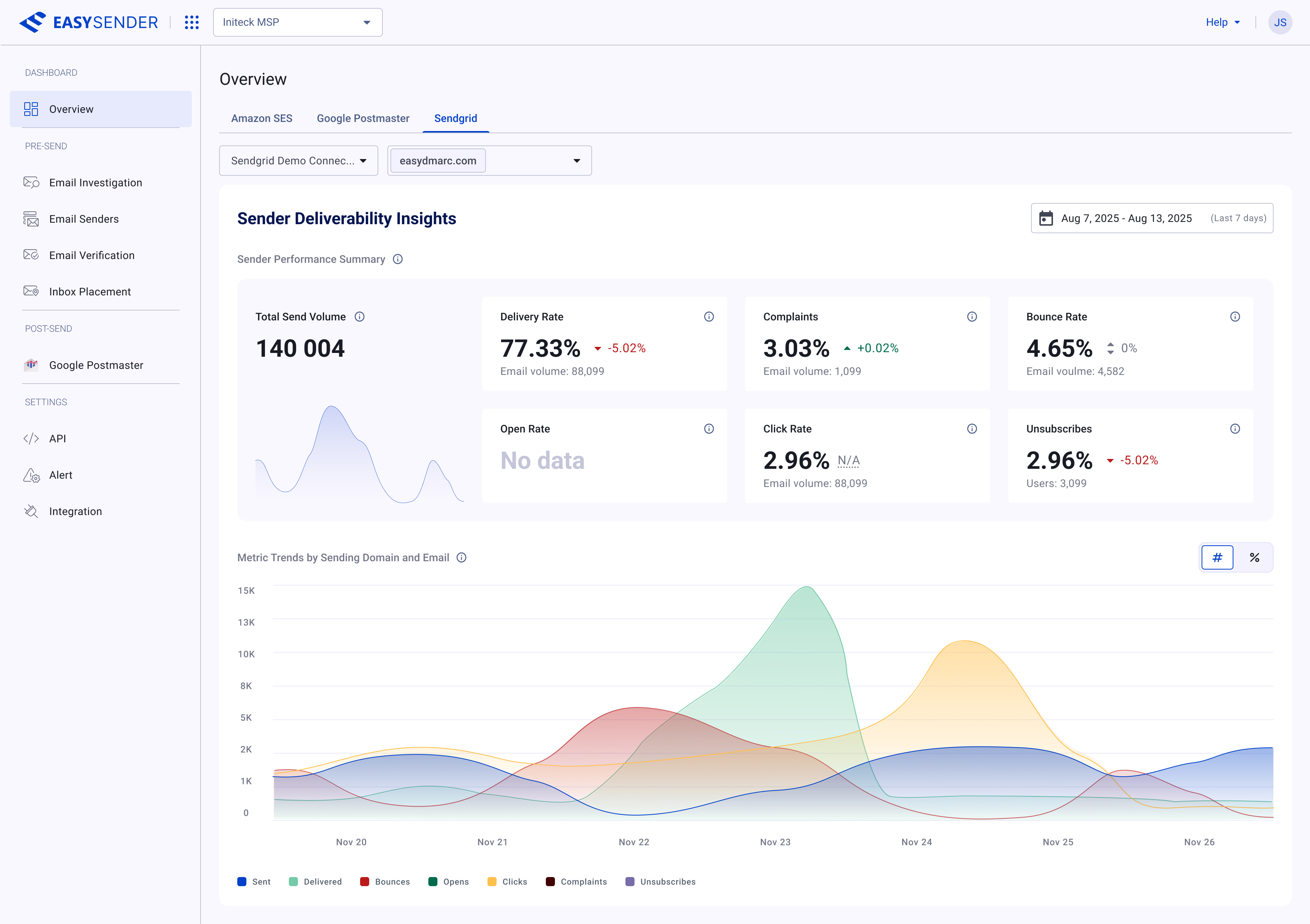
The Overview dashboard — Sender Deliverability Insights: metric cards for delivery, bounce, complaint, and open rates above a multi-series trend chart, all assembled from the system's tokens and components.
A data-dense platform that needed a system fast.
EasySender helps senders protect and improve their email deliverability — investigating and verifying addresses, running inbox-placement tests, and connecting the major sending providers (Amazon SES, Mailgun, SendGrid, Google Postmaster). It's a workspace-and-organization product full of tables, settings, statuses, and configuration flows.
Building a bespoke design language for all of that would have been slow. Material Design 3 already solves the hard, generic problems — a tonal color architecture, a complete type scale, elevation, and a mature component model. So the strategy was deliberate: adopt Material 3 as the backbone, then adapt it — re-tune the palette to EasySender's blue, set type and density for data-heavy screens, and extend the kit with the product-specific components Material doesn't ship.
The approach: don't reinvent what Material already does well. Inherit its foundations and component architecture, customize the tokens to the brand, and spend the design effort where it actually matters — the components and patterns unique to a deliverability product.
What I inherited, and what I tailored.
- Inherited from Material 3 — the tonal palette structure, the type scale (Roboto, Display → Label), elevation, and the component anatomy and state model.
- Tailored — the primary palette re-keyed to EasySender's blue, light and dark theme token maps, and density tuned for tables and settings rather than touch-first mobile.
- Extended — components Material doesn't provide out of the box: drawers, dialogs/message boxes, system & inline & toast notifications, status indicators, tags, and plain & rich tooltips — all built to match the Material foundations.
The result is a system that feels native to Material but unmistakably EasySender, and that an engineer familiar with M3 could implement quickly.
Material's tonal architecture, re-keyed to EasySender blue.
Color follows the Material 3 model: tonal palettes (Primary, Secondary, Tertiary, Error, Neutral, Neutral Variant) from 0–100, mapped to semantic roles — Primary / On Primary, Surface, Surface Container, Outline, and so on — for both light and dark themes. I re-keyed the primary ramp to EasySender's blue and validated every role pairing for contrast, so the same token set drives both themes without one-off overrides.
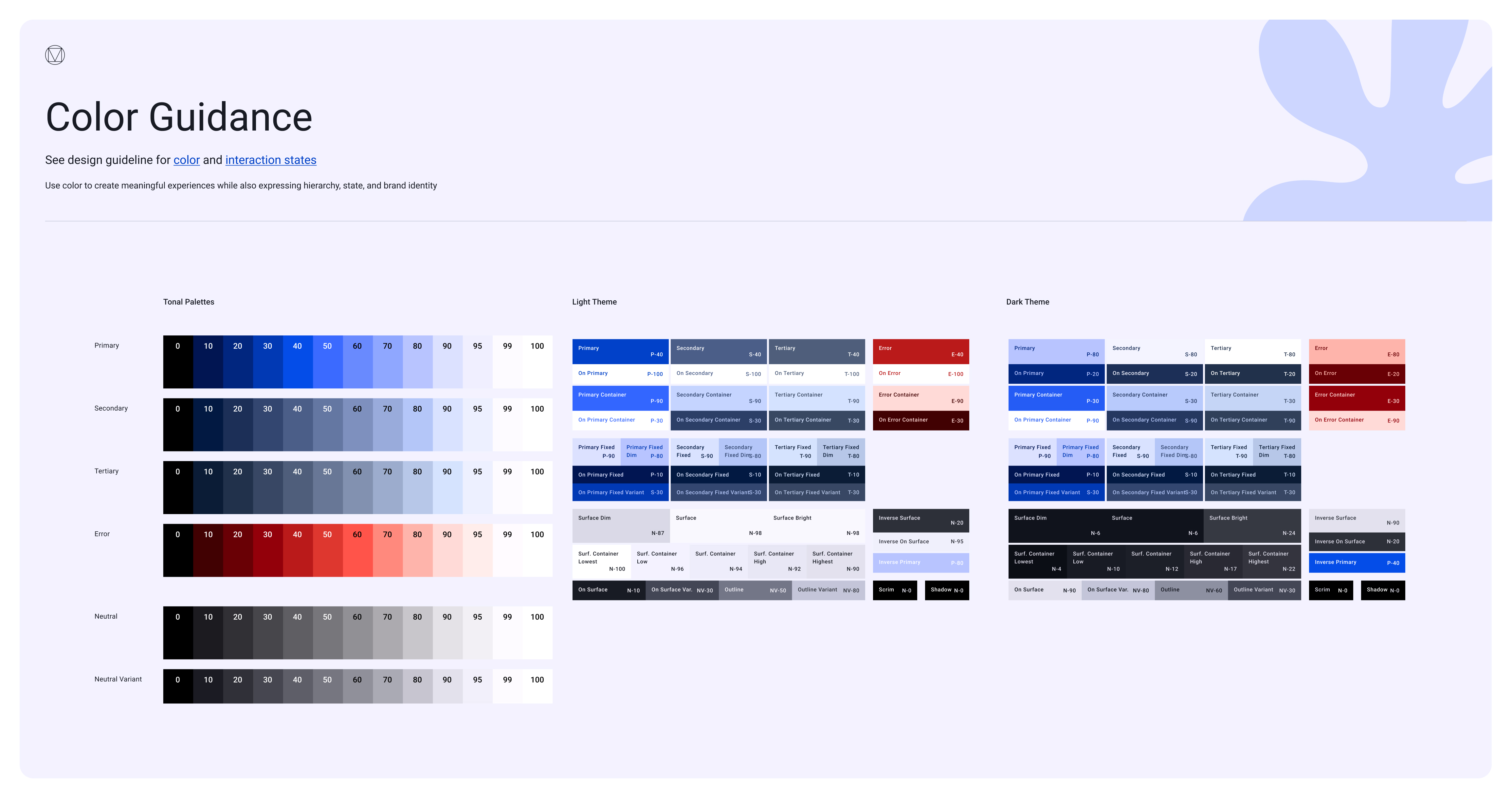
Tonal palettes on the left; the full light- and dark-theme role maps on the right — the semantic tokens every component references.
The Material type scale, tuned for dense screens.
Typography uses the Material 3 scale in Roboto — Display, Headline, Title, Label, and Body, each in large / medium / small with defined sizes, line heights, and tracking. For a product this table- and form-heavy, the workhorses are the Title, Label, and Body steps; the larger Display sizes are reserved for empty states and marketing surfaces.
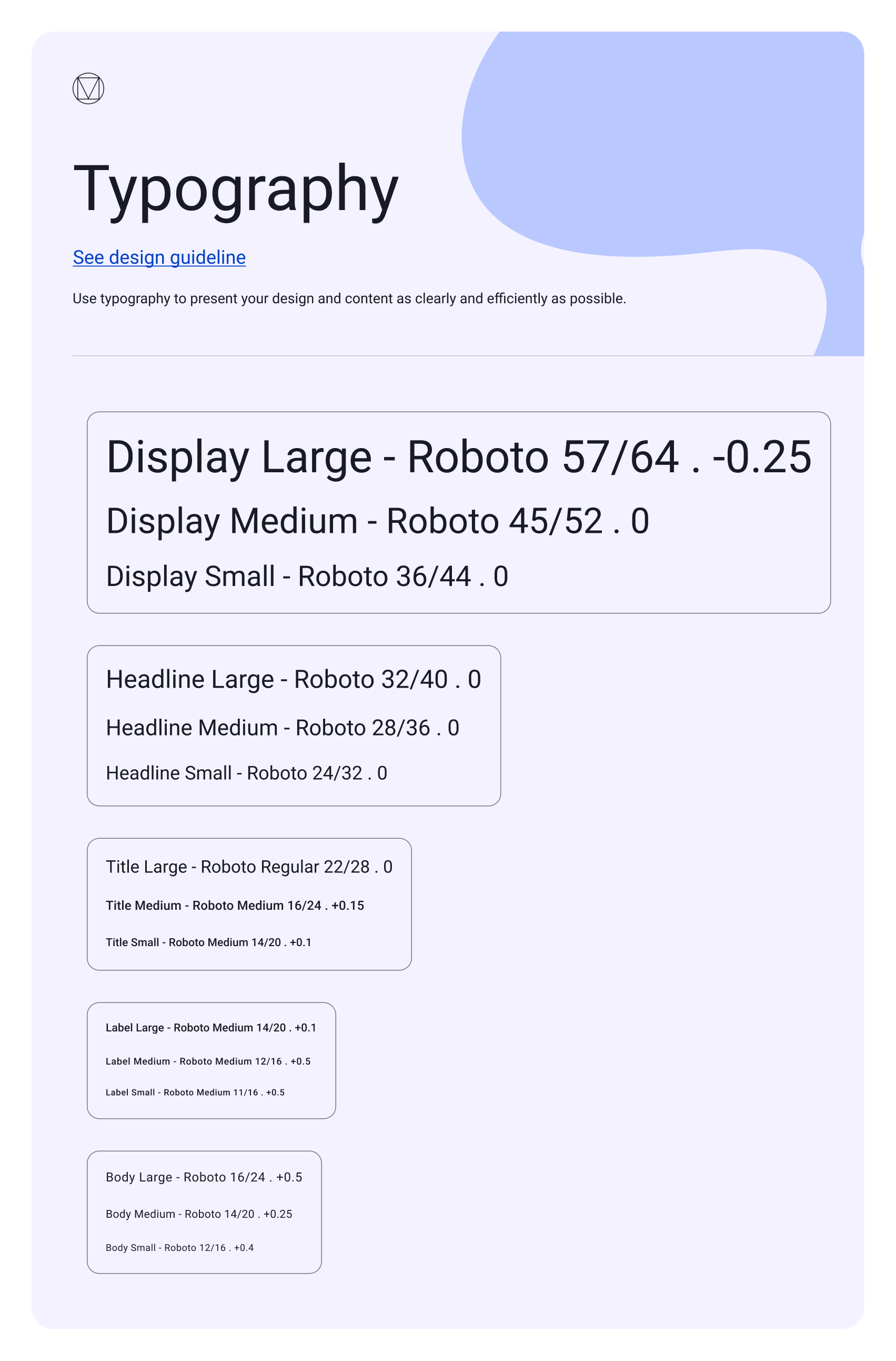
The full Roboto type scale — Display through Body — with the exact size / line-height / tracking values components inherit.
A shared elevation ramp for both themes.
Depth follows Material's elevation levels, expressed through surface fills and shadows and defined for light and dark surfaces alike. A consistent ramp keeps the relationship between resting cards, menus, dialogs, and tooltips legible — and it's tokenized, so a card and a popover never disagree about how high they sit.
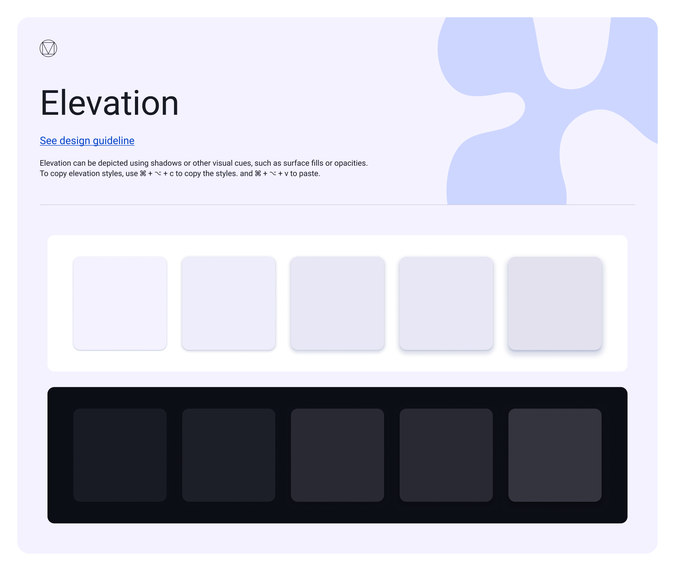
Elevation levels on light and dark surfaces — depth as shadow and surface fill, consistent across themes.
The Material library, specced for EasySender.
Each core component keeps Material 3's anatomy and state model — but with EasySender's tokens applied and every variant, size, and state drawn out, so engineering can build straight from the sheet.
Buttons
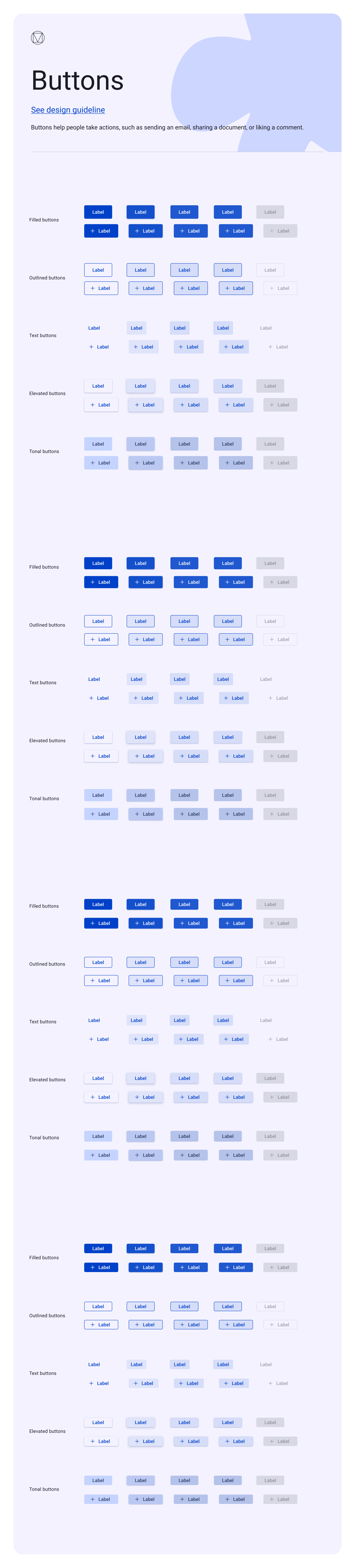
Buttons — filled, outlined, text, elevated, and tonal types, every size and state, on the EasySender palette.
Icon buttons
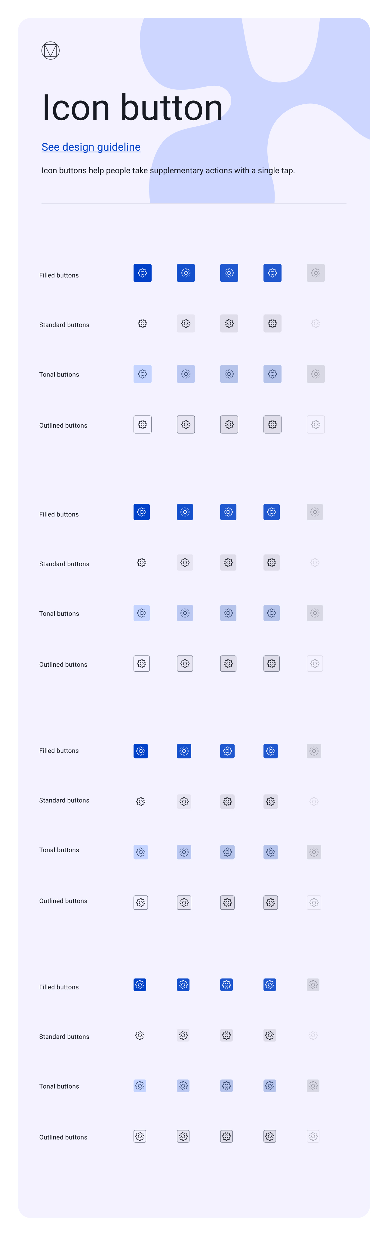
Icon buttons — filled, standard, tonal, and outlined, across sizes and states for supplementary actions.
Segmented buttons
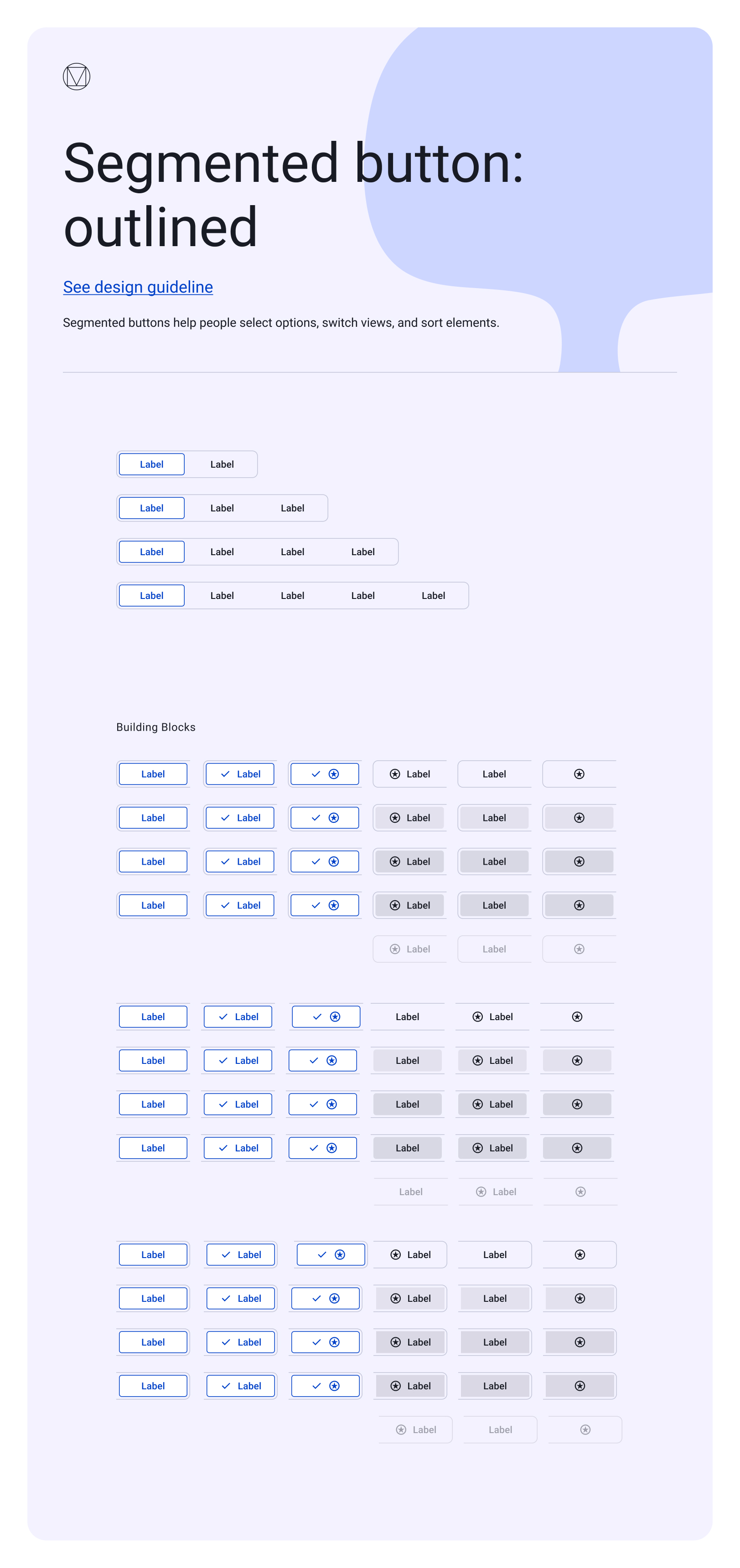
Segmented buttons — for switching views and sorting, from two to five segments with selected and icon states.
Text fields
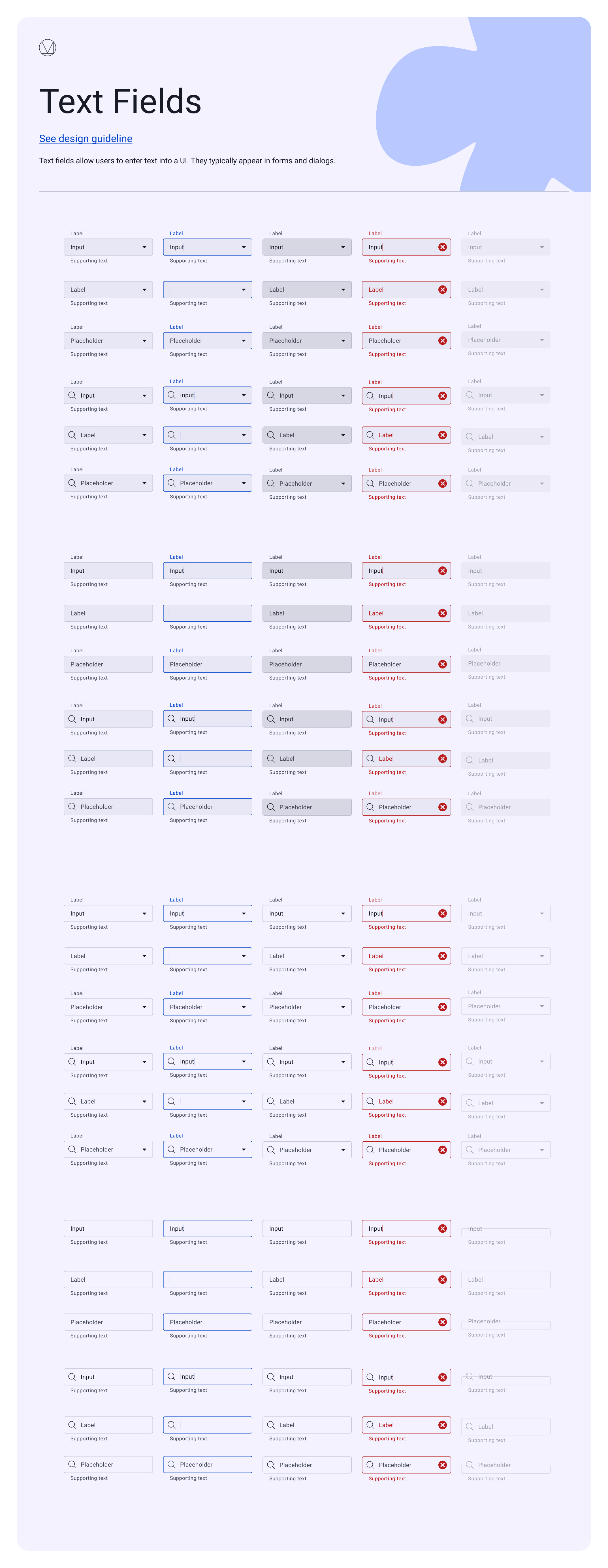
Text fields — filled and outlined, with labels, icons, supporting text, and the full validation state set.
Checkboxes
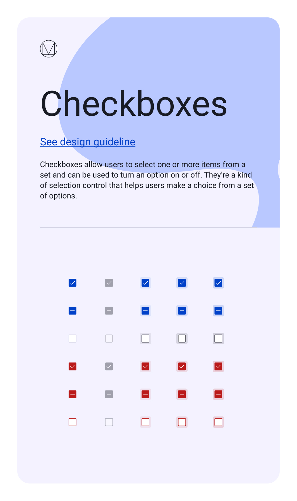
Checkboxes — selected, indeterminate, and unselected, in primary and error roles with every interaction state.
Chips
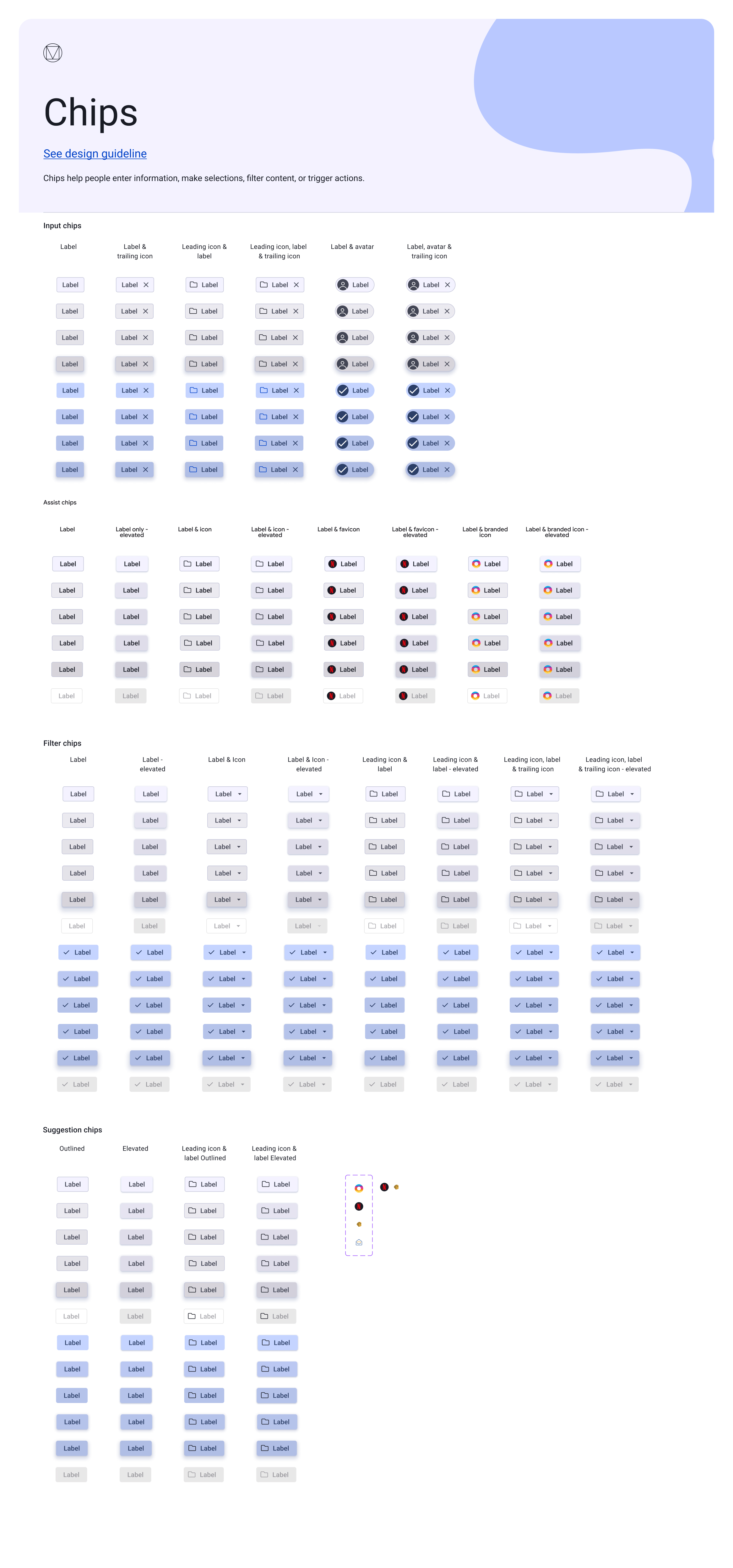
Chips — input, assist, filter, and suggestion, with icons, avatars, and elevated and selected variants.
Lists
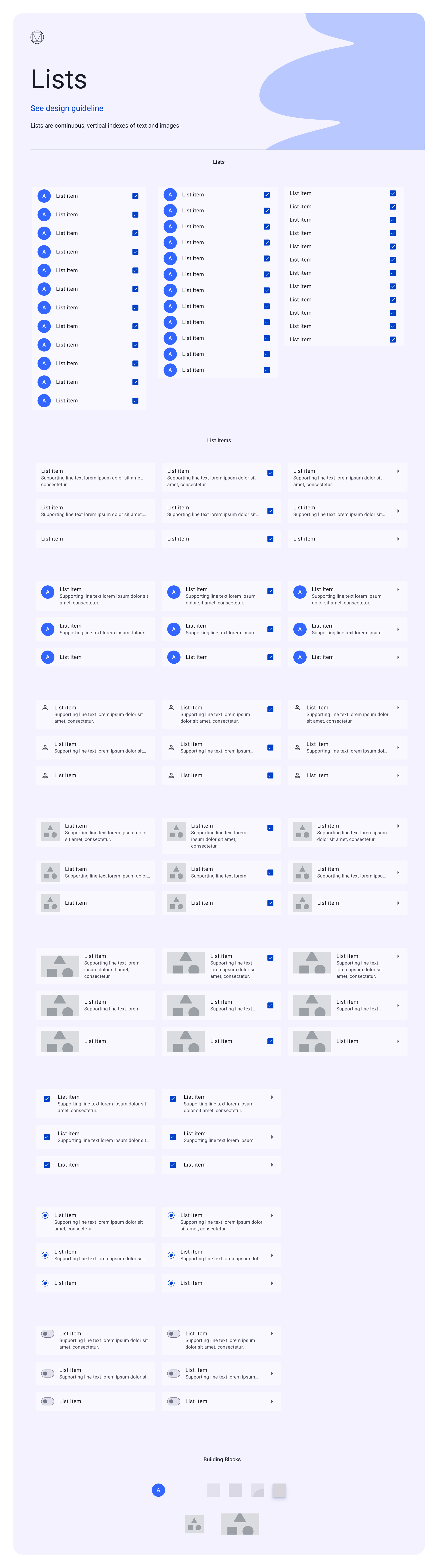
Lists — one to three lines, with leading avatars/icons/thumbnails and trailing checkboxes, toggles, or chevrons.
Menus
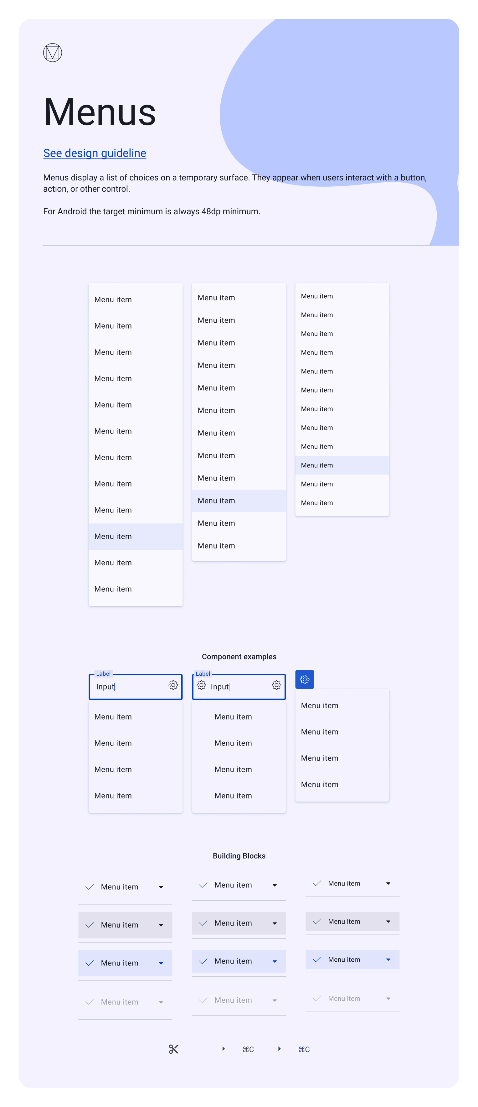
Menus — dropdowns at multiple densities, anchored to fields and buttons, with the full item-state building blocks.
Tabs
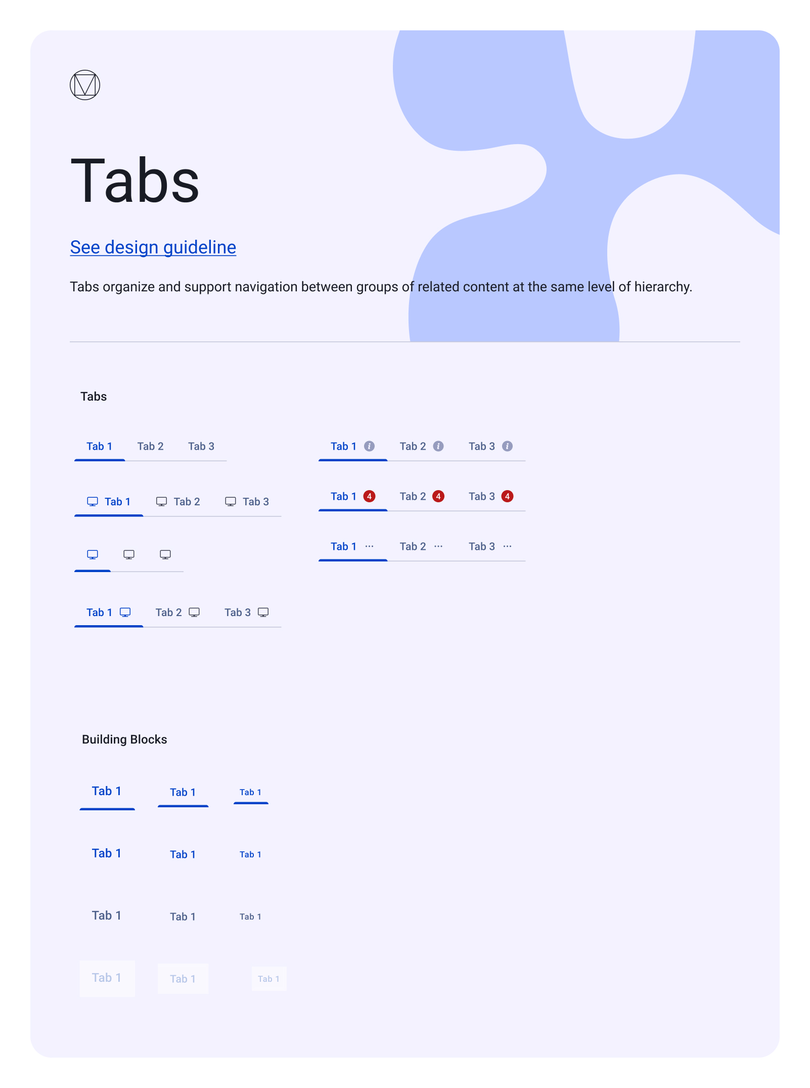
Tabs — text, icon, and combined, with badges and info affordances and the underlying state building blocks.
The components Material doesn't ship.
A real product needs more than the core kit. These components extend Material's foundations into the patterns EasySender relies on — built to inherit the same tokens, elevation, and states so they sit seamlessly beside the core library.
Drawers
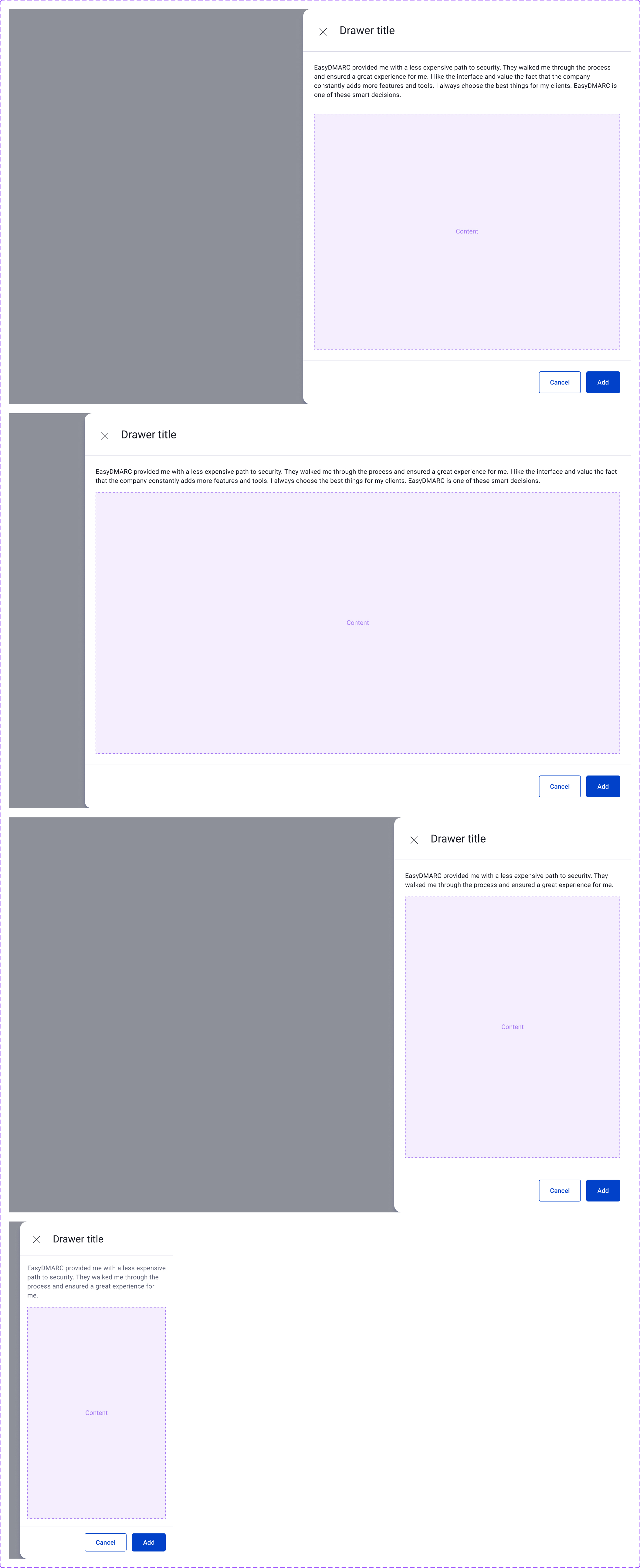
Drawers — side panels for secondary tasks and quick edits, responsive from desktop to mobile.
Modals & dialogs
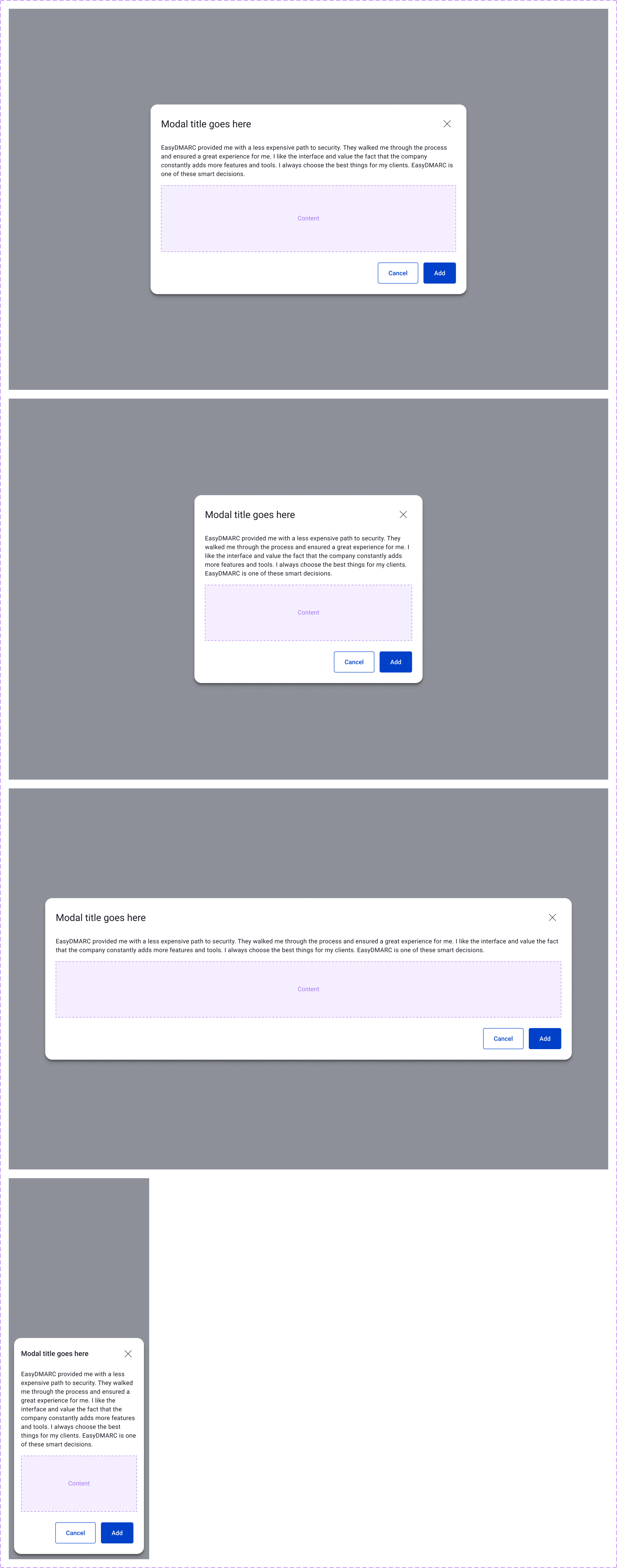
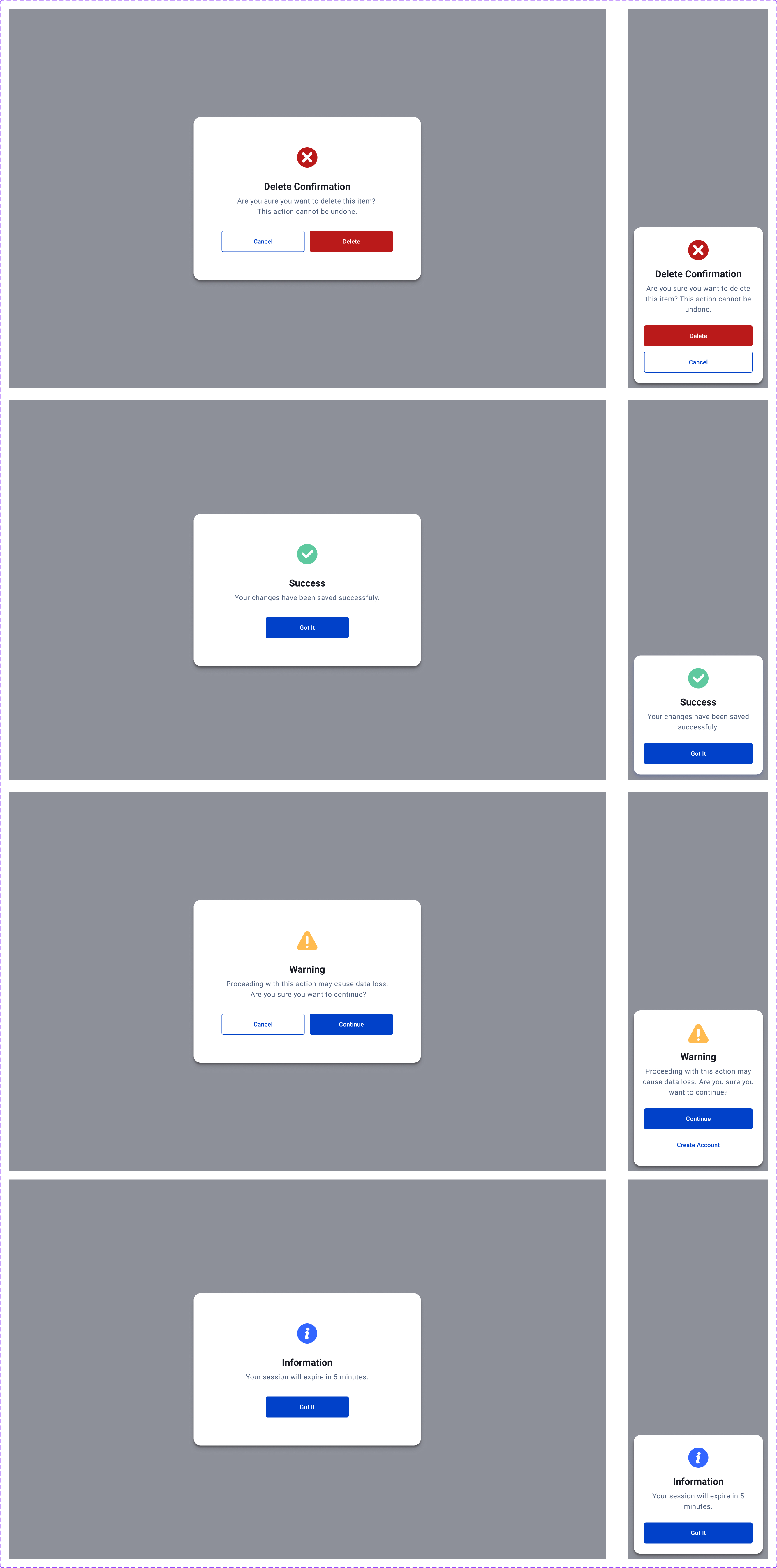
Modals for tasks; message-box dialogs for confirmation, success, warning, and information — desktop and mobile.
Notifications
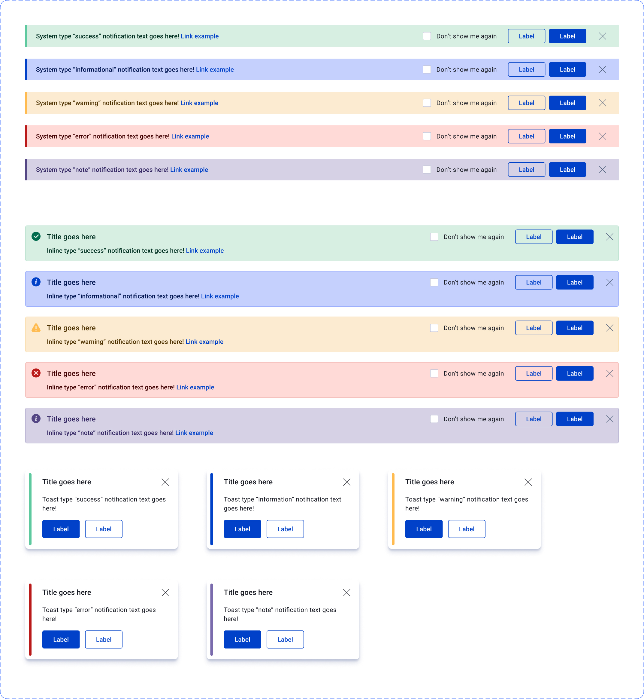
Notifications — system banners, inline messages, and toasts across all five types, with actions and dismissal.
Status & tags
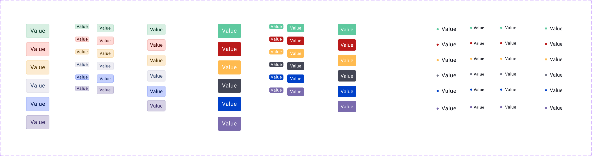
Status & tags — semantic colors mapped to the token system, as filled and outlined tags, dots, and sizes.
Tooltips
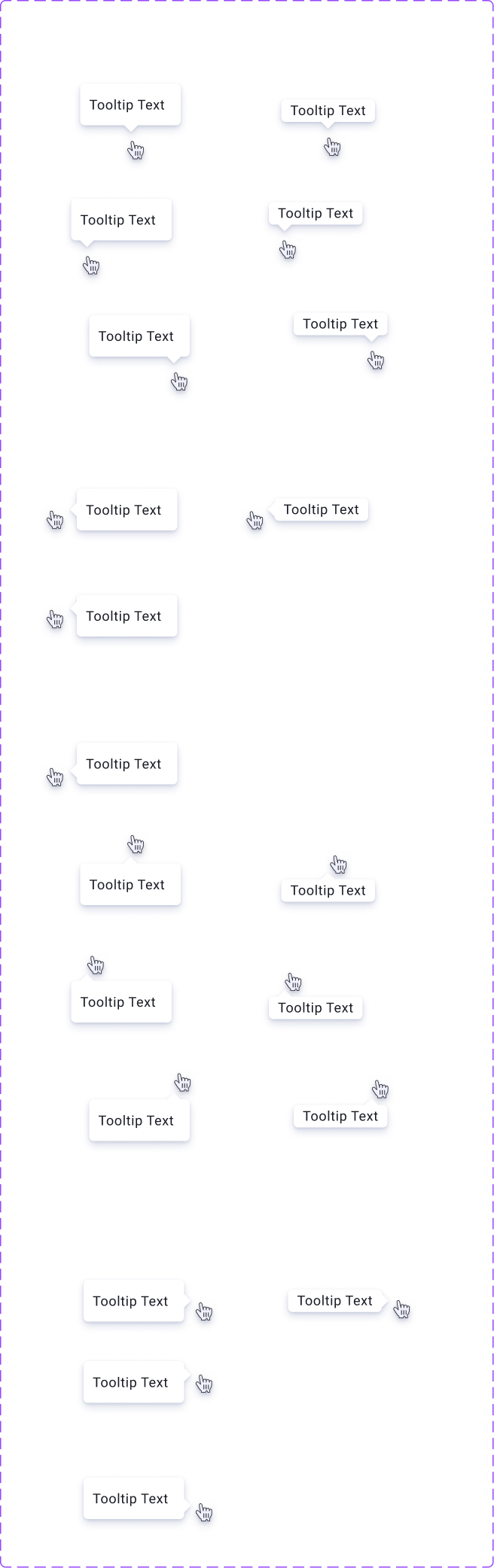
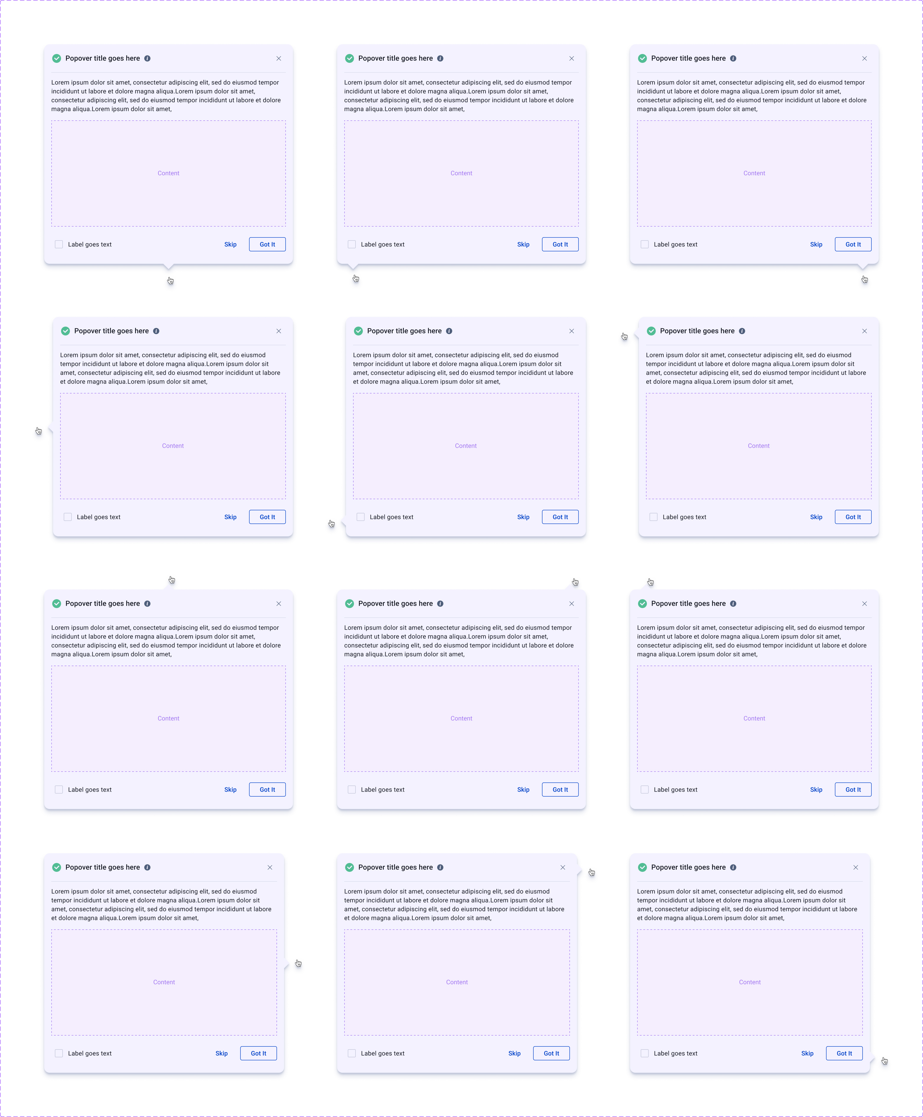
Tooltips — plain labels for hints in every placement, and rich tooltips with title, content, and actions for guidance.
The same system, scaled down to mobile.
Material's responsive guidance made the jump to mobile straightforward. The navigation collapses into a drawer, the profile and help menus become nested mobile menus, and every control keeps Material's minimum touch targets — the same tokens and components, simply reflowed.
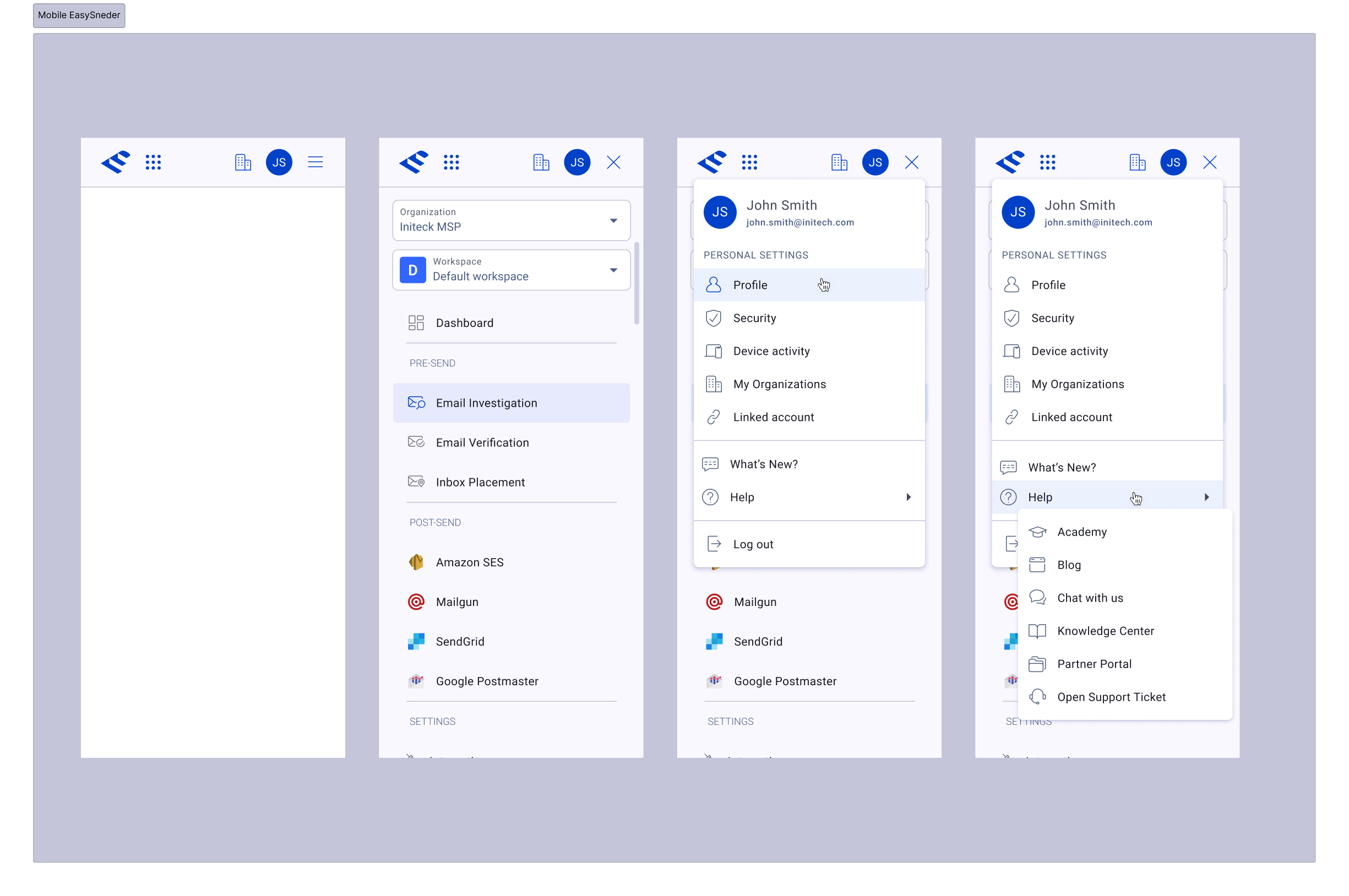
Mobile — the navigation drawer and nested profile/help menus, built from the same component library.
A system that shipped quickly and scales.
Standing on Material 3 meant the system reached production fast and stayed consistent as the product grew. The screens on this page — Integrations, the connection tables, the mobile navigation — are all built from the same tokens and components, across light and dark themes, on web and mobile.
Why adapt rather than invent
The lesson I keep from this one: a design system's value isn't in being original — it's in being reliable. Material 3 gave EasySender a battle-tested foundation and a shared vocabulary with engineering, which freed the design effort for the things that were actually unique to the product. Adapting a strong base, then extending it with intent, got us a more robust system in a fraction of the time.
Happy to walk through the Figma library, the token architecture, and how we mapped Material 3 to the brand — in a conversation.
Get in touch →Like what you see?
I'm open to senior product design roles and select freelance engagements. Always happy to chat.
Get in touch →