Growing plants at home, guided by an app.
Eveloon is the companion app for a smart indoor device that grows plants in your home. It pairs with the device, lets you pick a growing program for the plant you want, and tracks each stage of growth — water, humidity, and temperature included.
Growing plants indoors is hard to get right.
Light, water, humidity, and temperature all change as a plant grows, and most people don't know what each plant needs. The device can handle all of it on its own, but only if people can set it up easily and trust what it's doing.
The app had three jobs: make pairing easy, make choosing a plant simple, and show progress in a way you can check at a glance.
The device handles the growing. The app's job is to make that care visible, so you always know how your plant is doing.
From unboxing to connected in a few steps.
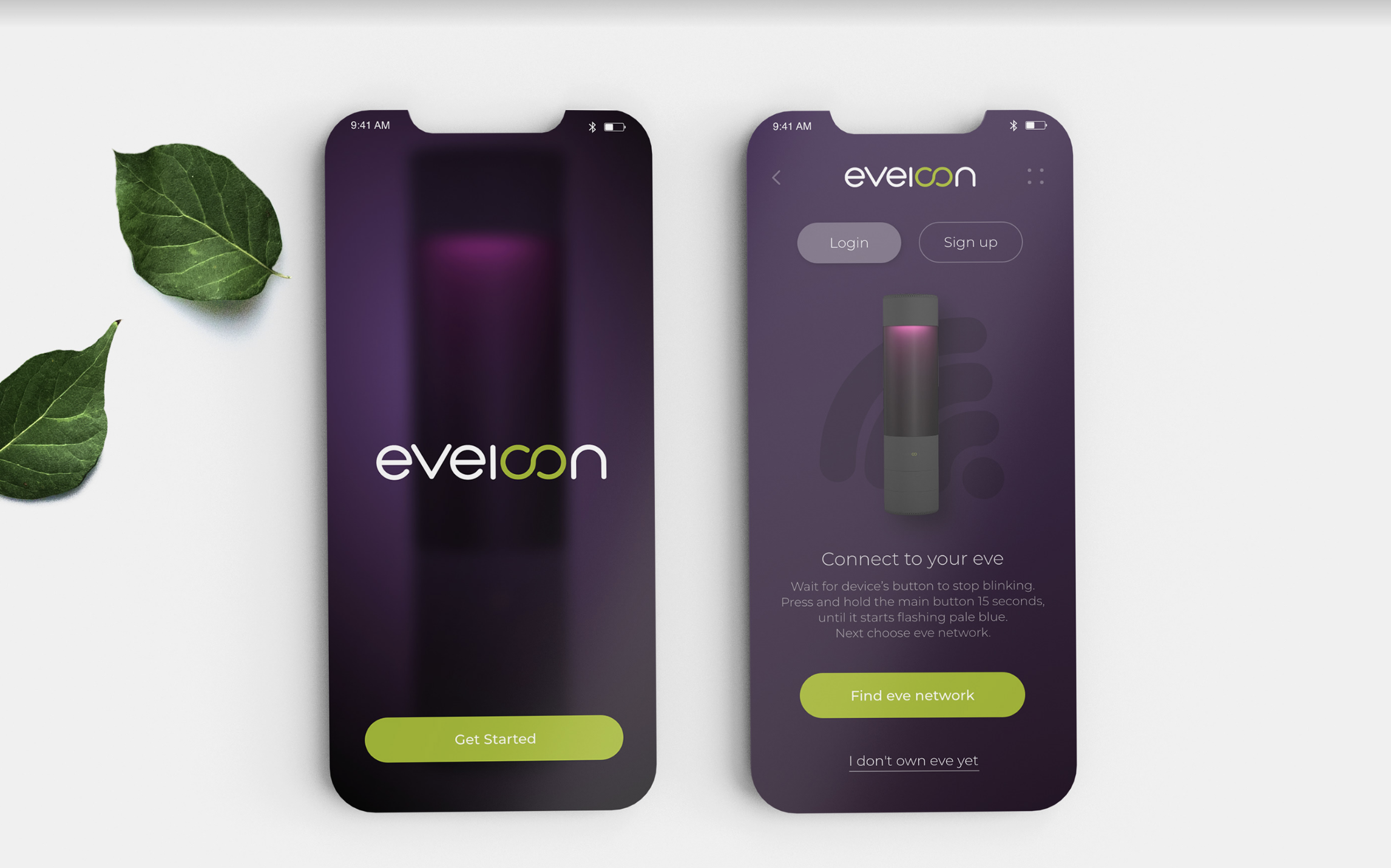
A splash screen, then a single task: connect to your eve. The pairing steps are written out in plain language right below an illustration of the device, so you can follow along with the hardware in your hand. People who don't own a device yet get a way out ("I don't own eve yet") instead of a dead end.
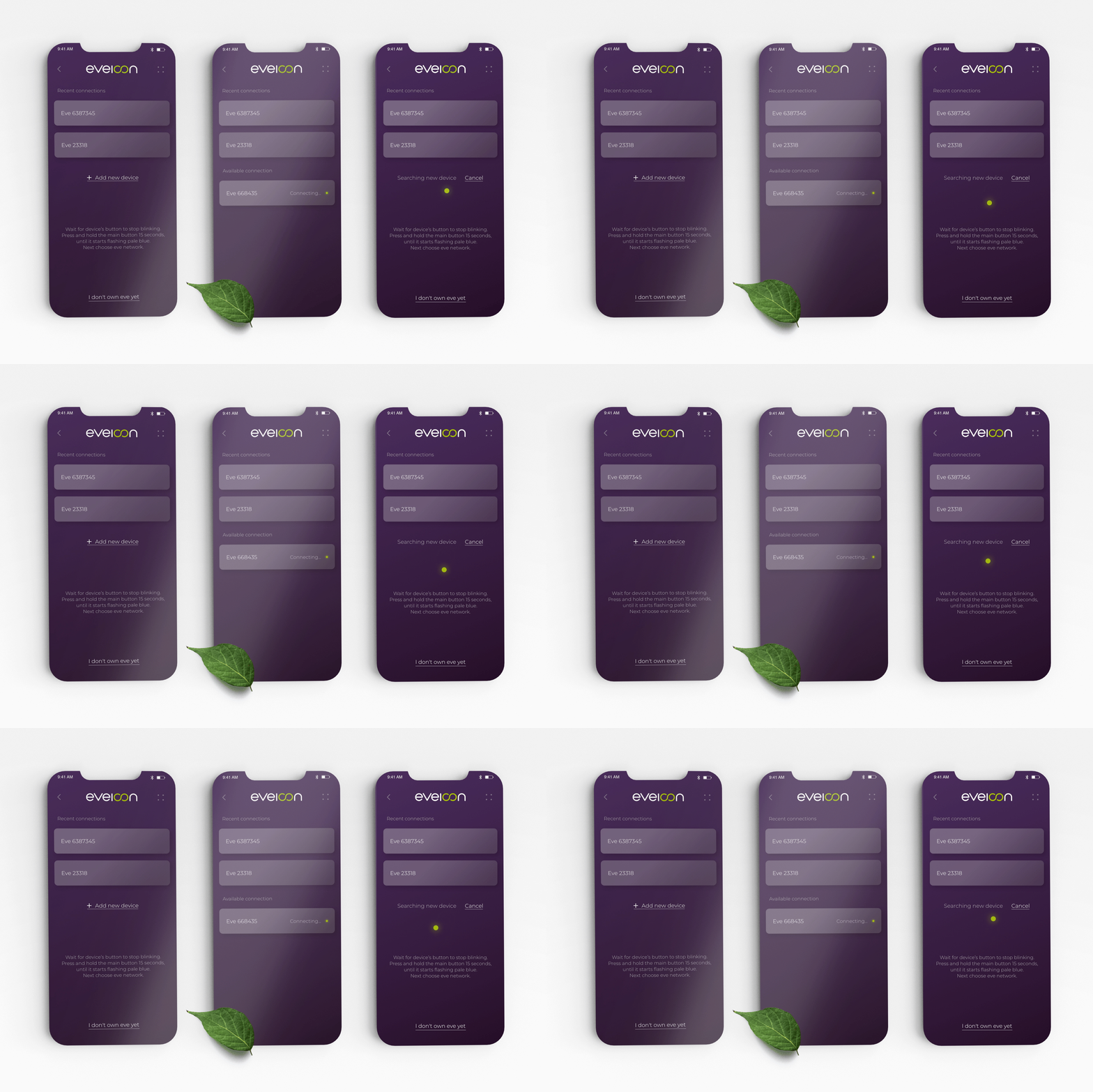
Pairing. Recent devices come first, then search, then connect. Every step shows its status.
Pick the plant, and the device handles the rest.
Once connected, the app switches to a bright, light interface. Programs are grouped into categories people already understand (vegetables, fresh herbs, flowers, tissue culture), each with a simple line icon. Inside a category, plants appear as photo cards with Recommended, Top, and Favorites tabs, so you pick a plant by how it looks, not by reading settings.
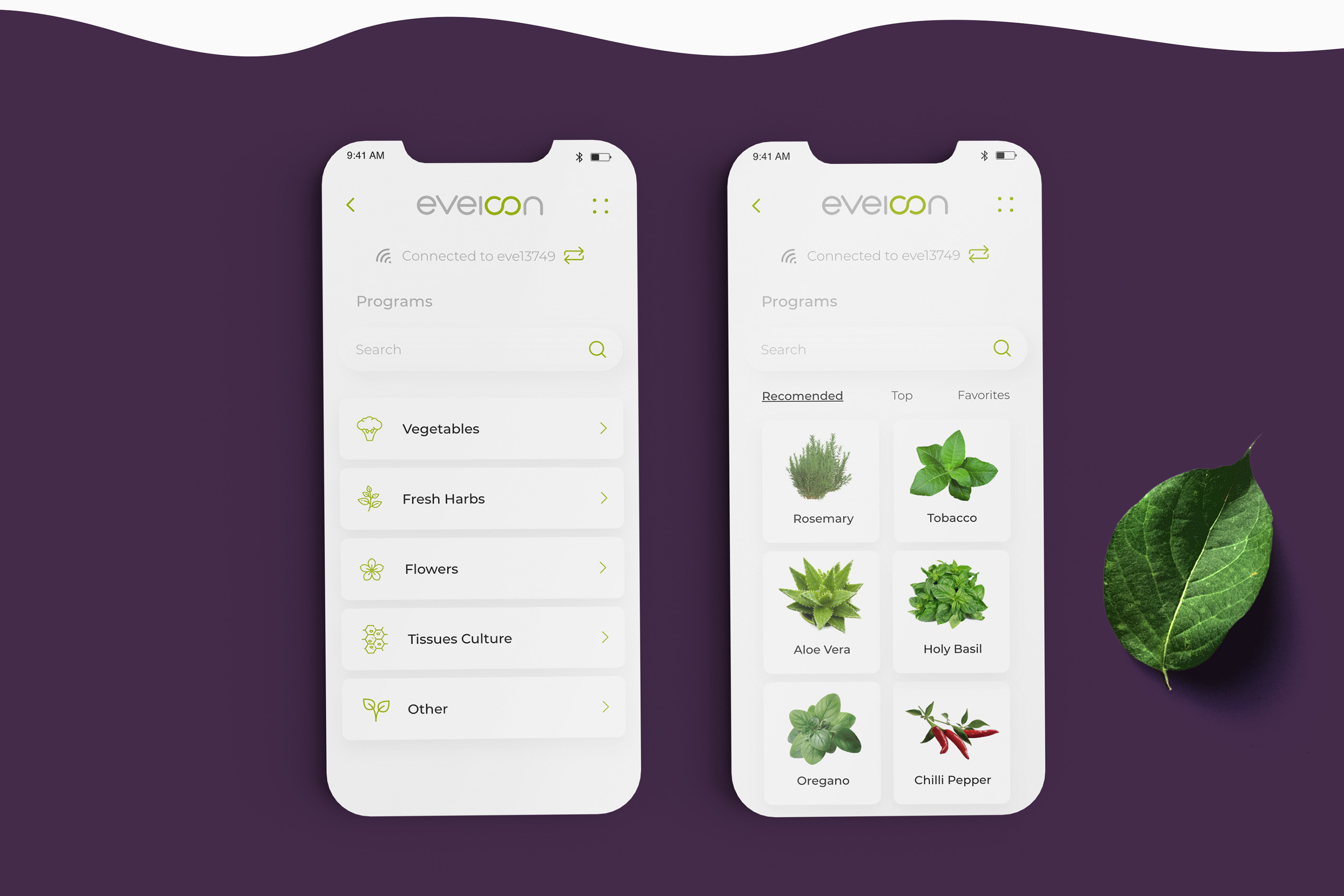
Categories, then plants. The connected device always shows at the top.
A dashboard built around time.
Each plant has a detail page (its botanical profile and care notes) before you commit with "Select the program." After that, the main screen centers on a large dial showing the current week. Underneath, a growth curve marks the stage you're in, from Vegetative to Flowering. Water level, humidity, and temperature sit at the bottom as three numbers you can scan quickly.
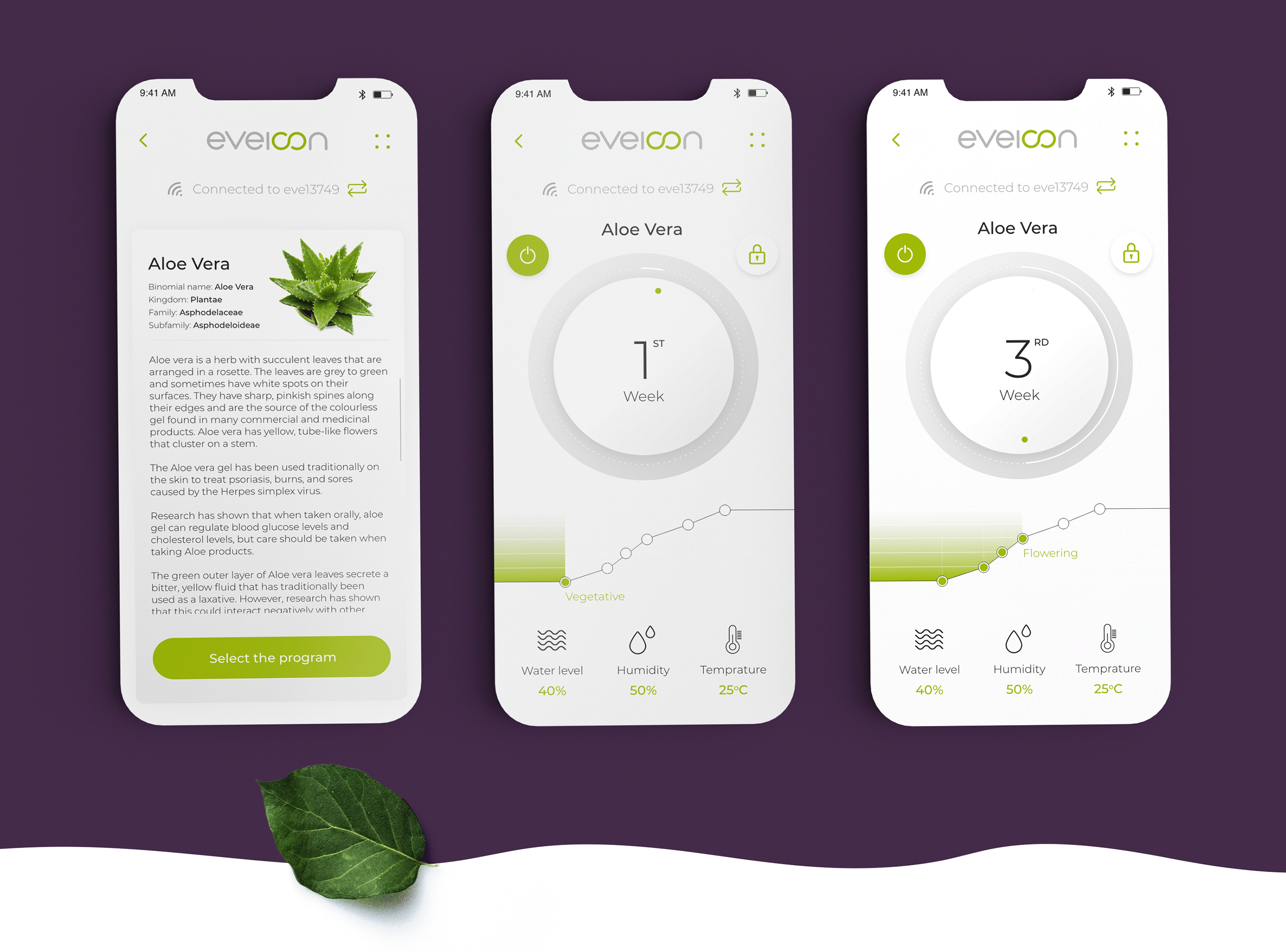
Plant profile, then week 1 and week 3. The dial and the curve both move as the plant grows.
Time as the main number
The week counter is the biggest element on the screen. It tells you where you are in the program in one glance.
Stages you can see
The growth curve fills with green as the plant moves from one stage to the next, so progress is visible.
Three readings, no clutter
Only the readings people care about (water, humidity, temperature) are shown. Everything else stays in the background.
Simple controls
A power button and a lock sit next to the dial, so you can pause the device or lock the program without leaving the screen.
Deep purple to set up, bright light to grow.
Setup screens use a deep purple that matches the device's glow. Once the device is connected, the app switches to a light theme with lime green for actions and progress. The color change tells people setup is done and the growing has started.
Designing for something slow.
Most apps are built around quick actions. Here, a plant takes weeks to grow, so the design had to make slow progress feel satisfying. Putting time at the center, with a week counter and a growth curve, gave people a reason to keep checking in.
Want to talk about designing for connected hardware? Happy to walk you through it.
Get in touch →Like what you see?
I'm open to senior product design roles and select freelance projects. Always happy to chat.
Get in touch →