A loyalty program that makes the next level feel worth chasing.
A gamified loyalty experience for a live-casino platform — four tiers, a benefits-and-requirements flow, a level-up celebration, and complete dual theming, designed from a brief as part of a design interview task.
Most loyalty programs are a wall of fine print.
Casino loyalty schemes usually hide the one thing a player actually wants to know: what do I get, and what do I have to do to get the next thing? Tiers, points, and conditions get buried in a help article — so the program quietly stops motivating anyone.
The brief was to redesign a live-casino loyalty page so the value of each level is obvious at a glance, progress feels tangible, and climbing the ladder feels like a game in its own right — not a terms-and-conditions page.
The real job wasn't laying out tiers. It was turning a rewards table into a sense of momentum — making the next level feel close enough to reach for.
UX and UI, working from a written brief.
I took the brief from concept through to a high-fidelity, fully themed design — owning structure, interaction, and visual craft. The header chrome shown is intentionally unbranded; the focus here is the loyalty experience itself.
- Translating the brief into an information hierarchy — current level, progress to next, and the full ladder, in priority order.
- Designing the two-state card system that flips between benefits and requirements, so one card answers both player questions.
- Building the gamification layer — tier mascots, achieved/in-progress/locked states, a step tracker, and a level-up moment.
- Delivering the full thing twice over — a dark casino theme and a light theme — plus a responsive mobile pattern.
Four tiers, one legible language.
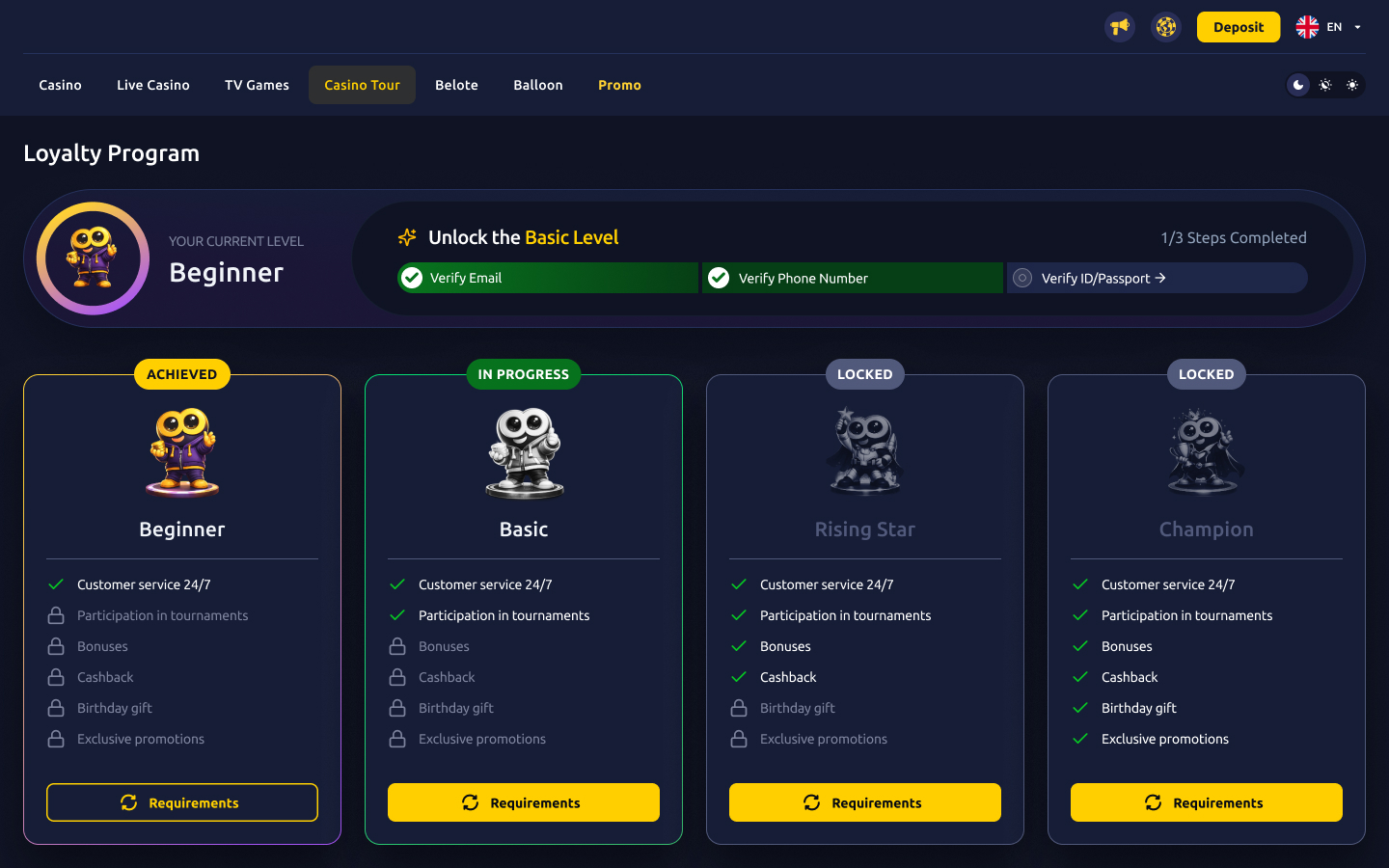
Everything hangs off a single card. Each of the four levels — Beginner, Basic, Rising Star, Champion — is a character with a clear status, a checklist, and one primary action. The state does the talking before any text is read.
Status at a glance
A colored mascot and an Achieved / In Progress / Locked badge tell you where you stand before you read a word. Locked tiers desaturate to grayscale — earned ones come alive in full color.
Progress you can feel
A persistent header tracks the steps to the next level — “1 of 3 completed,” with each requirement turning green as it’s met. The goal is always one short list away.
Two answers, one card
Every card flips between the benefits it unlocks and the requirements to reach it — so “what do I get?” and “what must I do?” live in the same place.
A reward for arriving
Hitting a new level triggers a celebration modal with the tier’s mascot — closing the loop and pointing straight to the freshly unlocked benefits.
Benefits on one side, requirements on the other.
The central interaction is a single toggle. A card shows the perks a level grants — customer service, tournaments, bonuses, cashback, birthday gift, exclusive promotions — with locked perks dimmed. Tap Requirements and the same card flips to show exactly what it takes to unlock it, with the in-progress step highlighted.
This keeps the player oriented: they never leave the card or the page to understand the deal. One surface answers both halves of the question.
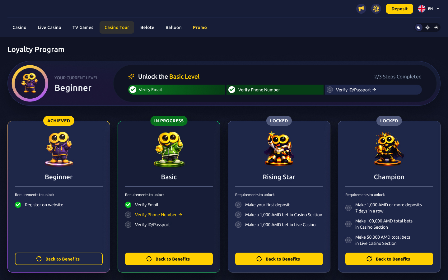
The same four cards, flipped. The header step-tracker stays put so progress is always in view.
The same system, in two moods.
The design ships in two complete themes. The dark theme leans into the casino atmosphere — deep navy, gold accents, glow on the active tier. The light theme keeps the exact same structure but reads calmer and brighter, with a violet accent. Both were built to one token set, so spacing, hierarchy, and states stay identical across the switch.
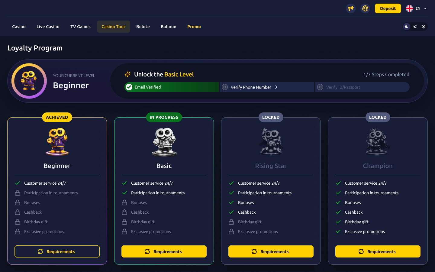
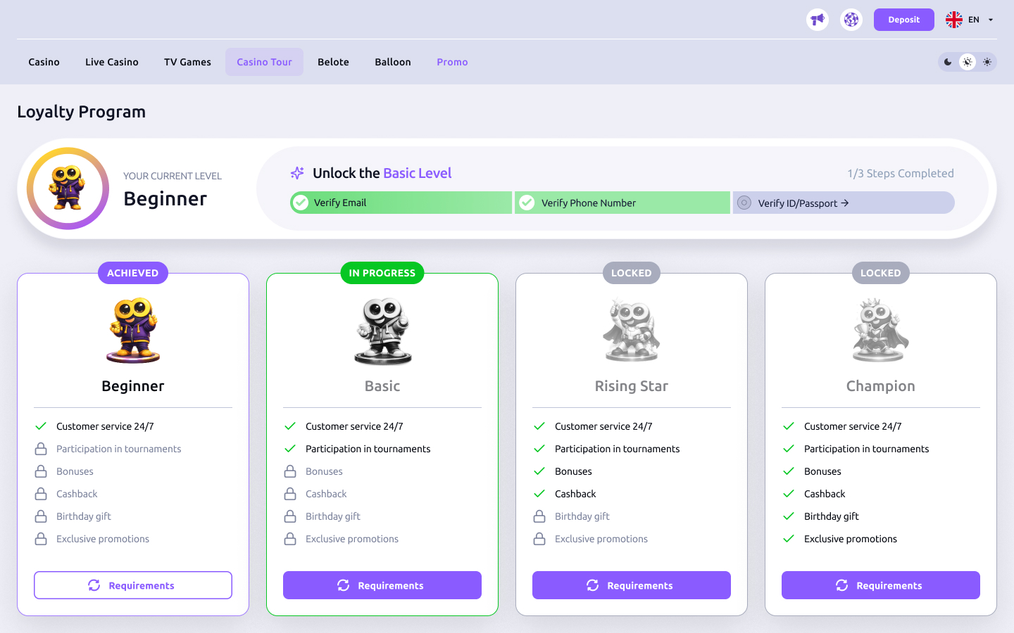
One layout, one token set — re-skinned, not redrawn.
Levelling up should feel like something.
When a player meets a tier’s requirements, the page rewards the moment instead of silently updating a number. A celebration modal brings the new tier’s mascot front and center, confirms the upgrade, and offers a single clear next step — go see what just unlocked.
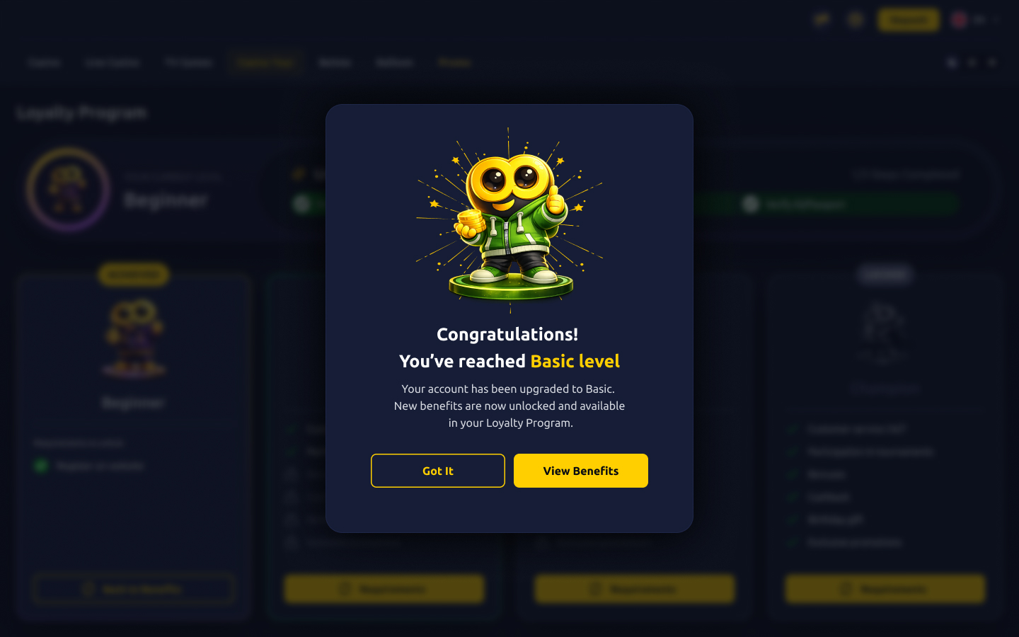
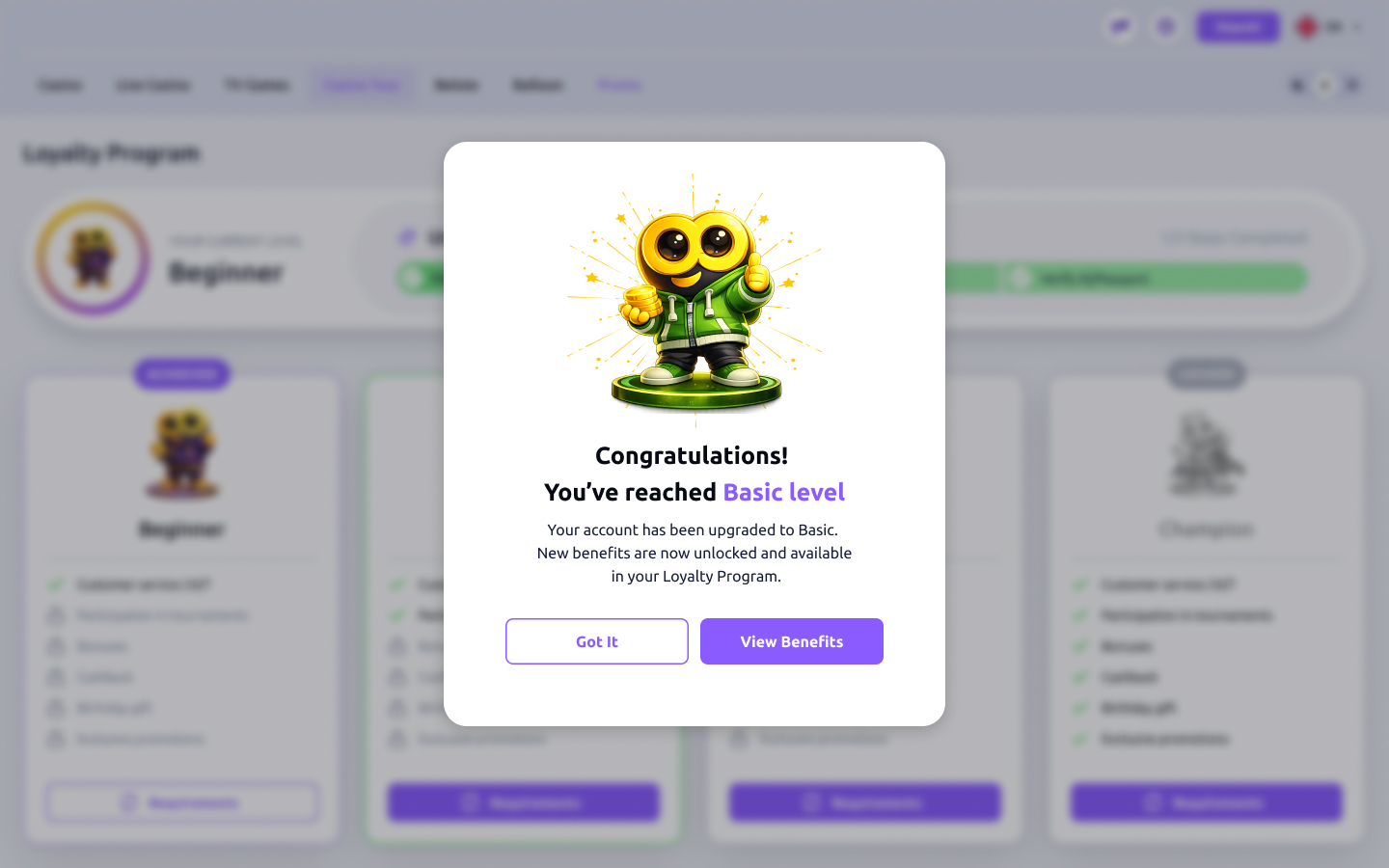
The loop closes here — the modal points straight back to the benefits the player just earned.
On mobile, one level at a time.
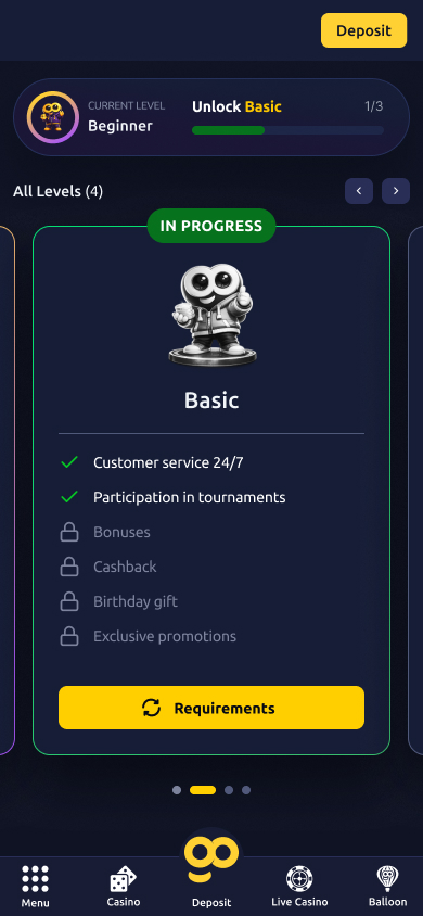
The four-up desktop grid doesn’t survive a phone screen — so on mobile the ladder becomes a swipeable carousel. Each tier gets the full width, the header collapses to a compact progress bar, and a bottom nav keeps the rest of the platform a thumb away. Same states, same language, sized for one hand.
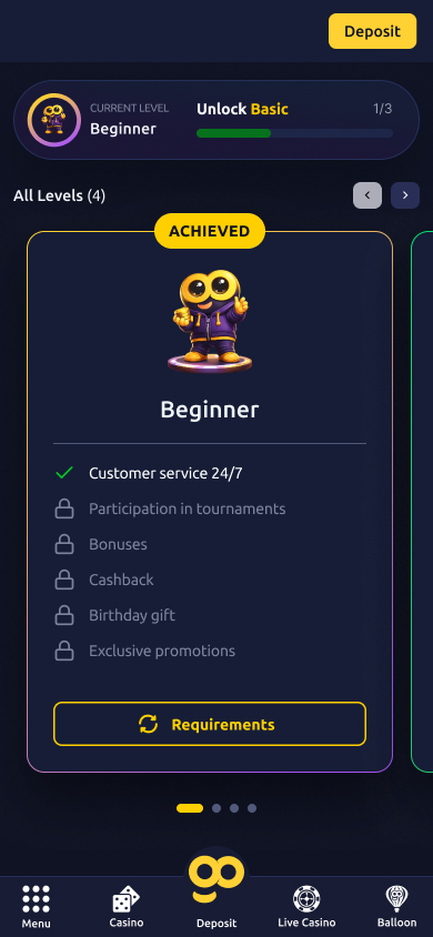
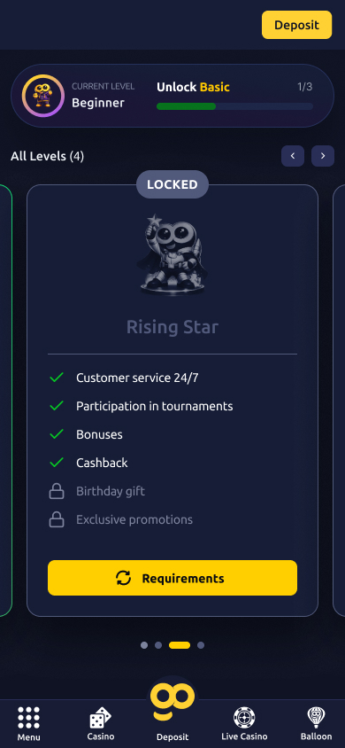
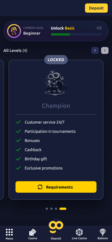
Dark theme · the level carousel from Beginner through Champion.
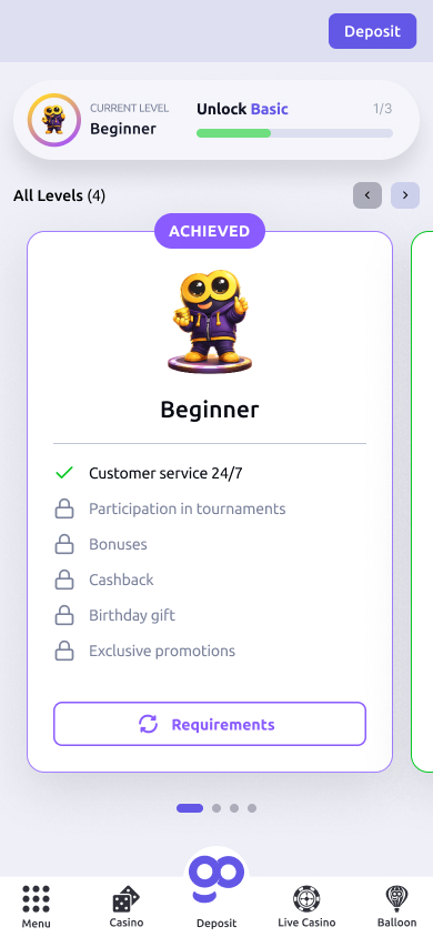
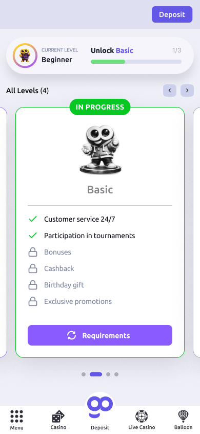
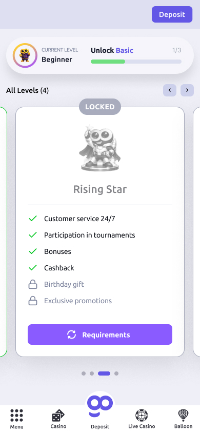
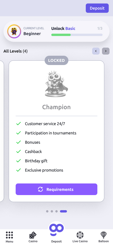
Light theme · the same carousel, re-skinned.
Motivation is a design problem.
The thing I kept coming back to is that a loyalty program isn’t an information display — it’s a motivation engine. The numbers and conditions matter, but only after the player believes the next level is reachable and worth it. Every decision here — the mascots, the step tracker, the flip, the celebration — exists to keep that belief alive.
Designing it twice, in two themes, was also a useful constraint. Committing early to one token set and one layout meant the dark and light versions never drifted — the system stayed honest because it had to work both ways.
Want to talk through any of these decisions, or see how I’d approach a gamified flow for your product? Happy to walk through it.
Get in touch →Like what you see?
I'm open to senior product design roles and select freelance engagements. Always happy to chat.
Get in touch →