Bringing Graphic Maker into the Renderforest family.
A full redesign of Renderforest's in-browser design editor — every panel, a new color picker, a new Layers system, and a custom in-product onboarding flow with its own illustration set — aligning the tool with the rest of the Renderforest suite.
A tool that had grown up separately from the rest of the platform.
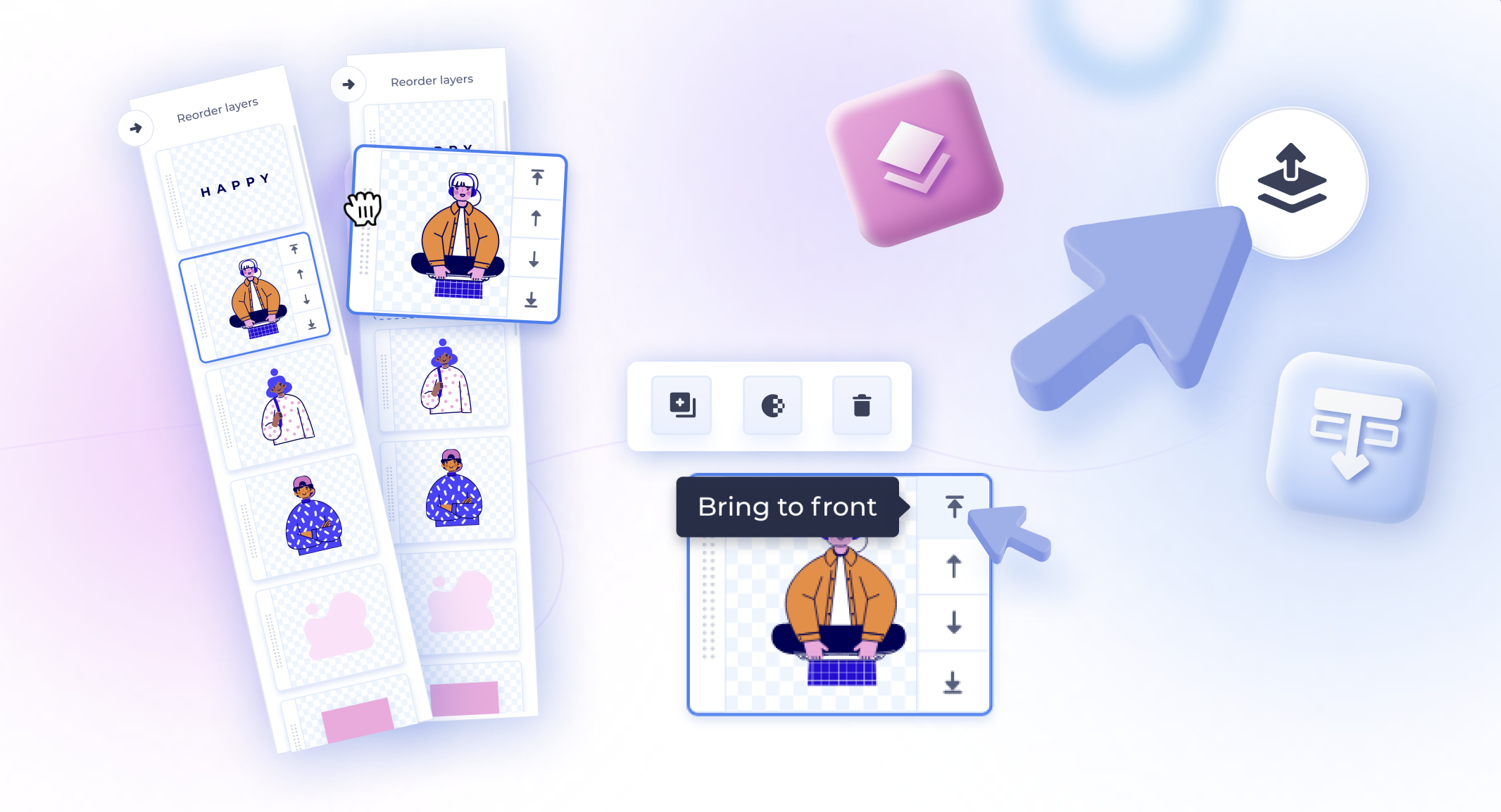
By 2022 Renderforest's suite had matured — the Website Builder and other tools had moved on to a cleaner, more modern visual language. Graphic Maker, the in-browser editor for social graphics, thumbnails, and marketing visuals, hadn't kept pace. It still worked, but it looked and felt like an earlier era of the product, and it was missing a layers system — by 2022 a baseline expectation for anyone who had touched a serious design editor.
The brief: bring Graphic Maker into the same family as the rest of Renderforest's tools, modernize the editor end-to-end, and close the gap with what users had come to expect from professional design software.
Lead designer on the full redesign.
I owned the redesign end-to-end, working directly with the PM. Every surface visible in the screenshots on this page was designed for this project:
- Editor chrome — top bar, canvas frame, left toolbar, contextual controls.
- All content panels — Text, Colors, Elements, Icons, Images, Designs.
- The color picker — element colors, default palette, recent, suggested, and a custom HEX/picker.
- The new Layers panel — drag-to-reorder, depth controls, lock, visibility.
- Format-aware size presets — Instagram post, story, YouTube thumbnail, and more.
- The on-brand onboarding — custom modal component and a custom set of soft-3D illustrations, designed from scratch.
The work drew on usability and customer feedback collected by the marketing team and a structured competitive look at the leading editors (Canva, Figma, Adobe Express).
Every surface, redesigned.
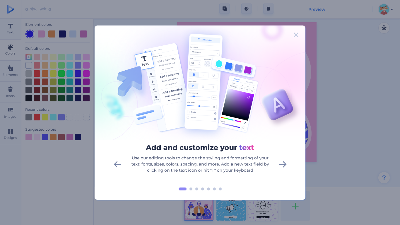
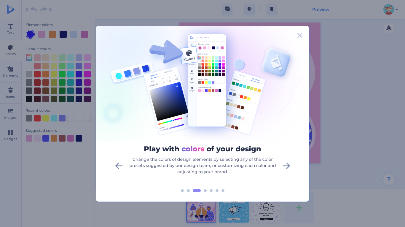
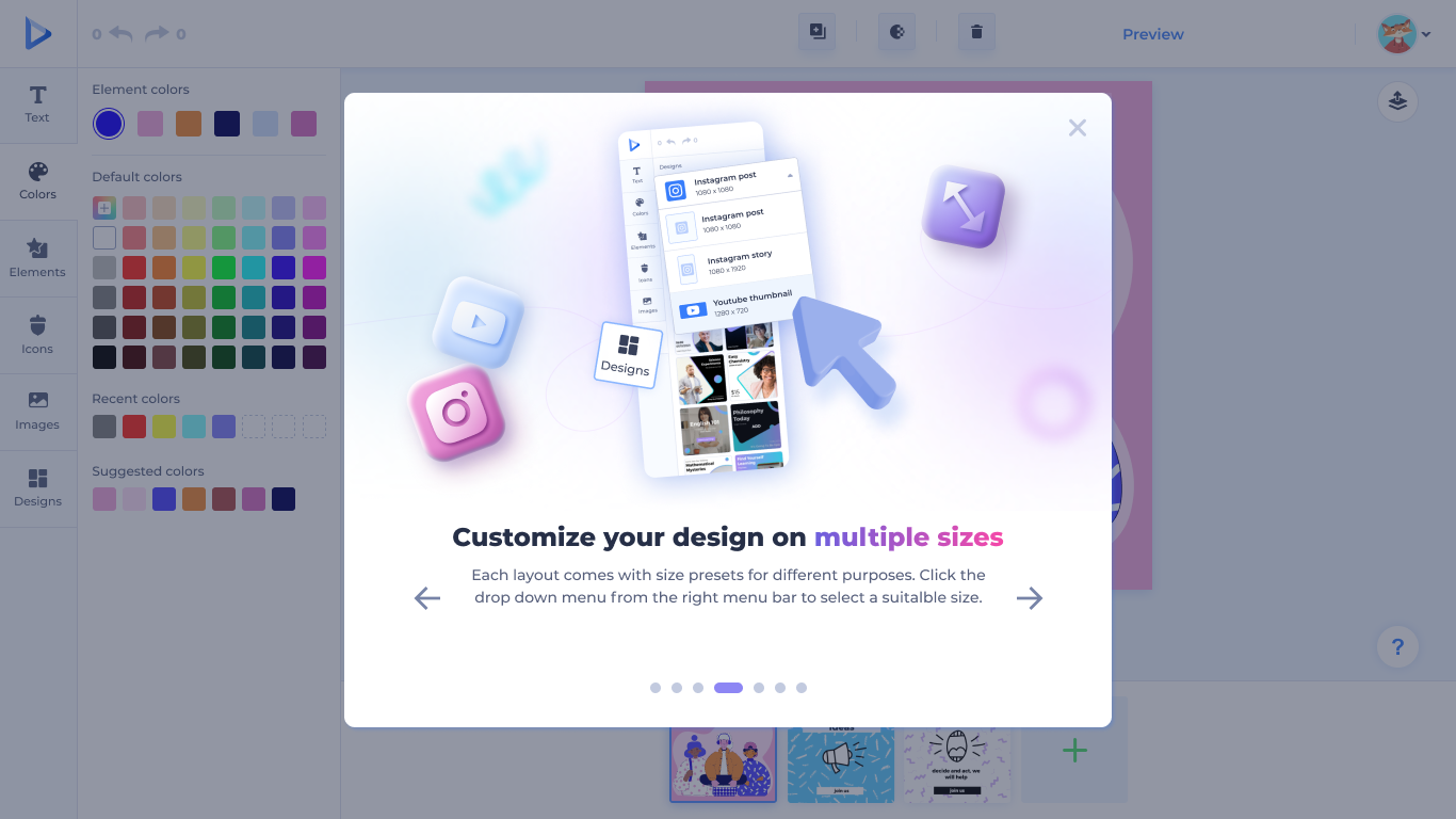
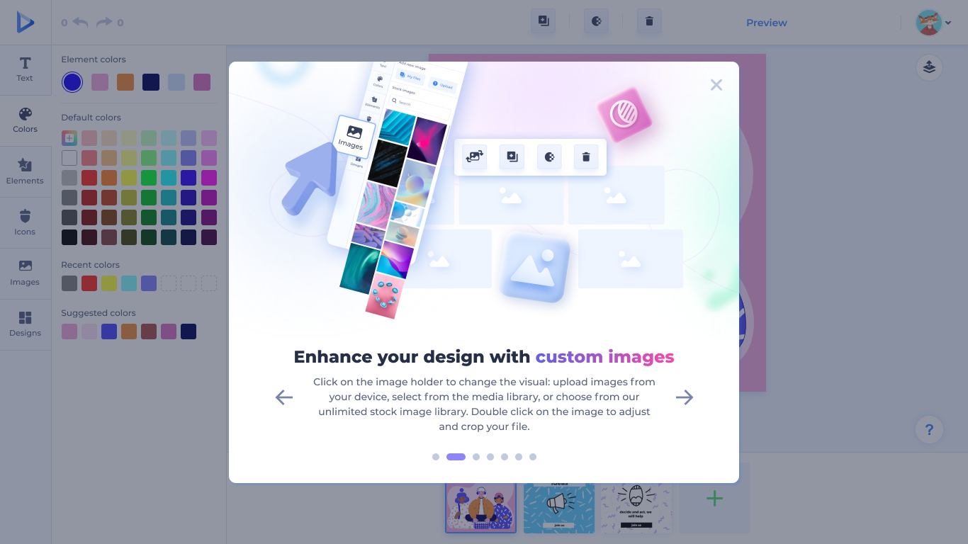
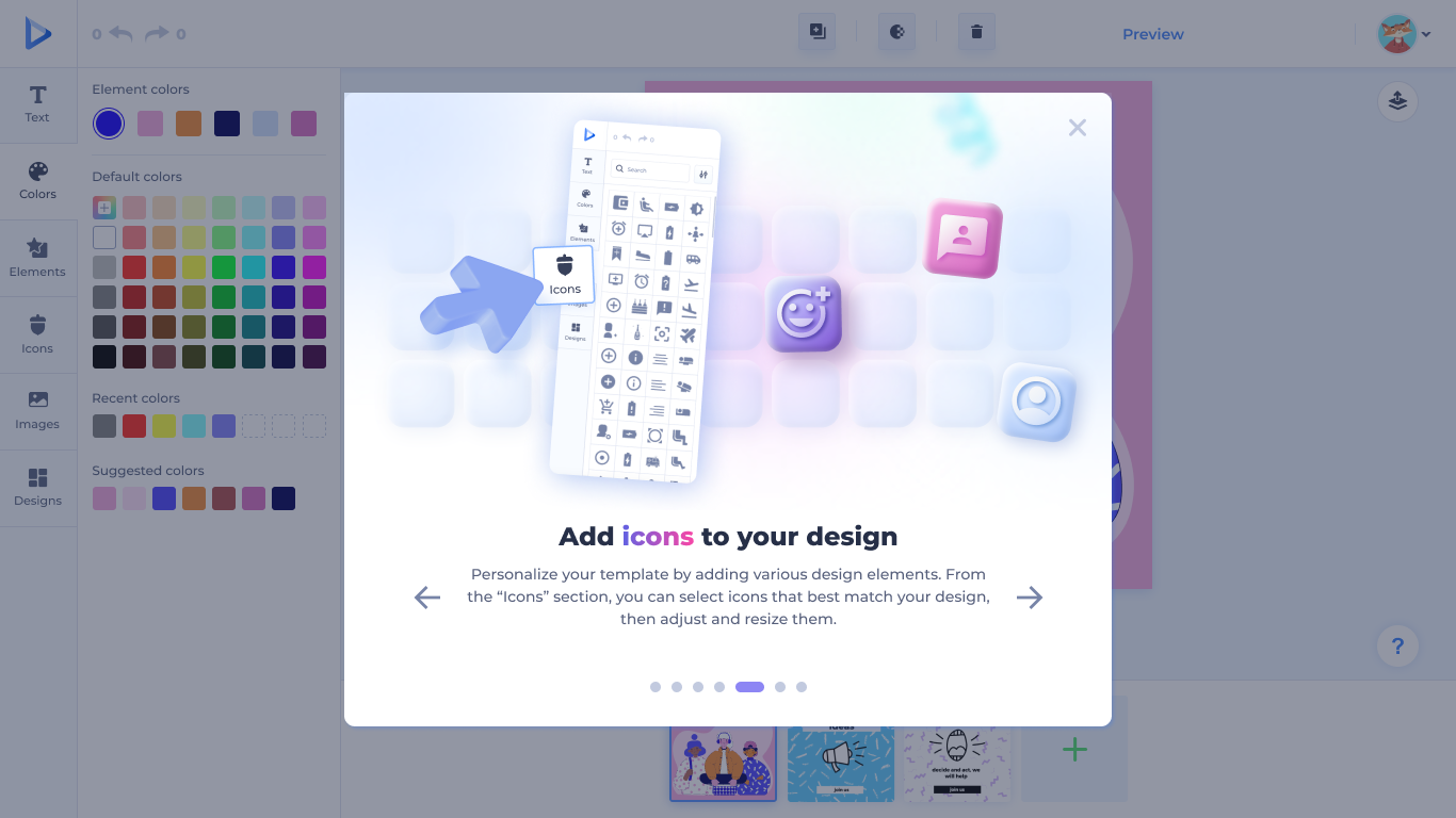
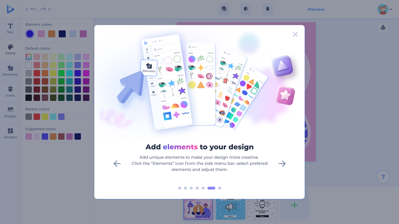
Each onboarding screen introduces a single panel — Text, Colors, Sizes, Images, Icons, Elements — with the same custom 3D illustration system. Once a user learns one panel, they've learned them all.
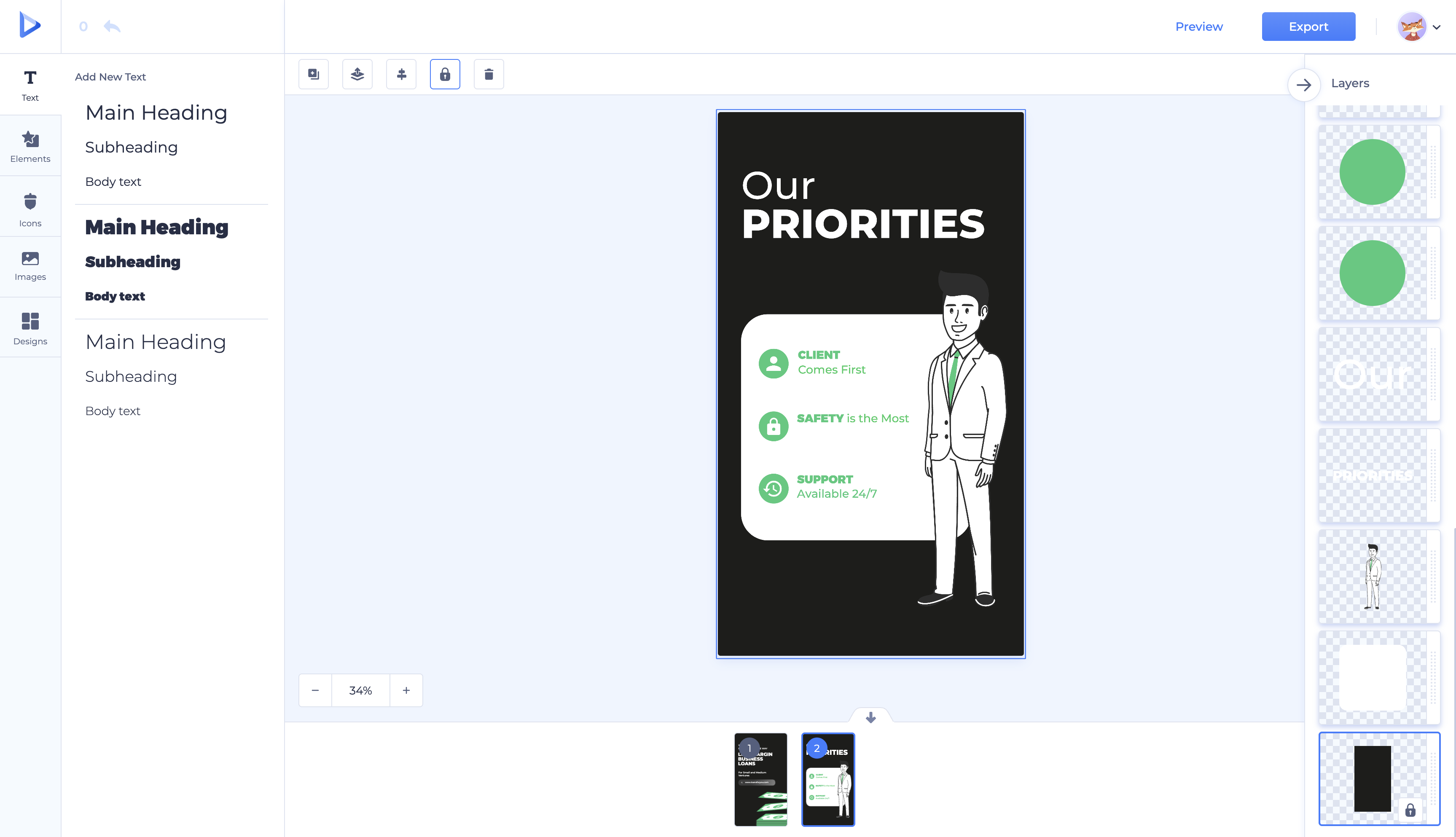
The redesigned editor in real product use — Text panel on the left, canvas in the middle, and the new Layers panel on the right.
A native dark mode, not an inverted skin.
The redesigned editor was designed for dark mode from the start — every surface, panel, picker, and modal has a parallel dark treatment with its own contrast, depth, and color logic. The custom 3D illustrations in the onboarding tour were re-rendered for the dark palette so the brand reads consistently across both modes.
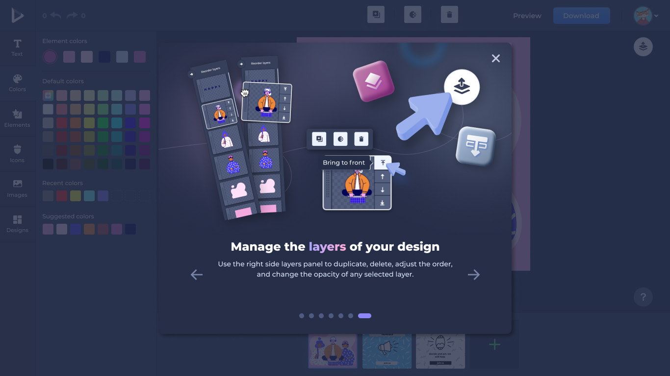
The Layers onboarding step — a custom on-brand modal with its own 3D illustration introducing the new feature.
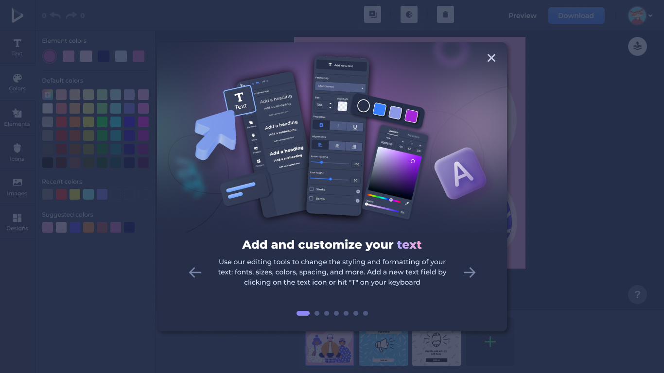
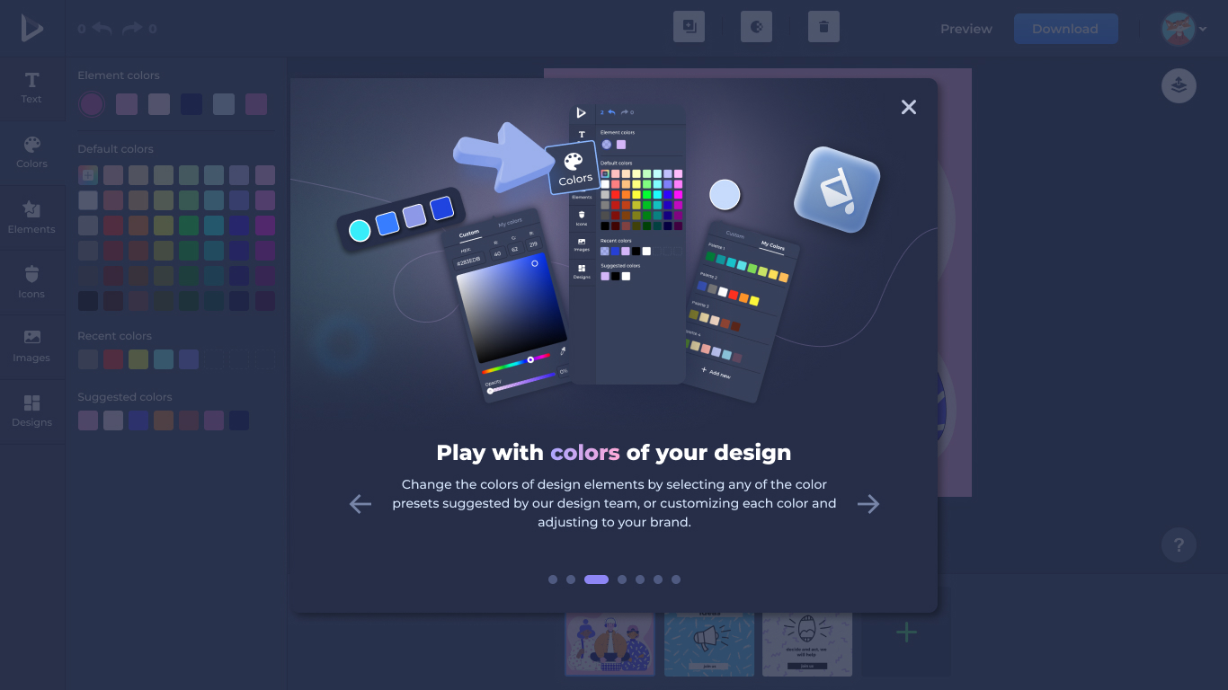
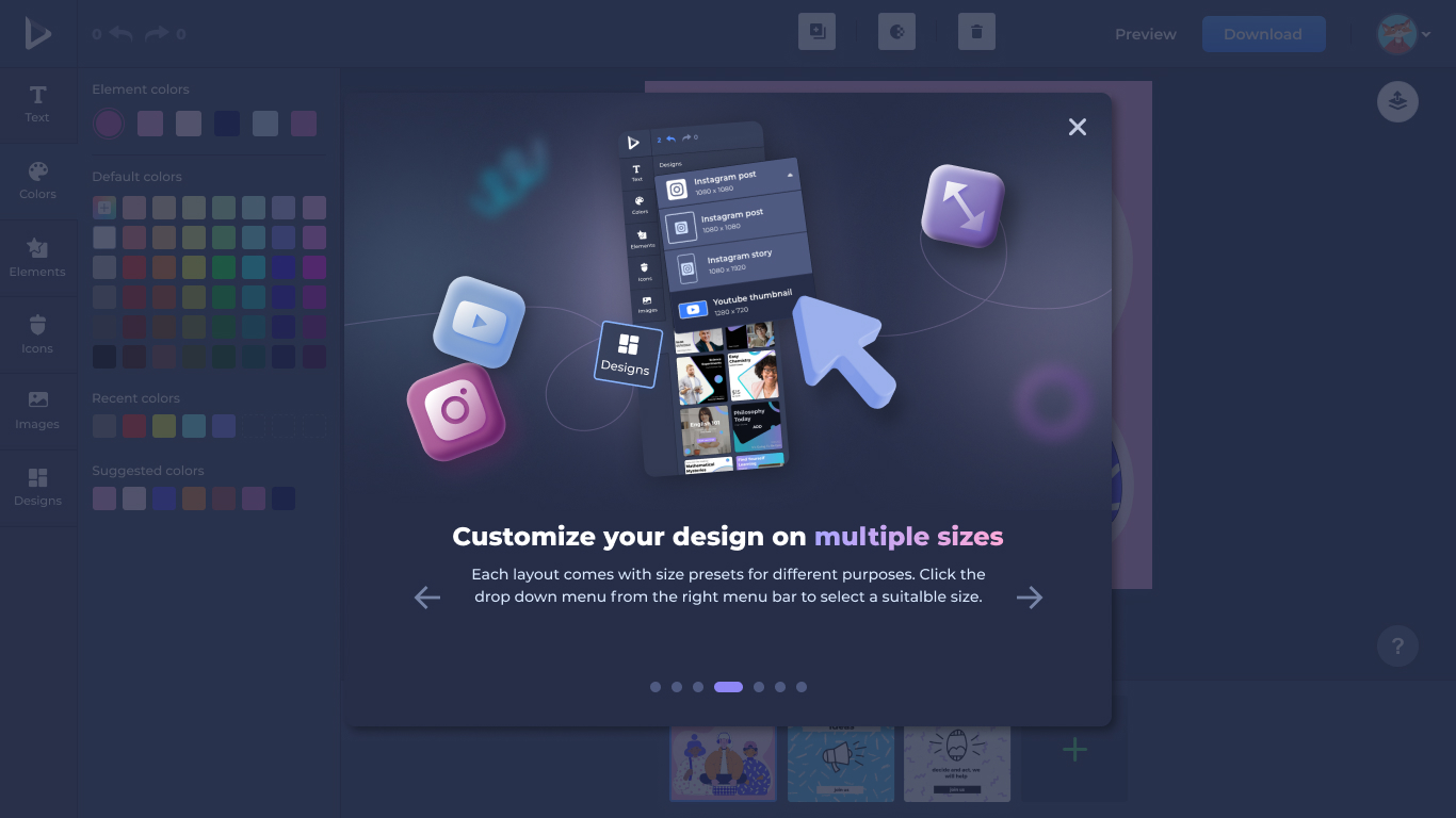
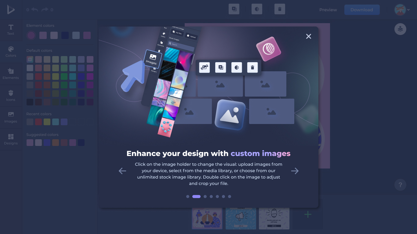
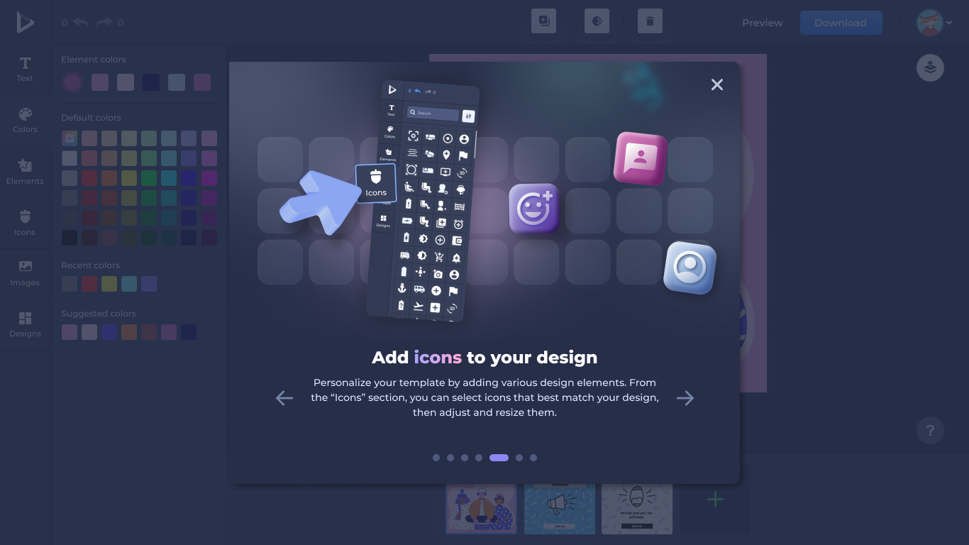
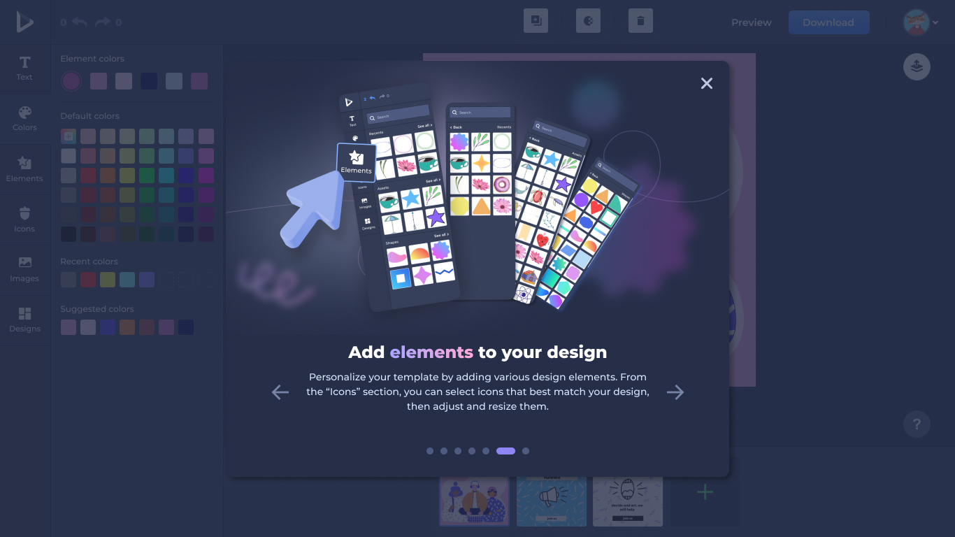
Every panel and every onboarding step has a parallel dark-mode treatment with its own contrast, depth, and color logic.
The little surfaces that make the editor feel finished.
Beyond the headline surfaces, the redesign included the small, often-overlooked screens that make a tool feel complete: loading states, primary action buttons, and the help affordance — each designed in both light and dark.
Designs loading state
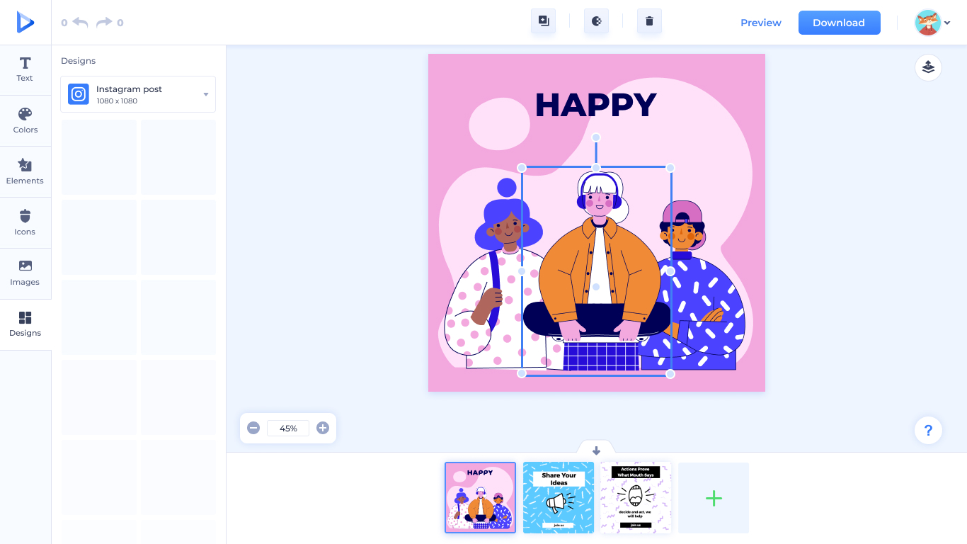
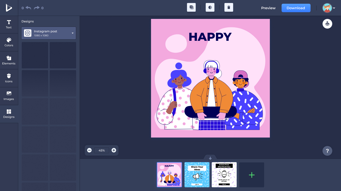
The Designs panel's loading state — skeletons that match the layout of the templates that will arrive, in both modes.
Download & preview button states
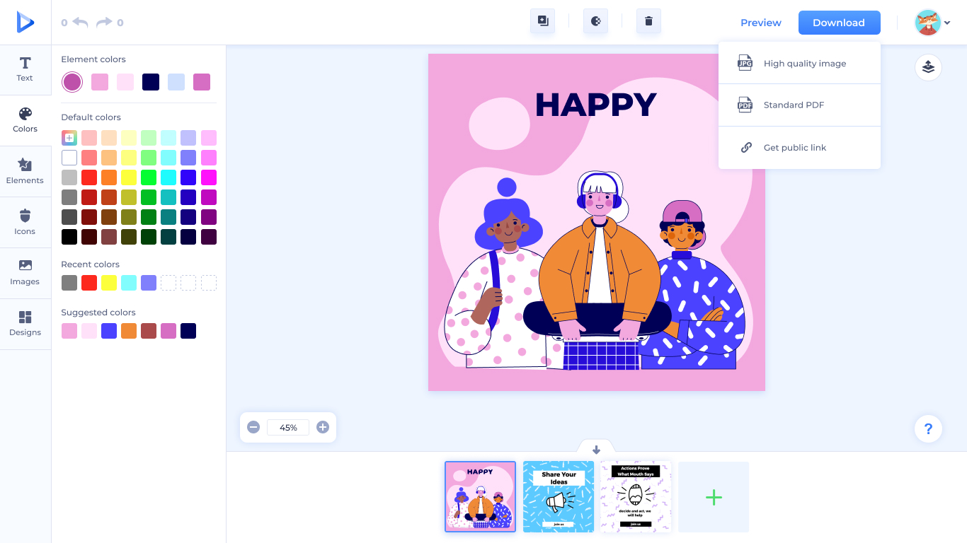
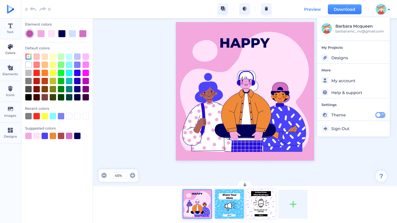
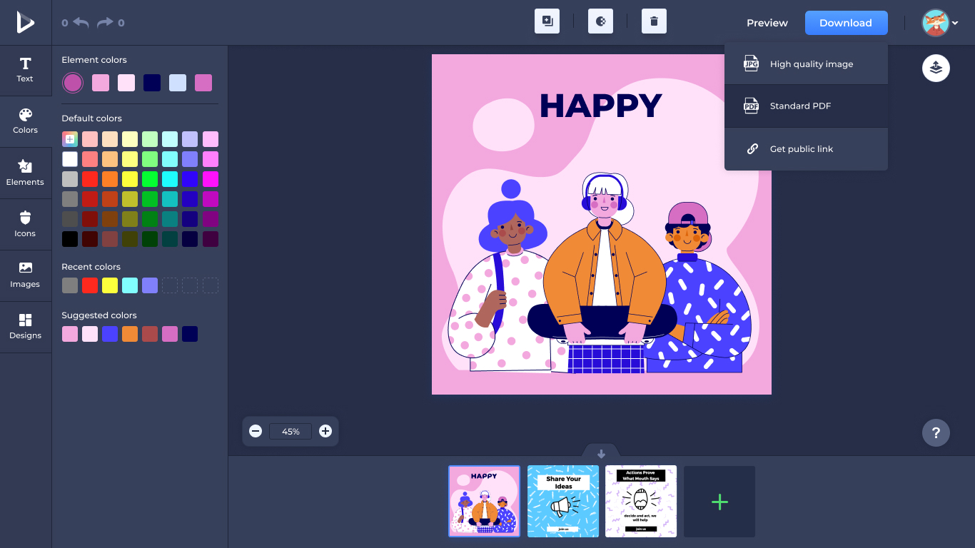
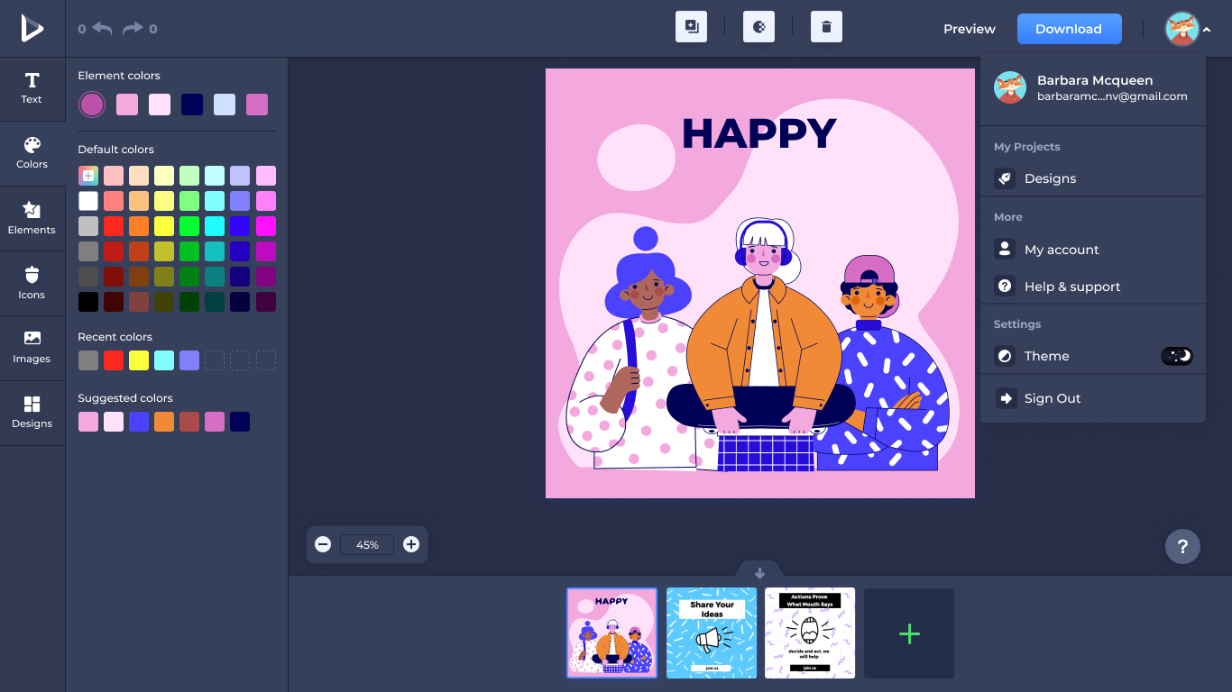
The download and preview action — designed across its full interaction sequence.
Help & question button
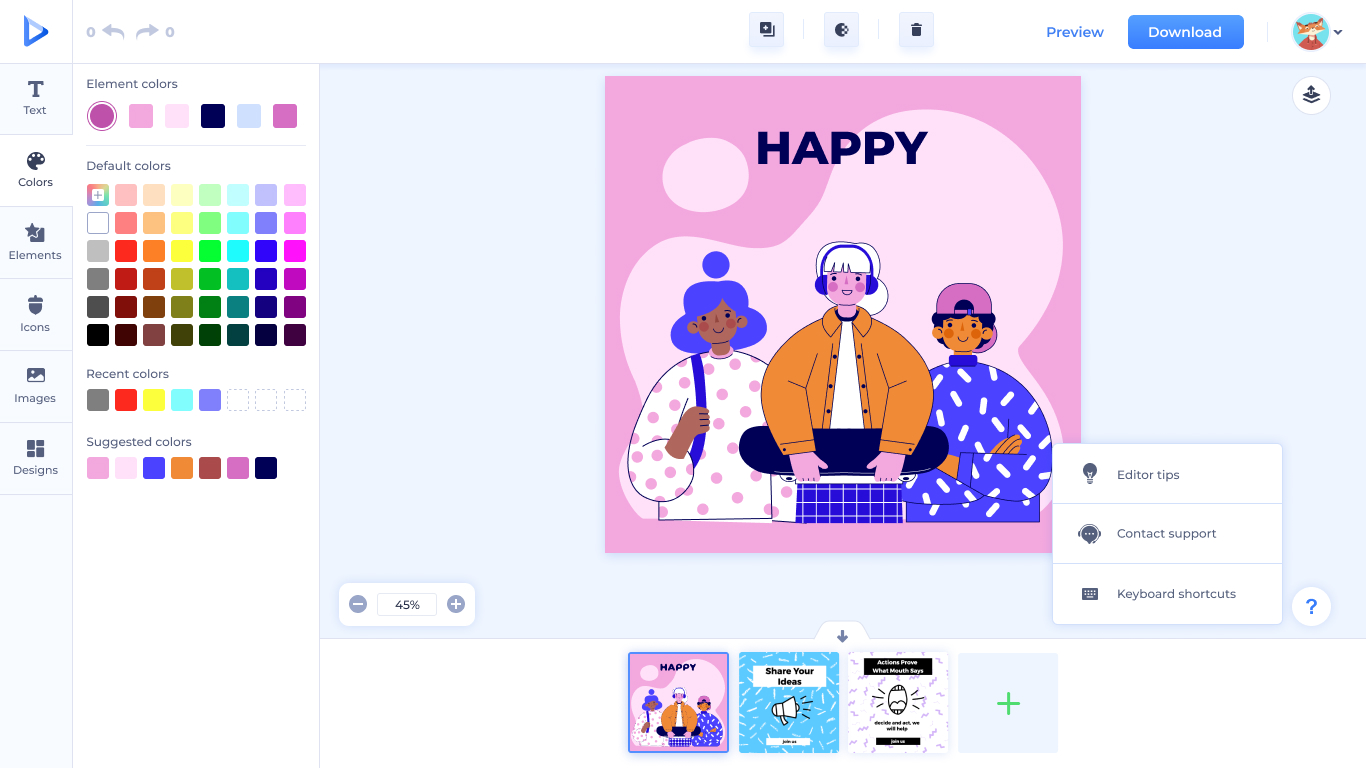
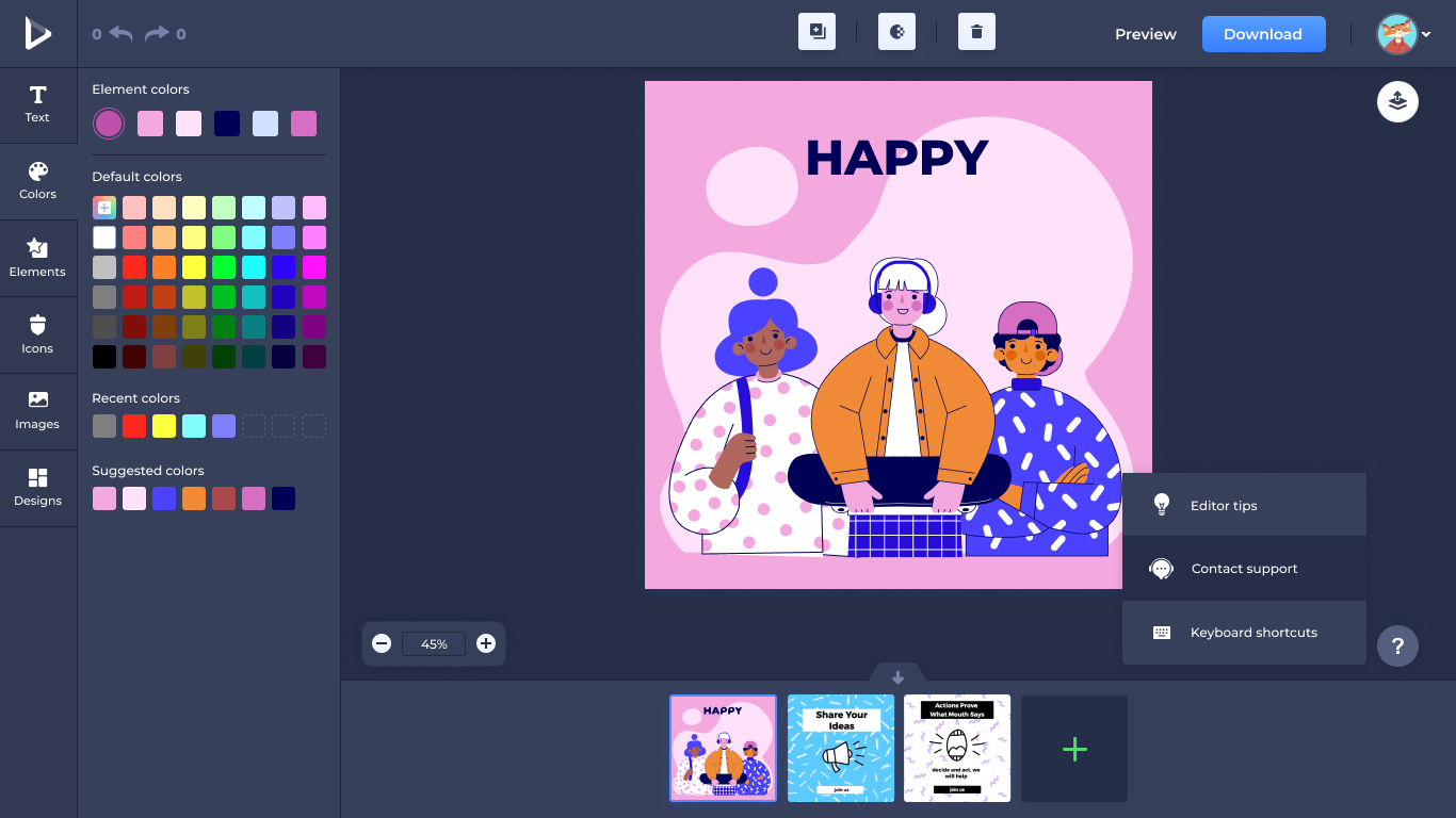
The help affordance in both modes — a small, persistent touchpoint that never gets in the way.
The editor on a phone, without losing what makes it work.
Mobile required rethinking the left toolbar's dominance and finding the right place for the layers, color, and content panels at thumb-reach. The composition keeps the canvas central and surfaces editing tools from the bottom — the help affordance stays out of the way until it's needed.
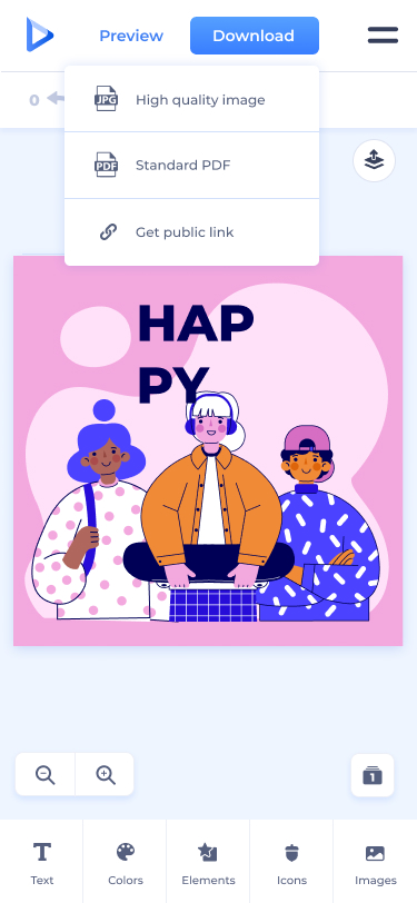
A mobile view of the redesigned editor — the help affordance and toolbar adapted for touch.
Shipped, and brought into the family.
The redesigned Graphic Maker shipped and is the live product today. The new visual system, the reorganized left toolbar, and the Layers feature were all carried into the in-product onboarding experience — the same illustrations on this page are the ones used to introduce new users to the tool.
Beyond the editor itself, the alignment work paid off across the rest of the platform. Customers moving between Renderforest's tools now do so without the visual whiplash they used to encounter on Graphic Maker — a small thing per interaction, a meaningful thing across an entire customer journey.
What I'd take into the next one
The discipline of audit first, align second, add third turned out to be the most useful working pattern from this project — and it's the one I've kept reaching for since. When a product has drifted from the rest of its family, the temptation is to fix it by adding more; the actual answer is almost always to start by removing the drift, and only then ship anything new on top.
Happy to walk through the full file — exploration, decisions I cut, the layers system tradeoffs — in a conversation.
Get in touch →Like what you see?
I'm open to senior product design roles and select freelance engagements. Always happy to chat.
Get in touch →