Three years of UX/UI
on a live signage platform.
Three years as the UI/UX designer for SquareSigns — an online sign-building and signage e-commerce platform serving customers across the US and Canada. I owned design across the full product: the storefront, the in-browser design tool, the templates library, cart and checkout, and the account experience.
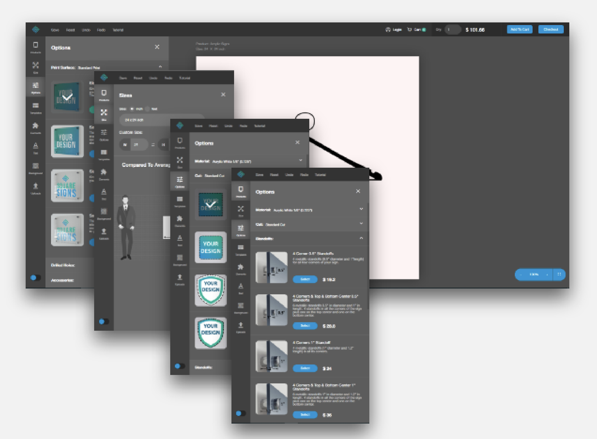
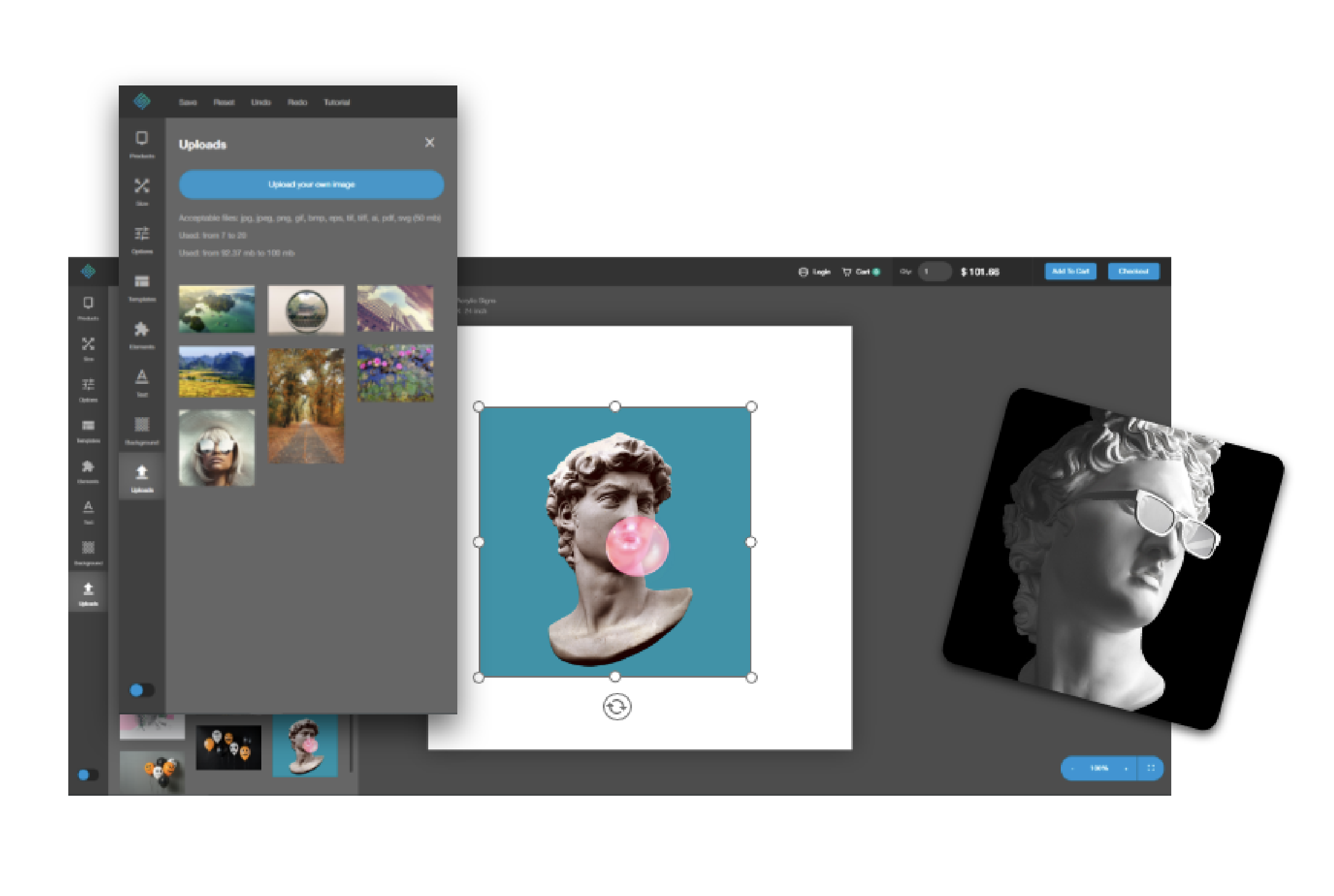
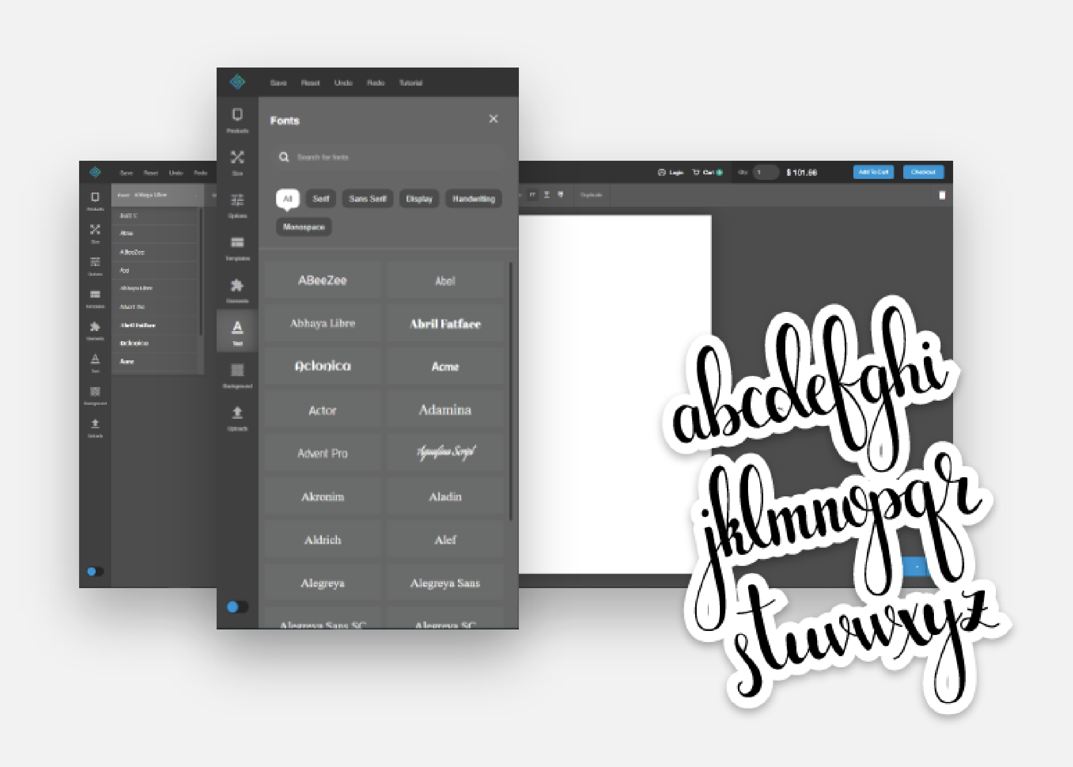
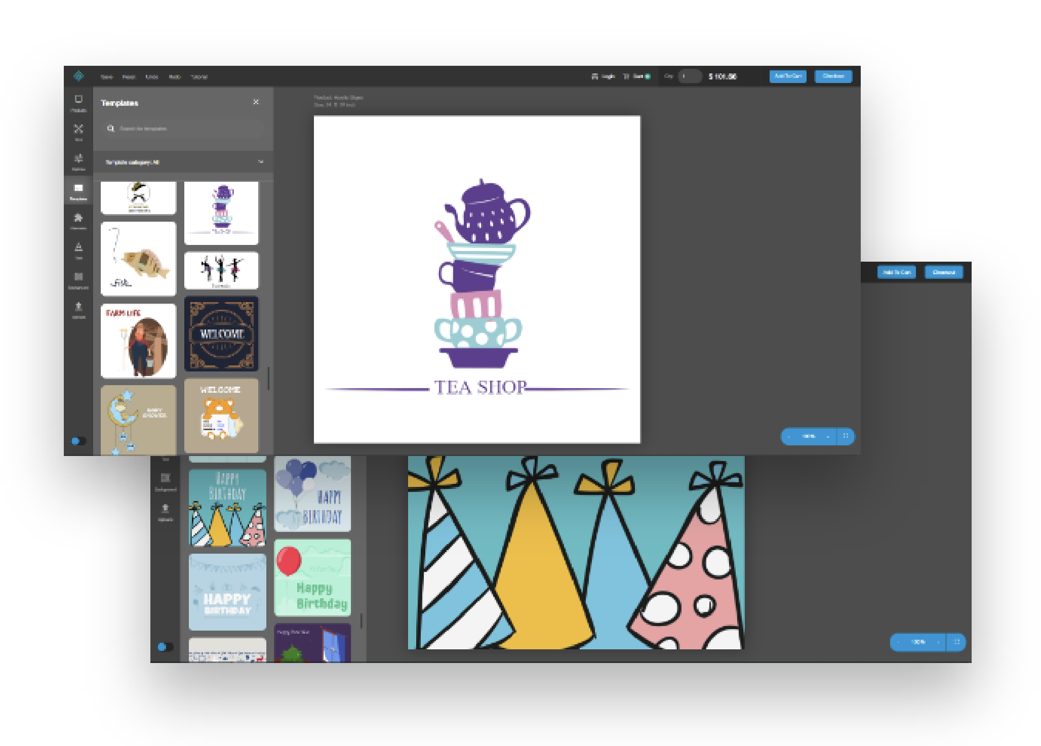
UI/UX across the entire product, for three years.
SquareSigns was a live, in-market product when I joined. For three years I was the designer on it — every product surface, every flow, every refresh that shipped during that period. The screenshots on this page are a representative slice, not the full extent. Day to day, the work moved between e-commerce surfaces, the design tool, the templates library, and the supporting marketing pages, with the same person (me) holding the visual language across all of them.
A sprawling e-commerce + design tool, in one product.
SquareSigns lets customers design and order custom signage online — banners, acrylic signs, decals, retractable banners, yard signs, posters, and dozens more categories. The product has two halves: an e-commerce storefront with the product catalog, cart, checkout, and account, and an in-browser design tool customers use to actually make their sign before they order it.
Both halves are live, both are revenue-critical, and both accumulate the kind of design debt that any product carries after years in market. The job wasn't a redesign — it was sustained, careful improvement.
The designer on the product, across every surface.
I partnered directly with PM and engineering on roadmap and shipped continuously. Across three years, the surfaces I owned included:
- The storefront — homepage, product catalog, category and product pages, supporting marketing surfaces.
- The in-browser design tool — the full editor: left rail, panels (Products, Size, Templates, Stock Images, Elements, Text, Background, Uploads, Settings), canvas chrome, contextual controls, and the dark-mode treatment.
- The templates library — not just the templates browser, but a number of the templates themselves: I designed them so customers had a strong starting point inside the editor.
- Cart and checkout — line-item layout, quantity-based pricing breakdowns, the multi-step checkout flow, order-summary panel.
- My Account — orders, designs, addresses, payment methods, profile, and email notification surfaces.
- 3D visualization — 3D-rendered marketing visuals built in 3ds Max for the homepage product slider, showcasing the in-browser design tool.
I worked across Figma, Adobe XD, Illustrator, Photoshop, and 3ds Max, and partnered with engineering daily on handoff and implementation review.
A product catalog built to scale to dozens of categories.
The homepage and category pages have to do a lot at once: introduce the brand, surface a custom design entry point, show a price band, and let users navigate into 30+ product categories without feeling overwhelmed. The hero composition, the size and rhythm of the product grid cards, the supporting illustrated explainer rows beneath — each one tuned across the three years rather than set once.
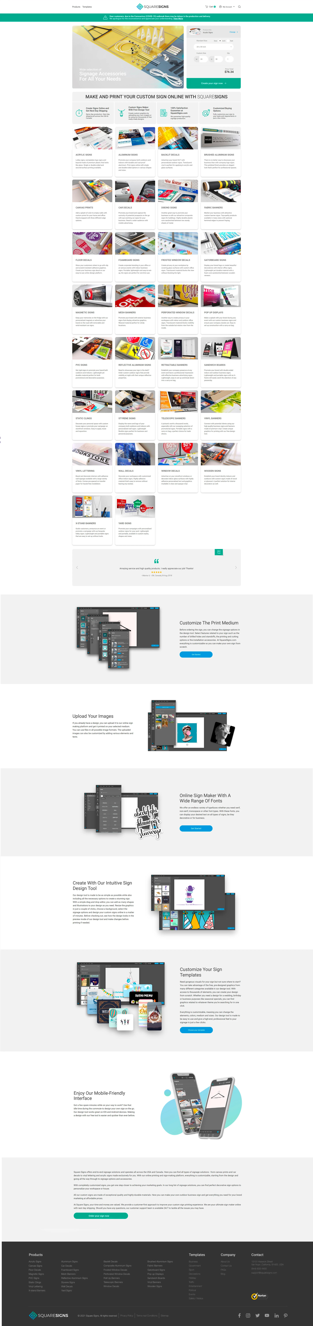
The SquareSigns homepage — hero, custom-sign entry point, and the full product catalog grid in one scroll.
The product I shipped against, every day for three years.
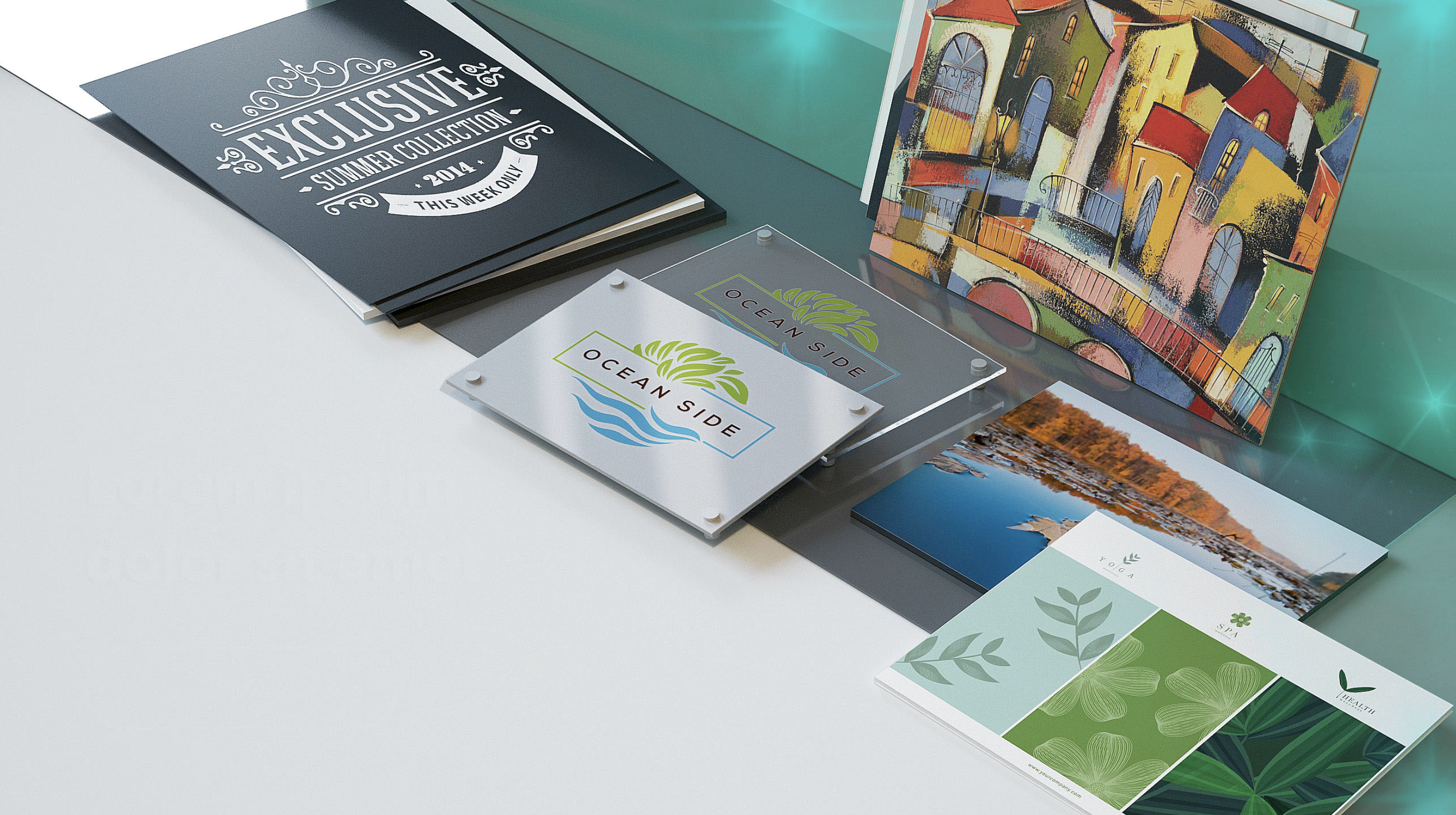
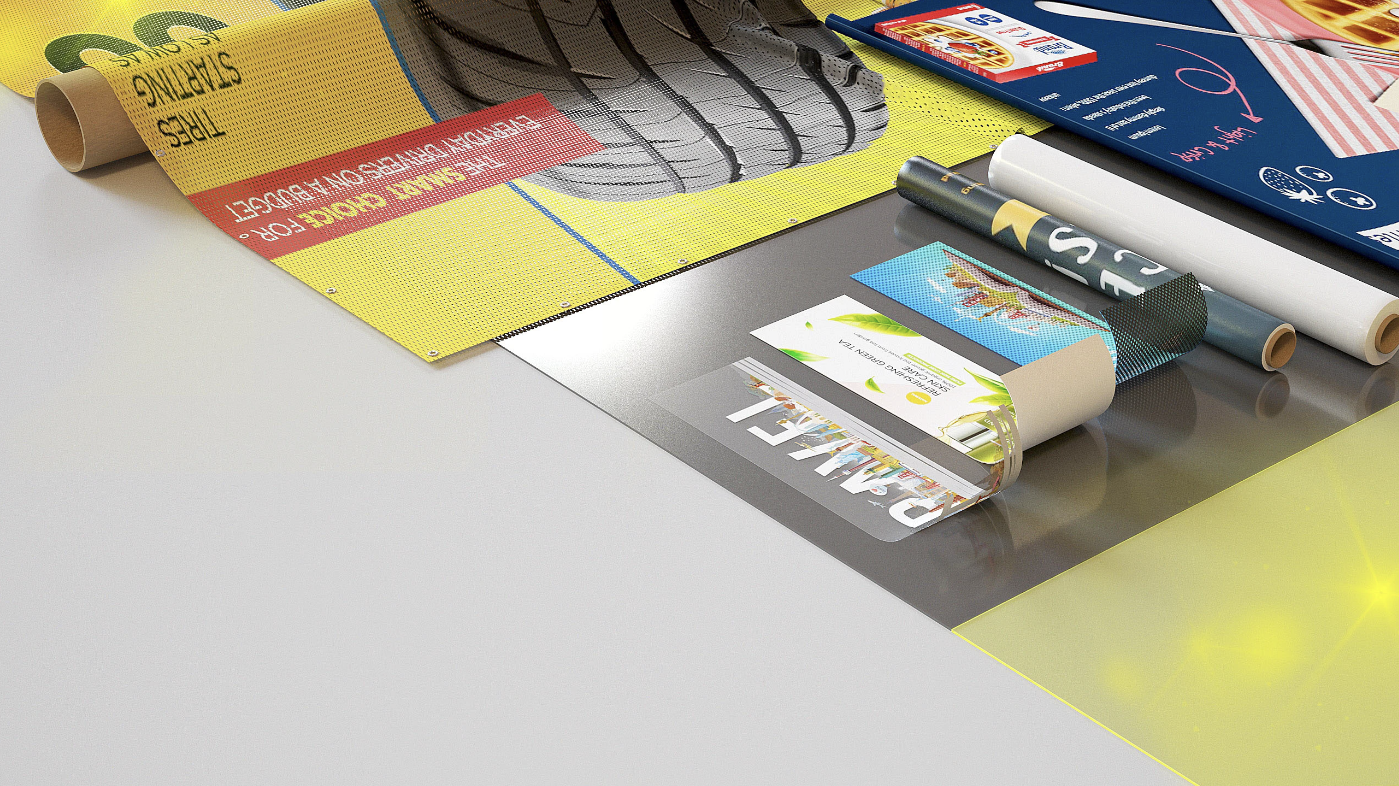
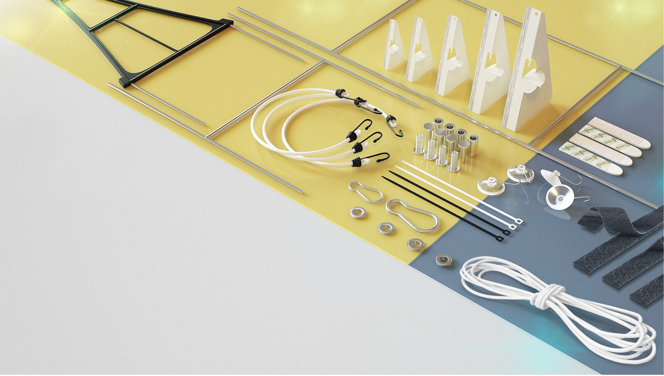
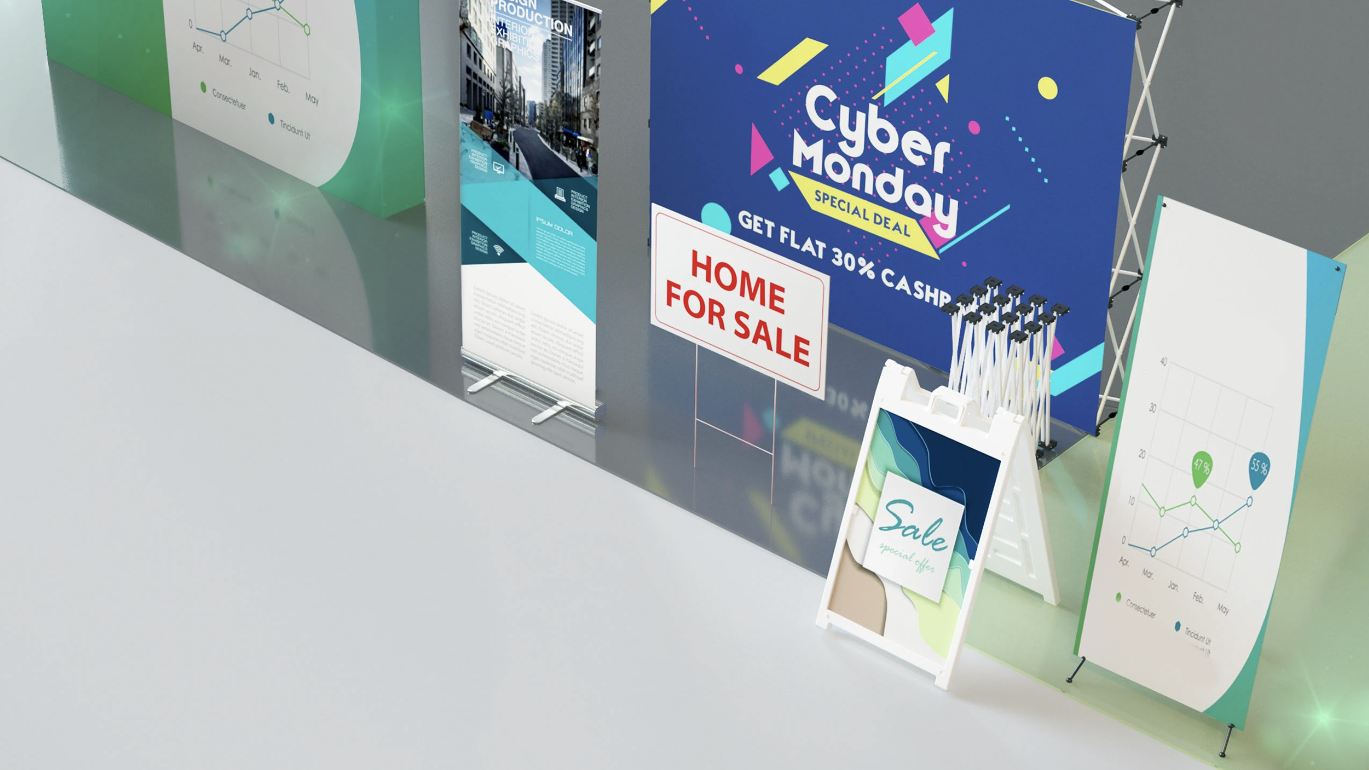
These are screenshots from the live SquareSigns design tool — the marketing and category surfaces customers see across banners, trade-show displays, and framed signage. The visual identity here predates me and was held by the team collectively; my work was inside it, not under it. Over three years I touched compositions like these continuously — refreshing them as products were added, tuning the rhythm of the catalog, and keeping the brand register consistent as the surface area grew.
A note: I don't have the original design files for this period — the screenshots are captures of the live site. They're here to show the product I worked inside, not to claim authorship of every visual.
Live captures from the SquareSigns site — three product families inside the same brand register.
Marketing renders of the design tool, made in 3ds Max.
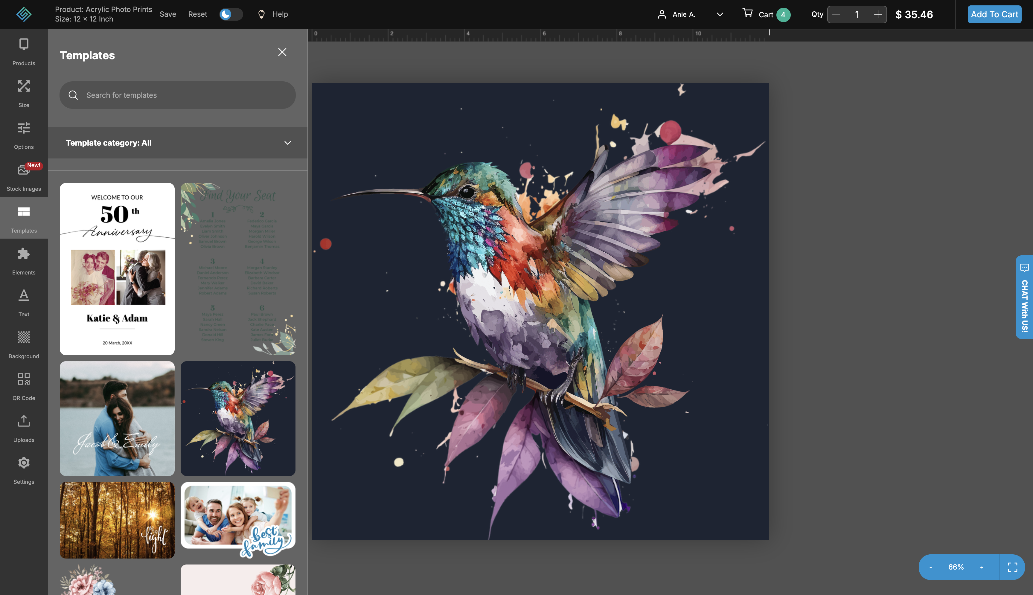
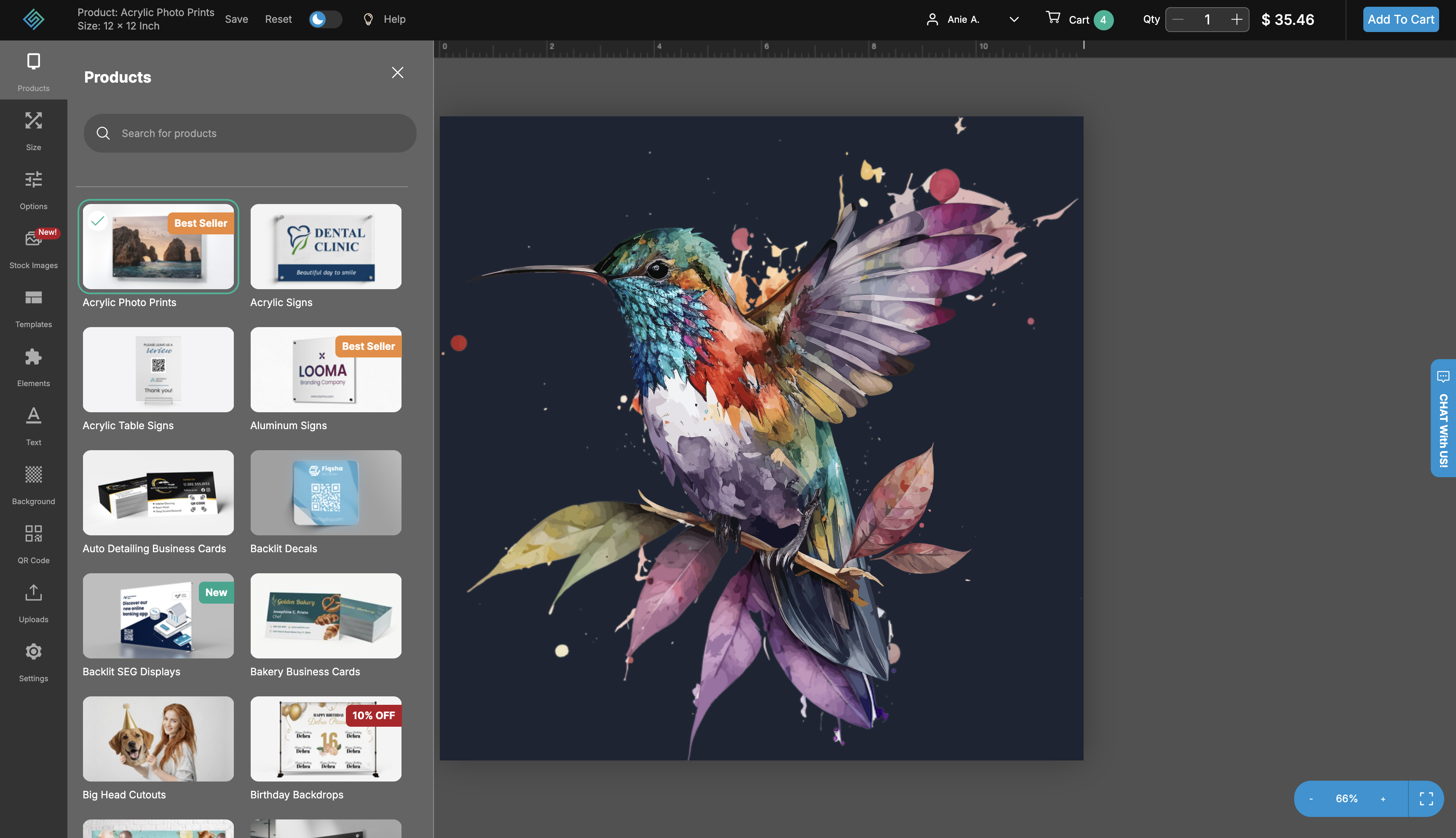
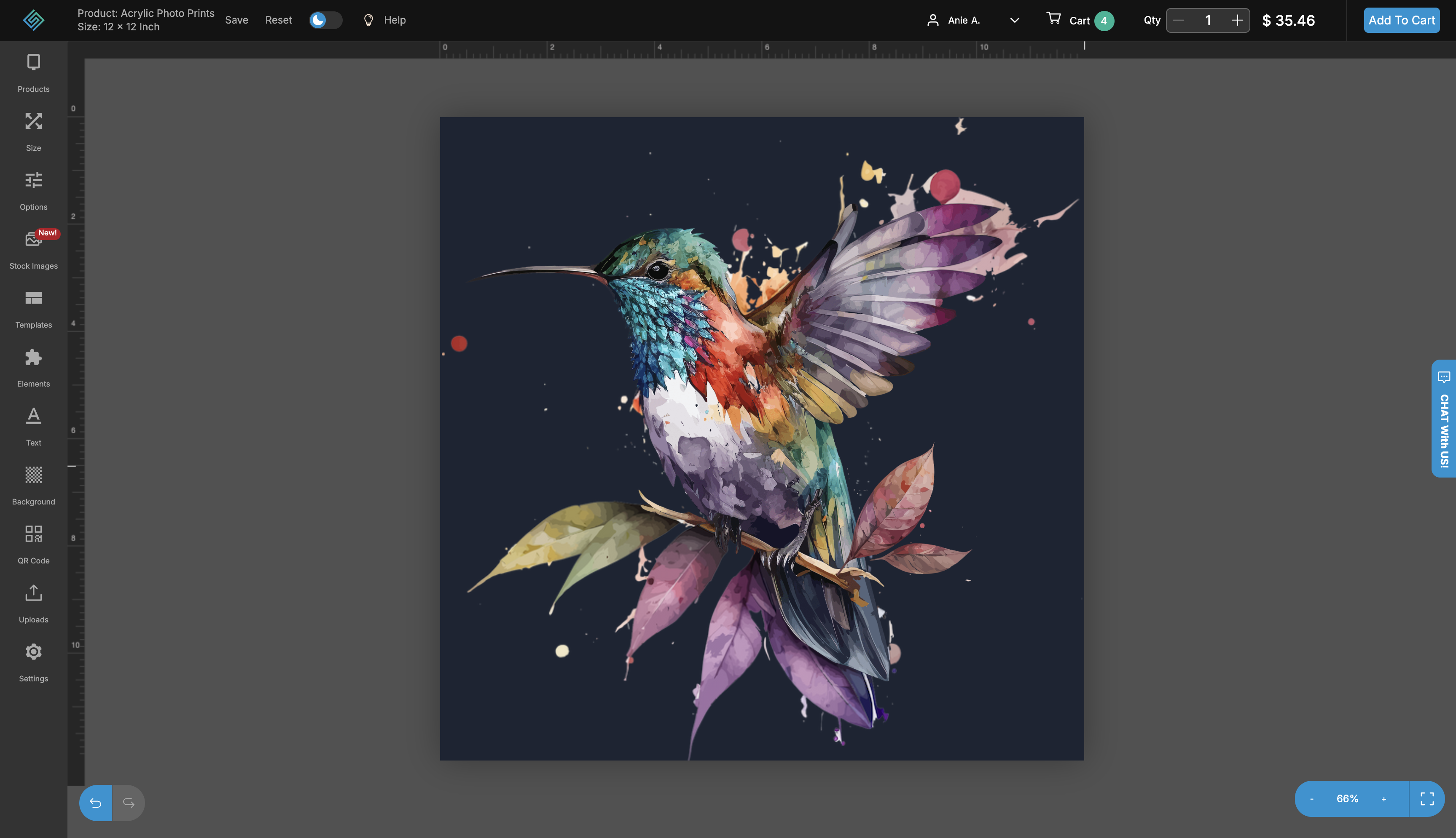
One of the more involved pieces of work I owned at SquareSigns sits across two crafts: UI design and 3D rendering. To promote the in-browser design tool on the homepage product slider, I created a set of 3D-rendered compositions in 3ds Max — promotional visuals that introduced new customers to what the editor could do, in both light and dark mode.
Each render was composed end-to-end: the editor mockup, the canvas content, the workspace framing, the lighting, and the surface that the canvas sits on. The point was to make the design tool feel tangible — something a customer could see themselves using — before they ever clicked into it. The hummingbird artwork was chosen as the slider's canvas content because it carries both the color range and the level of detail that show off the tool's range.
Slider compositions for the design tool — each foregrounding a different rail panel (Templates, Products, the canvas itself) so the marketing imagery teaches what the tool offers, not just what it looks like.
A cart that has to communicate quantity-based pricing.
Signage pricing isn't flat — it tiers by quantity. The cart has to make that visible without burying the line items themselves. Each line item shows its design thumbnail, product + size, options (material, cut, print sides, surface), quantity selector, total, and — importantly — the volume-pricing band underneath that shows how the price would shift at 2x, 6x, 11x, 21x, 51x. The order-summary panel sits to the right with subtotal, shipping, tax, and the primary checkout action.
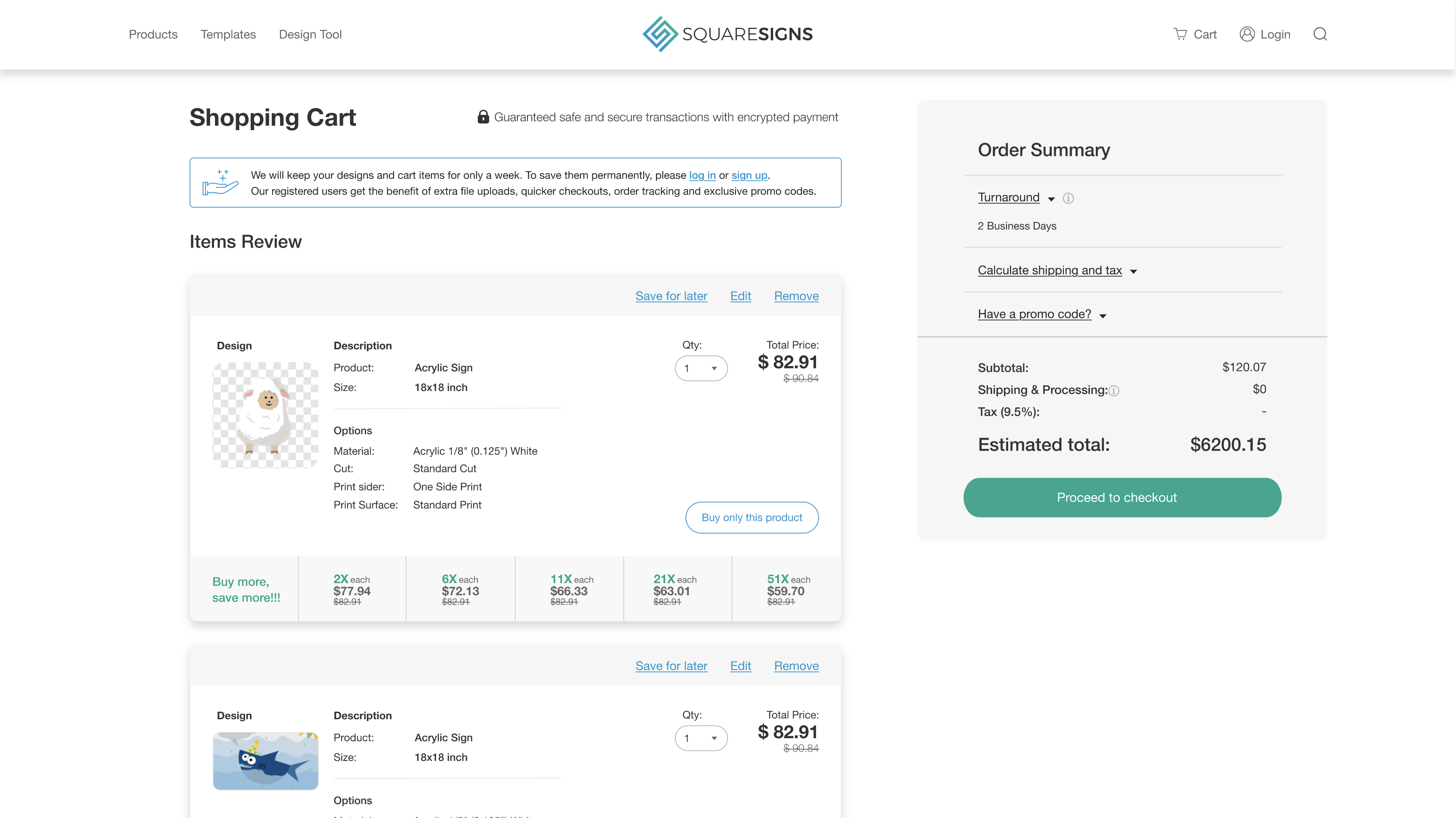
The cart — line items, options, the buy-more pricing tier, and a calm, collapsed order summary on the right.
Order summary, progressively expanded.
The order summary on the right is designed around progressive disclosure. By default everything that needs a customer input — turnaround, shipping address, promo code — sits collapsed under its own label, so the panel doesn't lead with empty inputs. As the customer opens each section, the relevant choices and their prices reveal in place: turnaround swap, shipping options with delivery dates, tax breakdown.
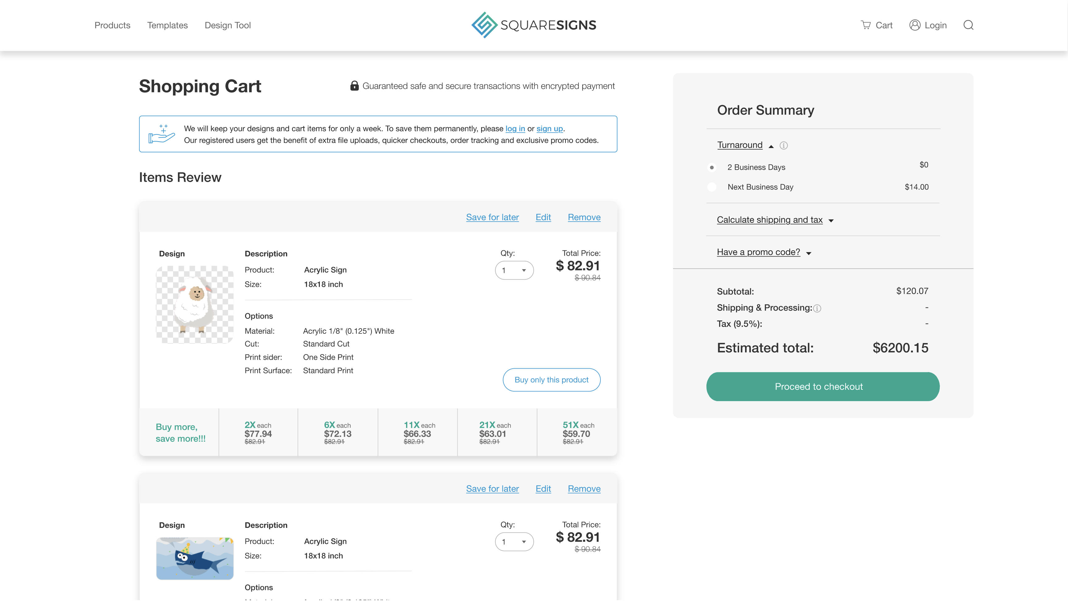
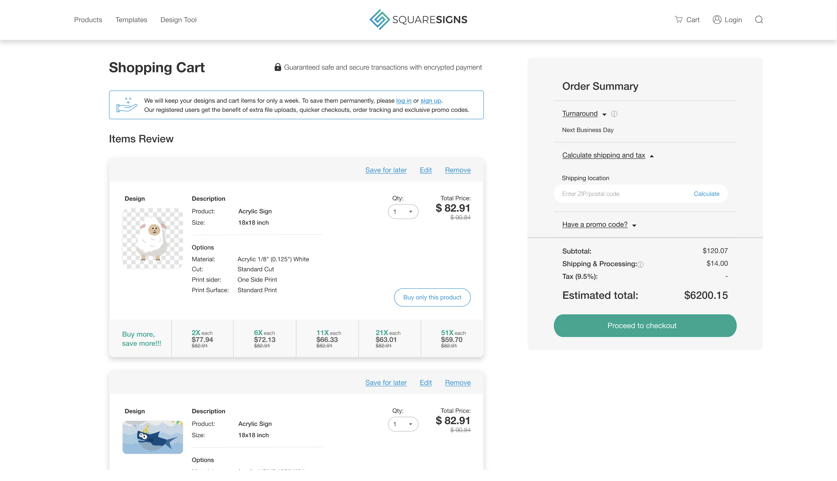
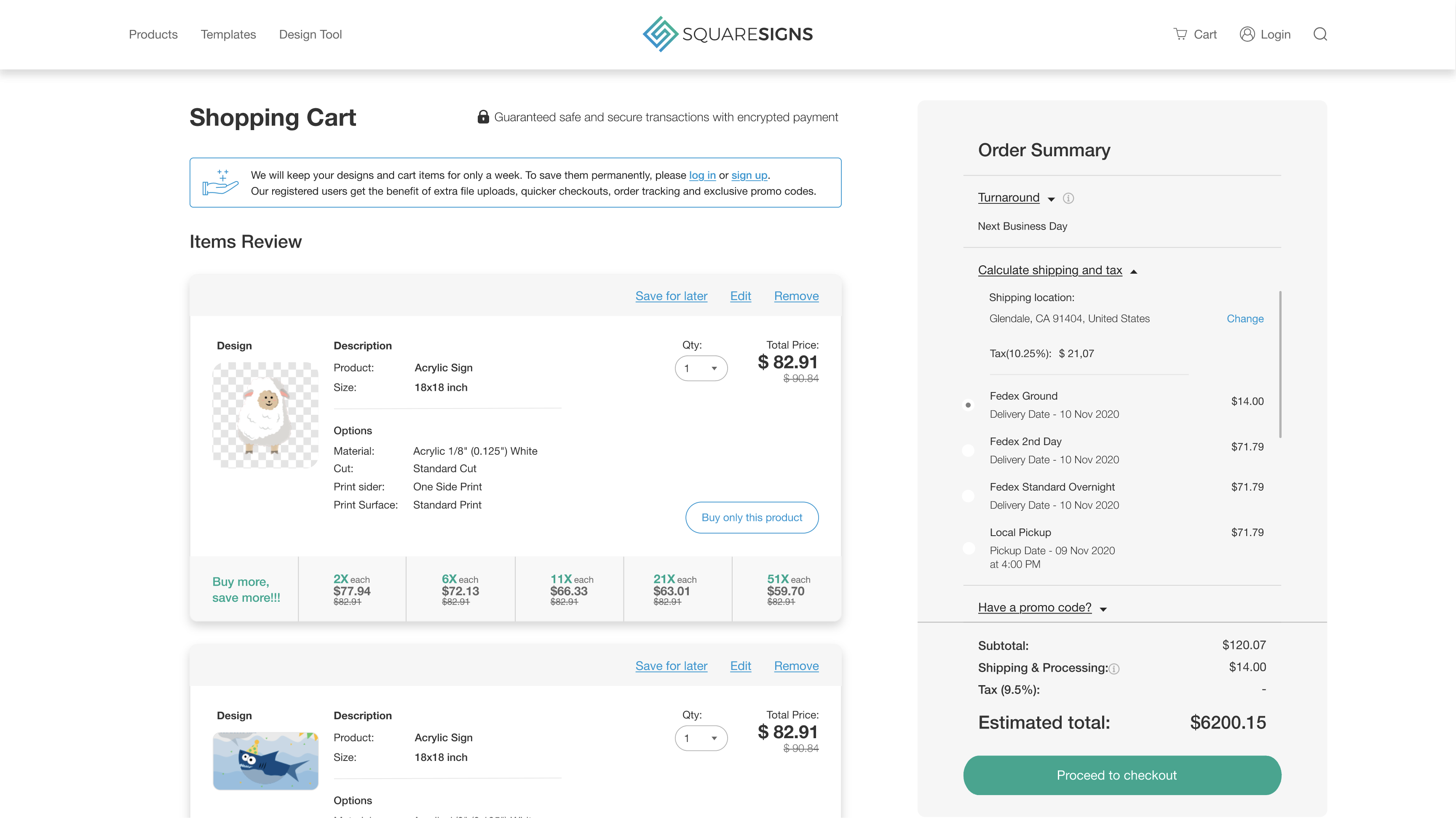
Three states of the same panel — turnaround choice, an empty ZIP input, and the fully-expanded shipping calculator with tax breakdown and Fedex / local pickup options.
A multi-step checkout, with the summary always in view.
Checkout splits into Contact information, Shipping, Payment, and Review & place order — collapsible sections that progressively expand. The order summary stays pinned on the right at every step so customers always see what they're paying and what's in it before they commit.
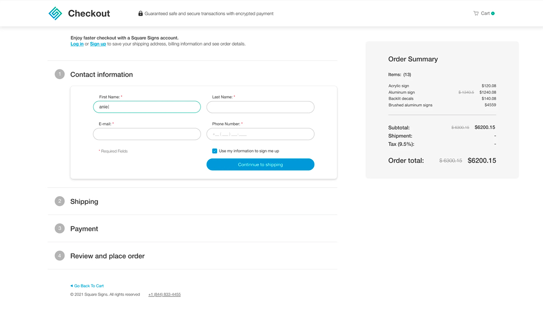
The checkout flow — collapsed steps, expanded contact form, and a pinned order summary that's always visible.
Orders, designs, and everything else a returning customer needs.
The My Account area is where returning customers spend their time after a purchase: looking at past orders, reordering, tracking, downloading invoices, managing addresses and payment methods, and updating notification preferences. The orders view groups items by order with order-level actions (Order details, Track order, Repeat Order, Cancel) on the right, and per-item details on the left.
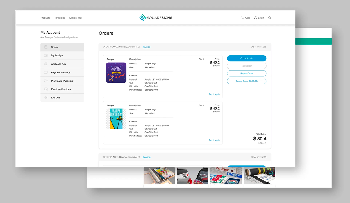
The My Account → Orders view — left-rail navigation, grouped order cards, per-item details, and order-level actions in one screen.
Owning a product end-to-end, for three years.
What I keep going back to from SquareSigns is the shape of the role itself. Being the designer on a live, sprawling product for three years meant I held the whole surface in my head at once — the storefront language, the editor's interaction patterns, the cart's pricing logic, the templates' visual range — and decisions in one area had to make sense in the others. That's a different muscle than designing a single feature inside a larger team.
It's also where I learned the discipline of continuous, considered change. You can't blow up the architecture every time something annoys you. You pick the screens where a careful change unlocks the most user value, ship that, watch how it lands, and come back to the next one — sometimes months later when the data and team agree it's worth touching. That habit is the through-line into everything I've done since.
Want to walk through specific surfaces — design tool tradeoffs, templates I authored, the third-year refresh decisions? Happy to dig in over a conversation.
Get in touch →Like what you see?
I'm open to senior product design roles and select freelance engagements. Always happy to chat.
Get in touch →