Designing EasySender's deliverability tools.
EasySender helps senders monitor and protect their email deliverability. This is the product work I designed on top of the EasySender design system — centred on the Overview page, which turns raw sending data from Amazon SES, Google Postmaster, and SendGrid into something a team can actually act on.
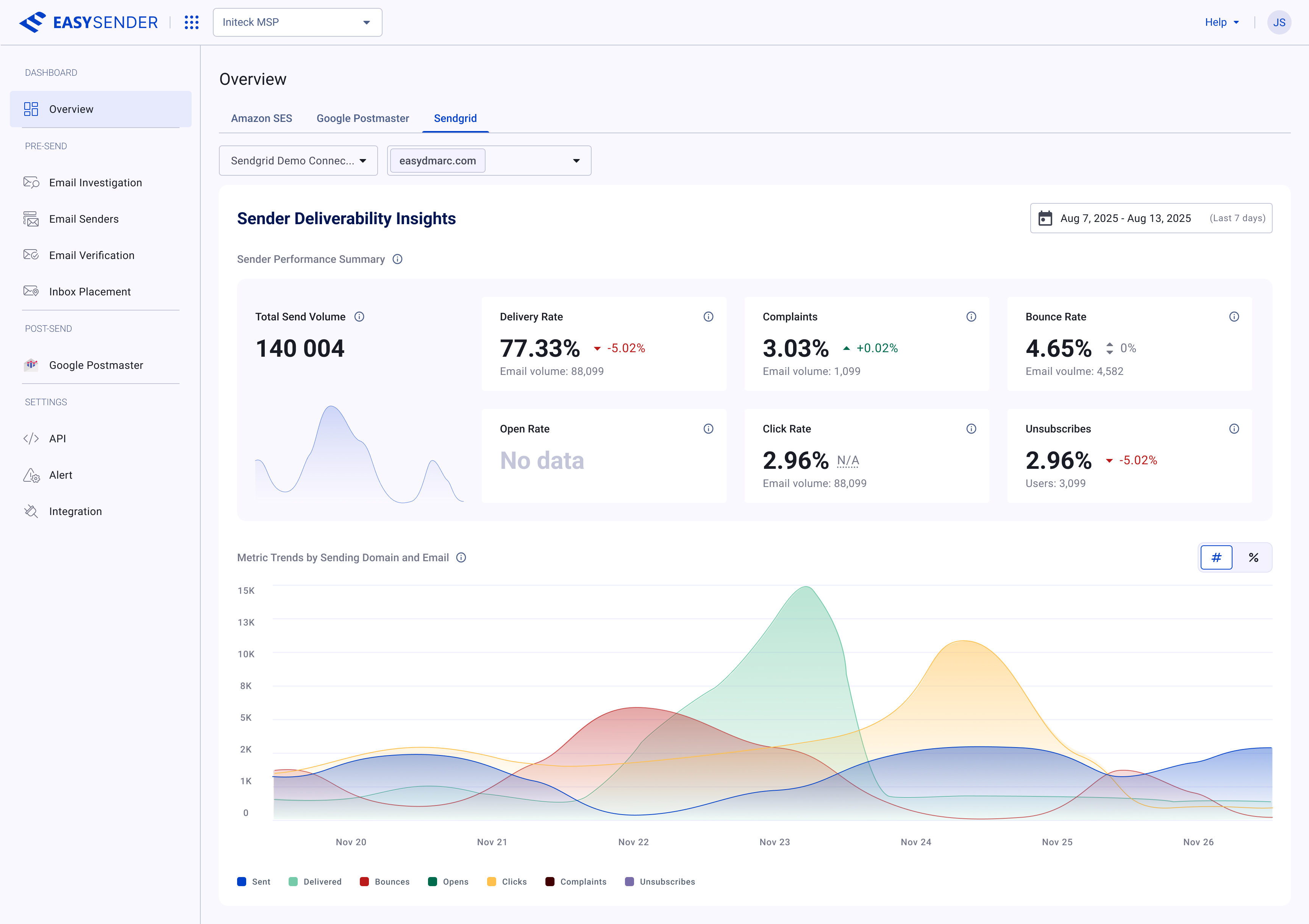
The Overview dashboard — Sender Deliverability Insights, turning a SendGrid connection's raw metrics into a scannable summary and trend view.
Deliverability data is only useful if you can read it.
EasySender connects the major sending and reputation sources — Amazon SES, SendGrid, Google Postmaster — and pulls in a firehose of metrics: send volume, delivery and bounce rates, complaints, spam reports, IP and domain reputation, authentication, and more. On its own that data is overwhelming. The job of the Overview page is to make it legible: surface what changed, what's at risk, and what to do next.
Rather than a separate screen per provider, the Overview page uses tabs — Amazon SES, Google Postmaster, SendGrid — over one shared shell. Each tab shows the right metrics for that source while feeling like the same product, so switching providers never means re-learning the page.
Because these screens are built on the EasySender design system, the design work focused on the hard part — information hierarchy, chart legibility, and comparison across providers — rather than re-deciding buttons, tables, and tokens.
Every screen here is the design system, applied.
The Overview page is the proof that the system works in production. The metric cards, tables, tabs, date pickers, tooltips, chart legends, and empty states all come straight from the component library — composed into real, data-dense surfaces. When a token or component changed in the system, these screens inherited it for free.
- Provider tabs — Amazon SES, SendGrid, and Google Postmaster share one Overview shell, switched by tabs from the component library.
- Metric cards — a single card pattern carries the headline number, trend delta, and supporting volume across every metric.
- Charts & legends — consistent color roles, tooltips, and legends so a spike means the same thing on every chart.
- Empty & no-data states — designed explicitly, because deliverability data is often partial or still syncing.
The Overview page — SendGrid tab.
The SendGrid tab pairs a sender performance summary — the headline rates and a metric trend chart by sending domain — with recipient insights that break the same metrics down by mailbox provider and recipient domain. Filters and date ranges sit in a consistent toolbar, and number/percentage toggles let the same data be read two ways. The no-data and partial states are first-class, not afterthoughts.
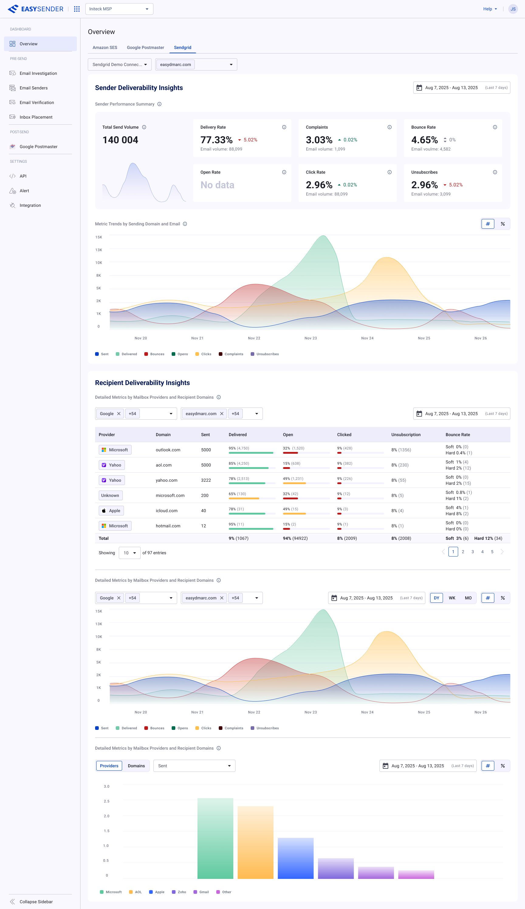
The full SendGrid Overview — sender summary and trends up top; below, the recipient breakdown table by mailbox provider and domain, with inline delivery, open, click, and bounce bars per row.
The Overview page — Google Postmaster tab.
The Google Postmaster tab is the densest view of the Overview page — and the one where hierarchy mattered most. It opens with a Compliance Status checklist that grades each requirement (SPF/DKIM, DMARC, encryption, spam rate, unsubscribe handling) and expands to show per-domain status, so a sender sees at a glance what's healthy and what needs work.
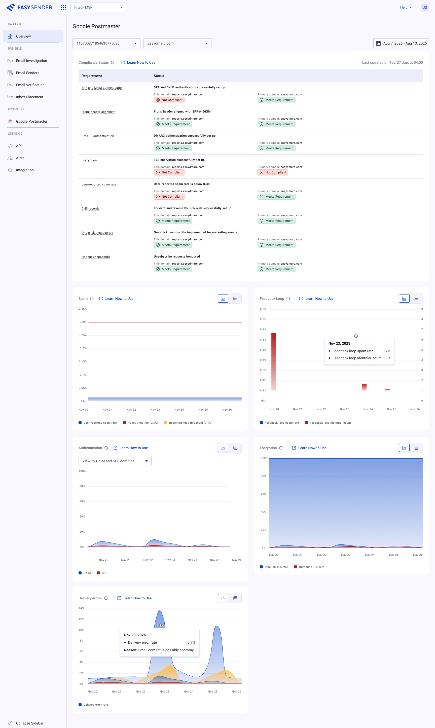
Compliance Status — each requirement graded per domain, with clear pass / needs-work states, sitting above the reputation charts.
Below it, eight reputation signals — user-reported spam, IP and domain reputation, spam feedback loop, authenticated and encrypted traffic, and delivery errors — each in its own card. Every signal can be read two ways: a chart for trend at a glance, or a sortable, paginated table for the underlying numbers. One toggle, same data, no context lost.
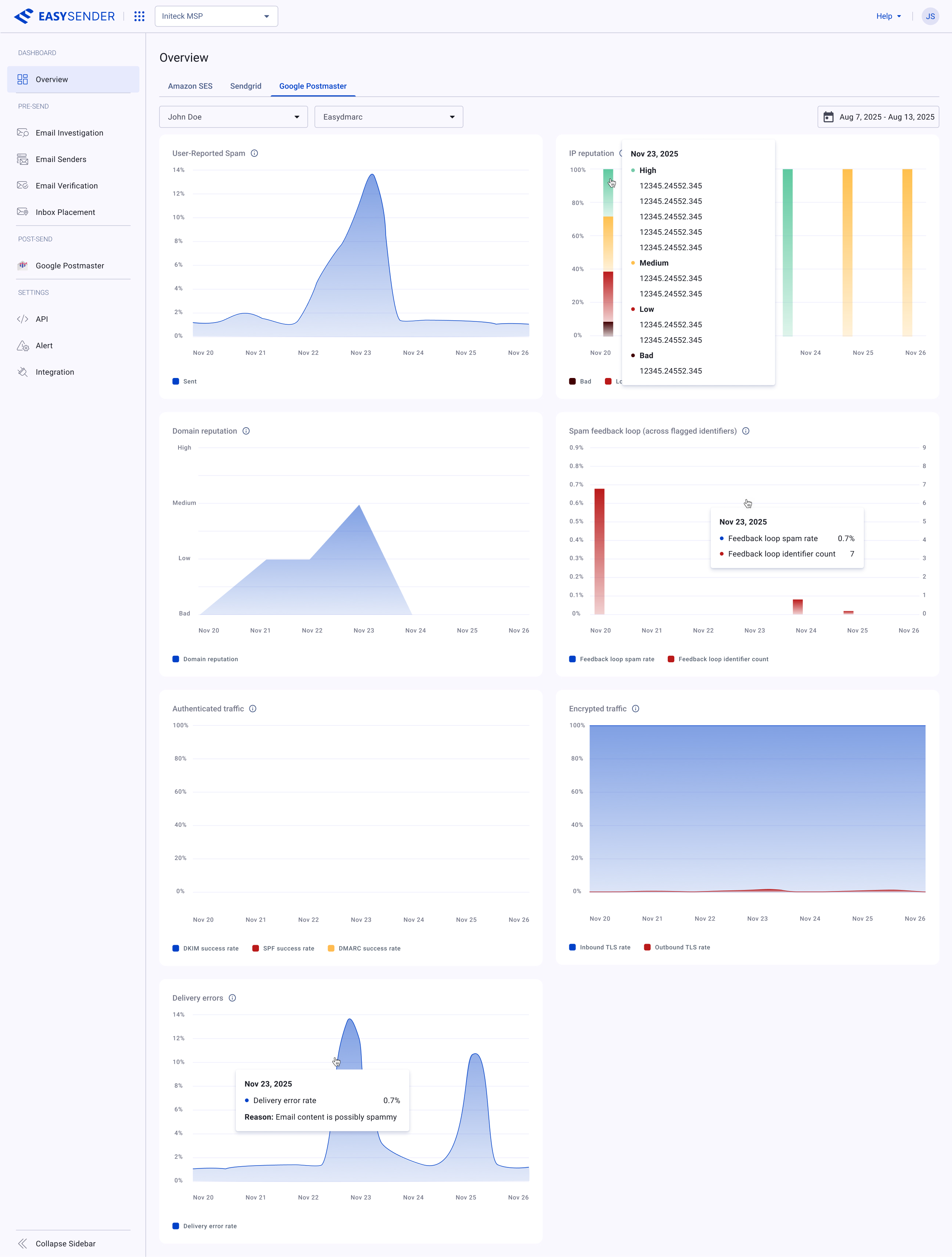
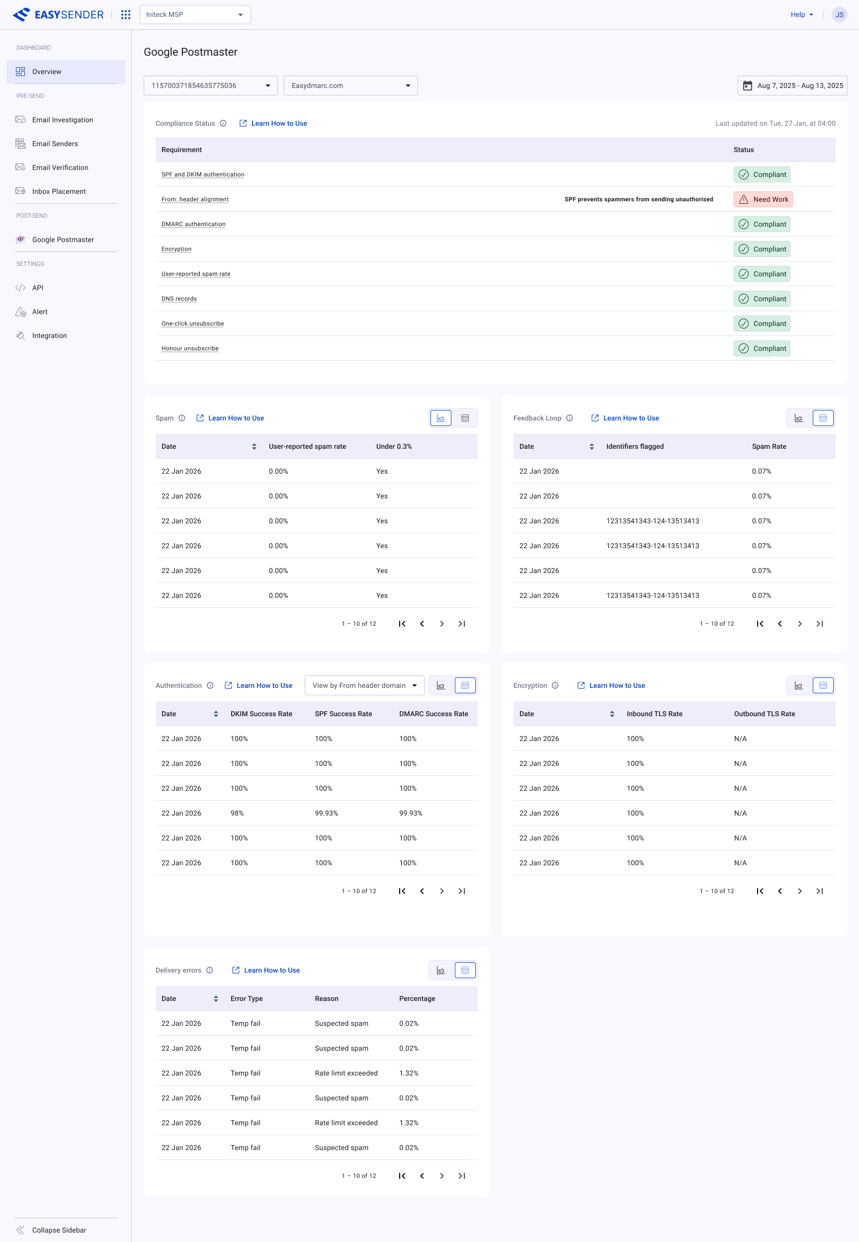
The same reputation signals, two lenses — charts for the trend, tables for the exact numbers — toggled per card.
One page, then the rest of the platform.
Beyond the Overview page, EasySender's pre-send tools — Email Investigation, Email Verification, and Inbox Placement — share the same system and patterns. They belong in this case study rather than separate ones: it's one product, one design language, and the value is in showing how consistently the system scales across very different jobs.
More screens are being added here — Email Investigation, Verification, and Inbox Placement next.
Complex data, made usable — fast.
Building on the design system meant the Overview page could focus entirely on the deliverability problem: how to compare providers, how to spot a reputation dip before it hurts, how to make a chart-heavy page calm. It shipped quickly and stays consistent with the rest of the product, on both web and mobile.
Happy to walk through the flows, the data model behind these screens, and the decisions I cut — in a conversation.
Get in touch →Like what you see?
I'm open to senior product design roles and select freelance engagements. Always happy to chat.
Get in touch →